Yanu
✧
Yanu ✧
Designing the digital presence of an autonomous AI-powered bartender
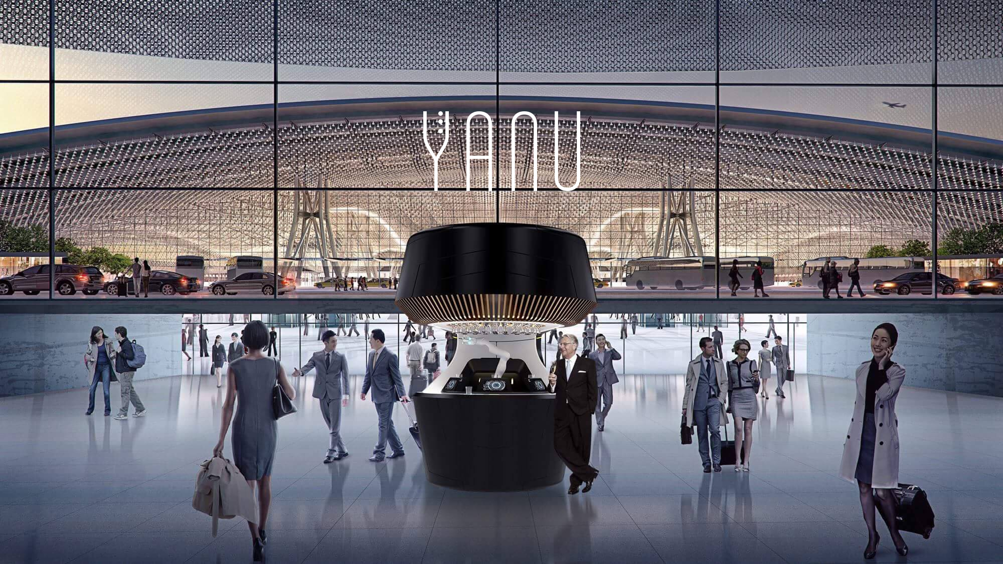
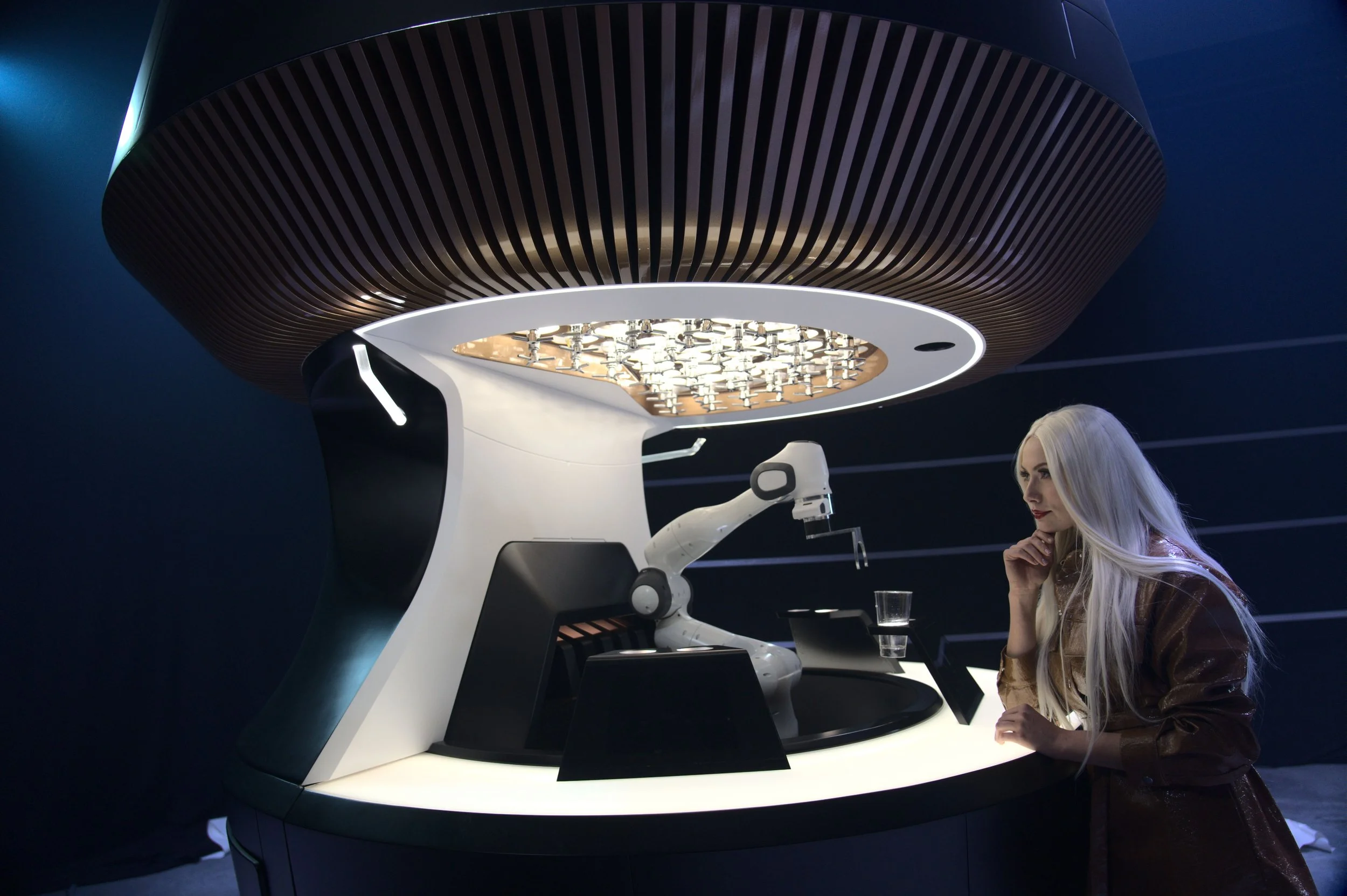
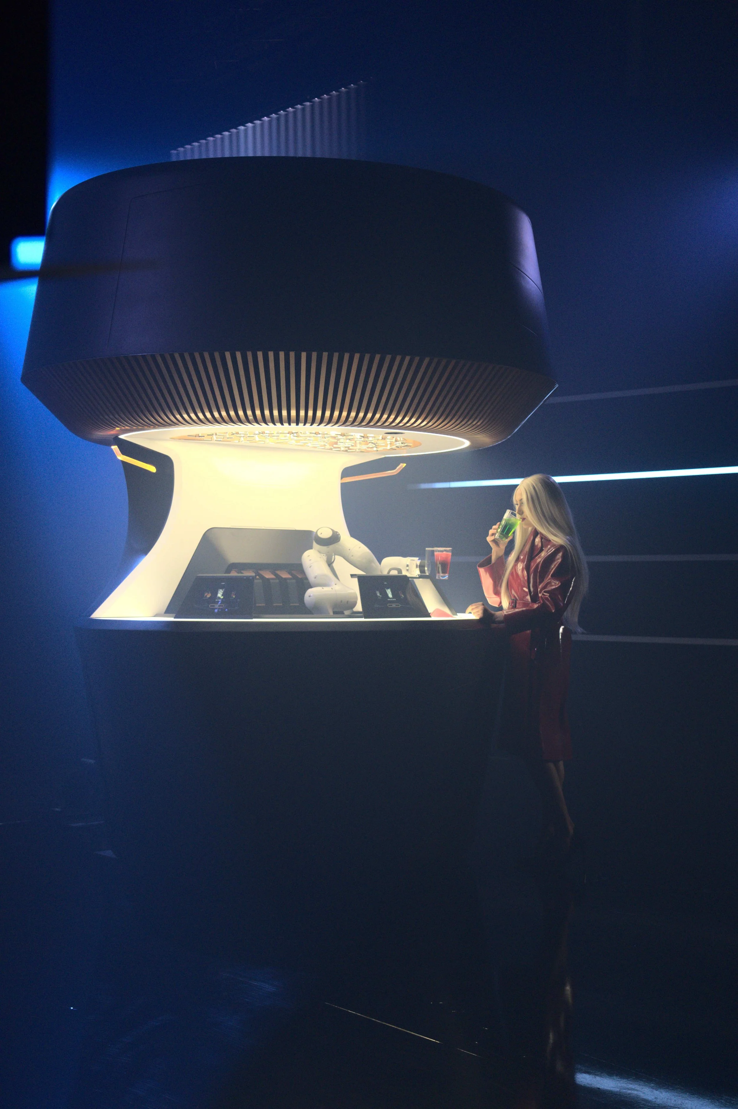
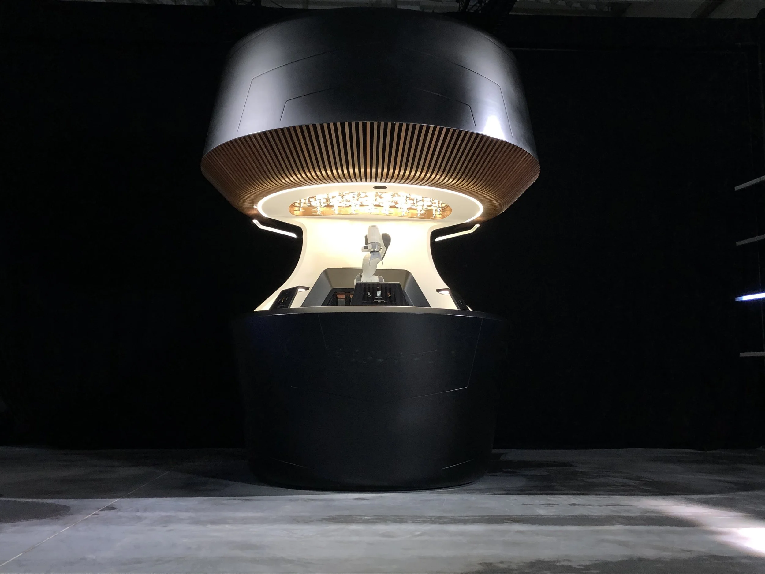
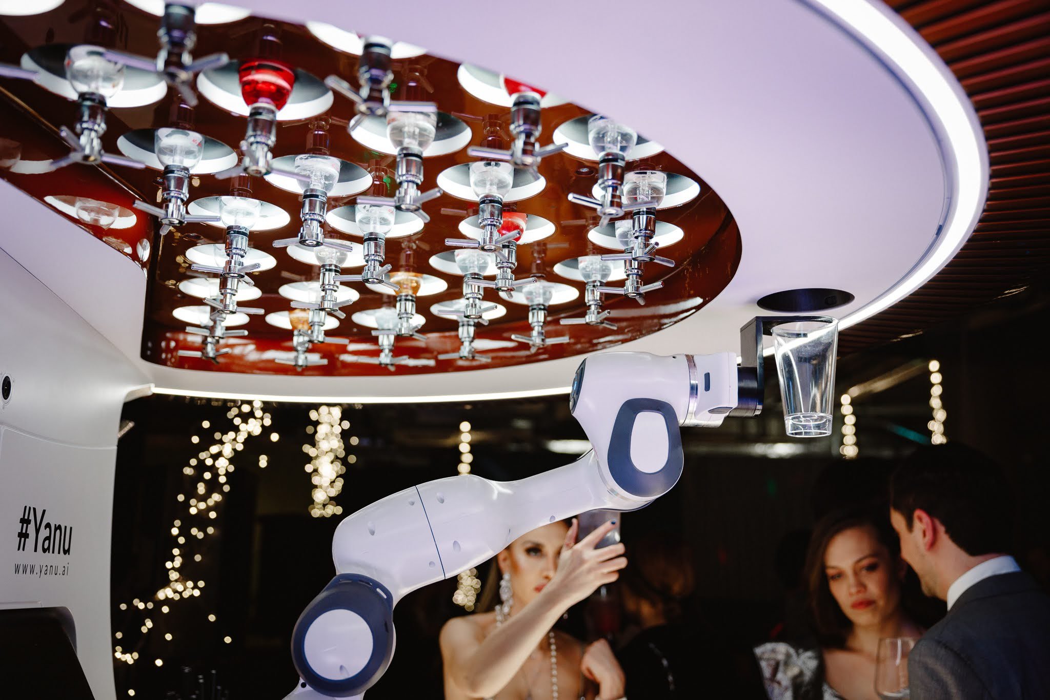
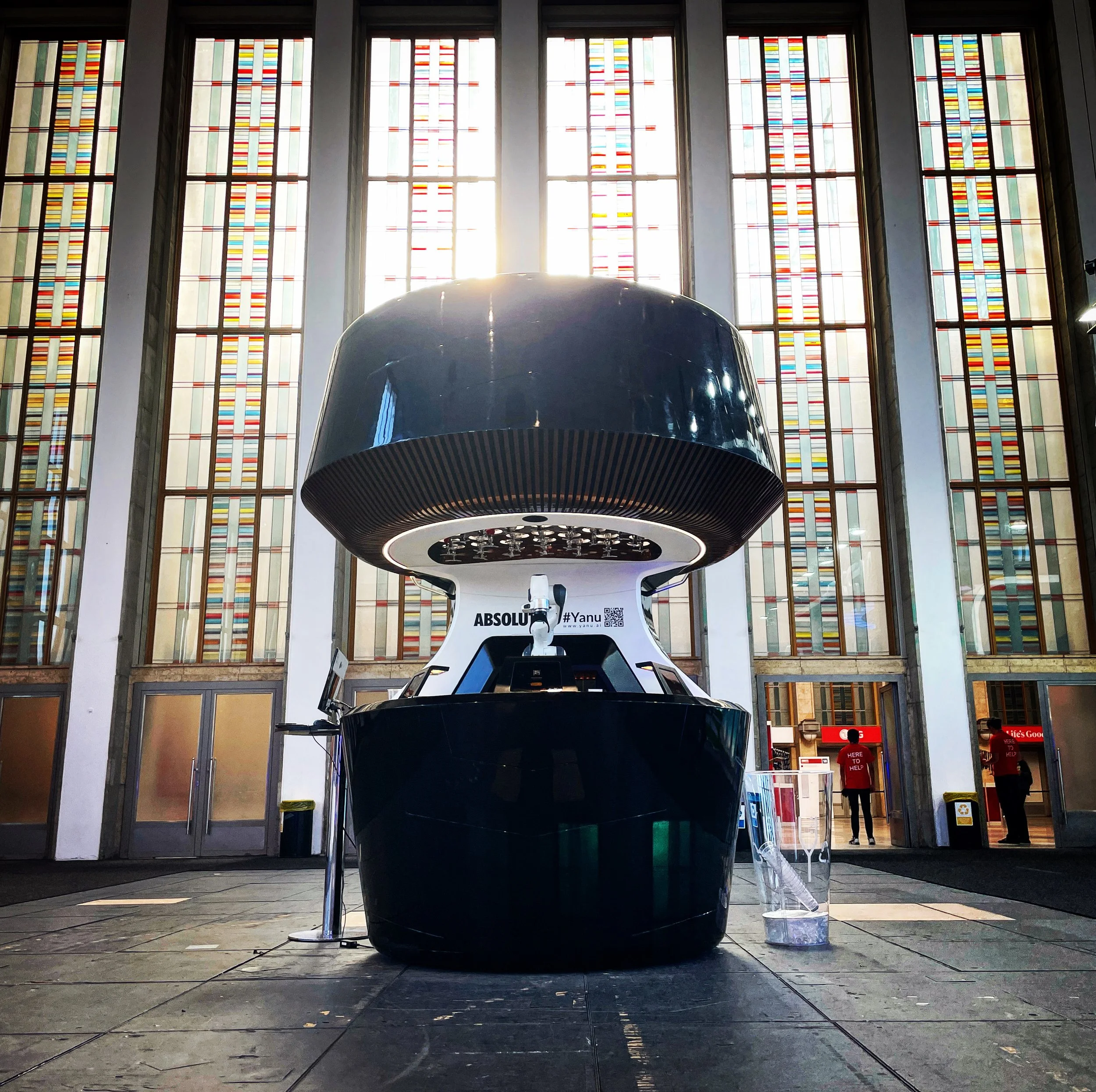
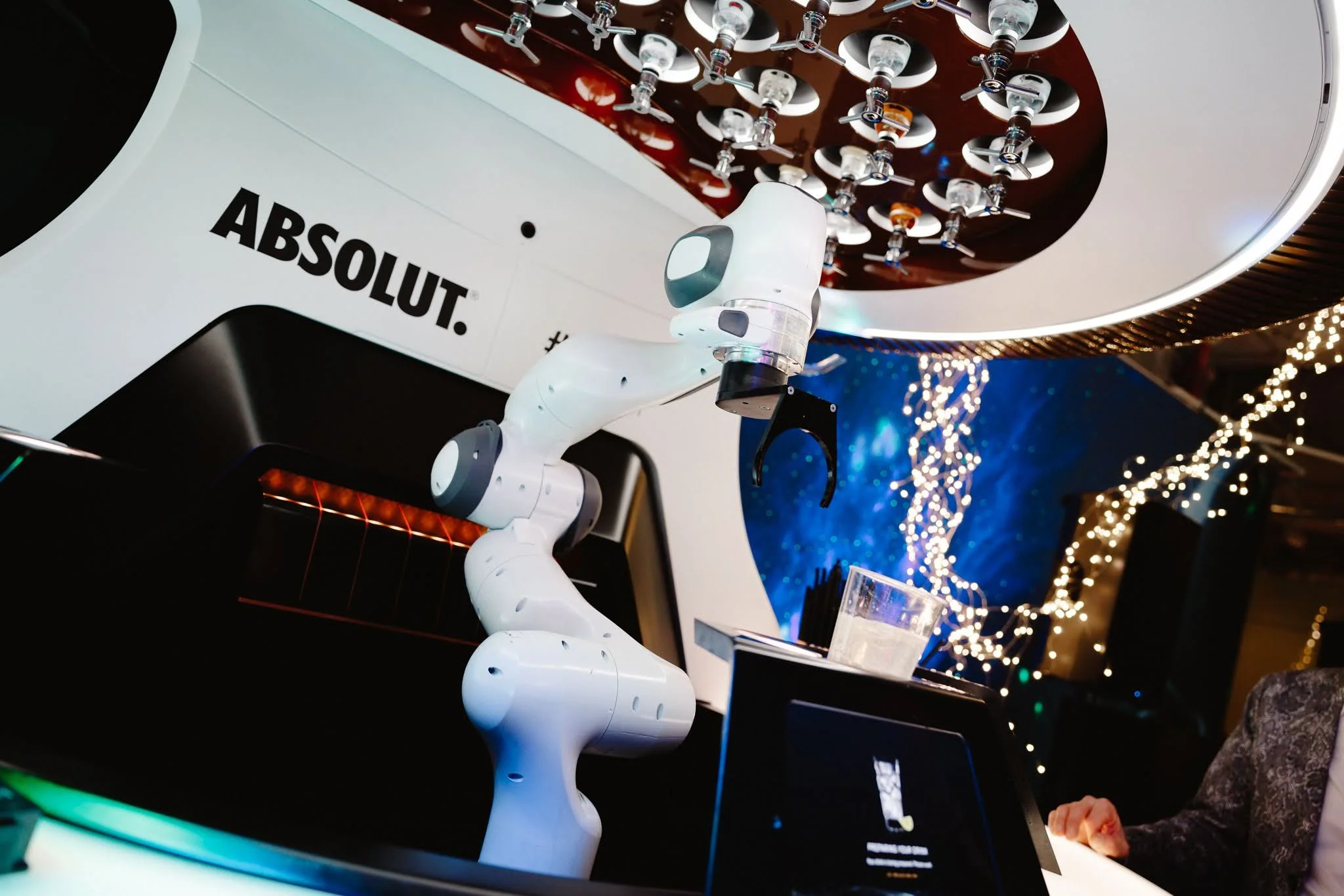
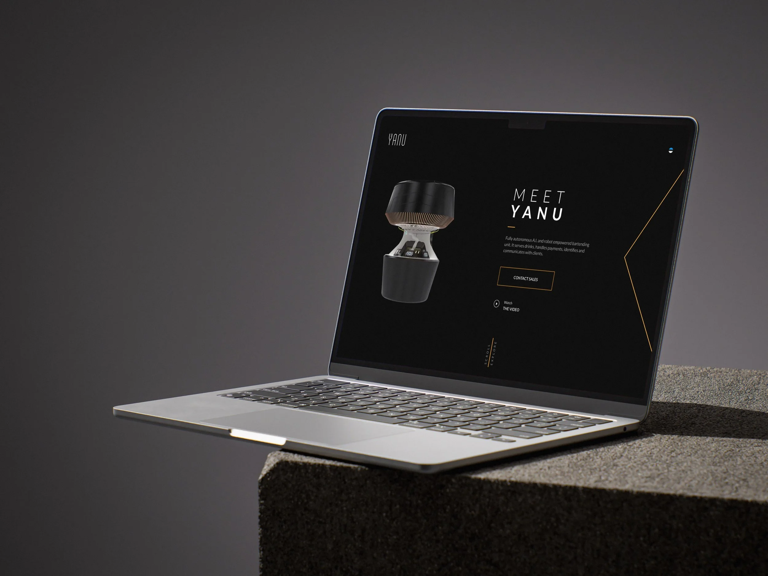
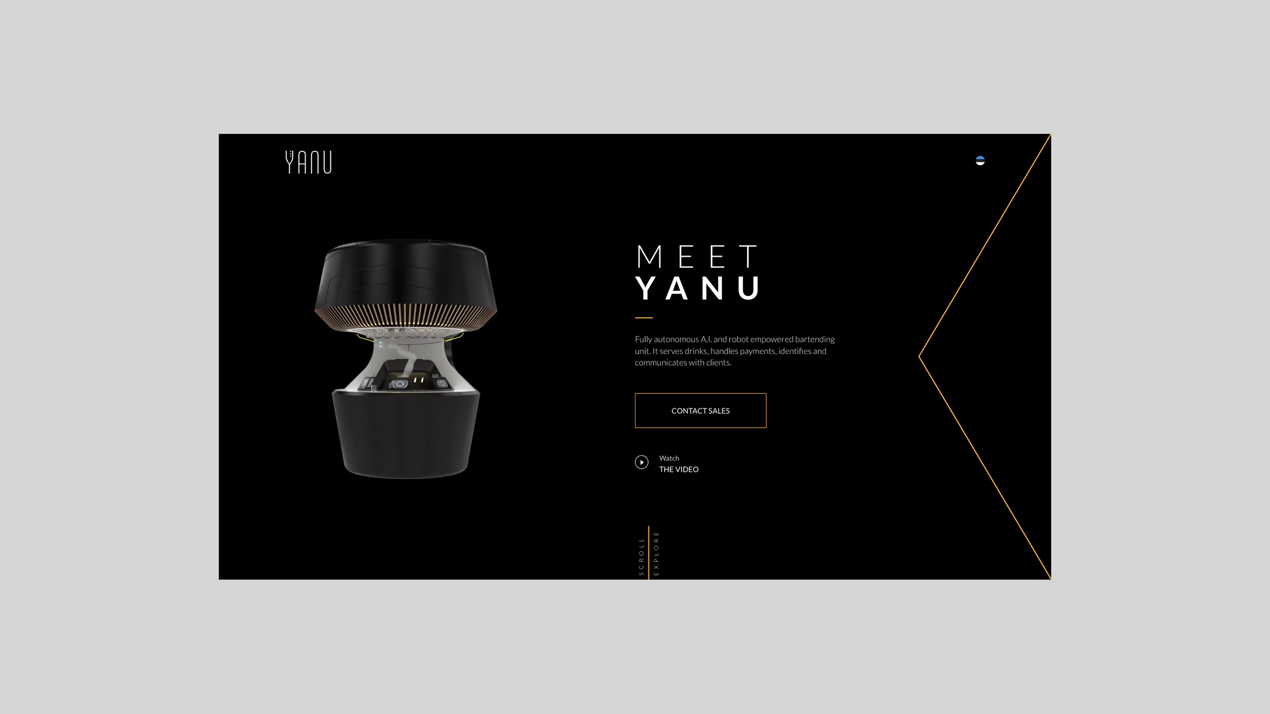
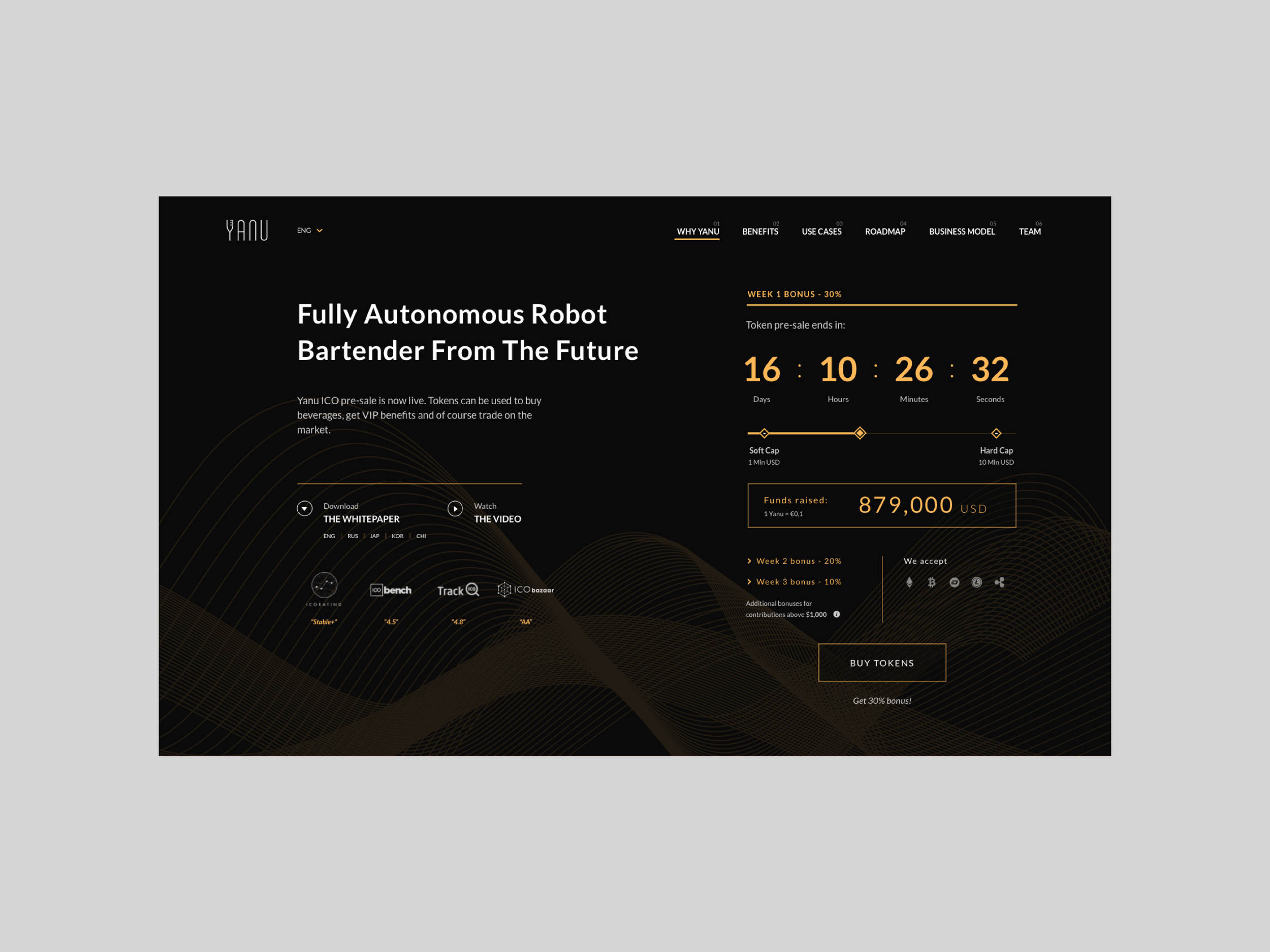
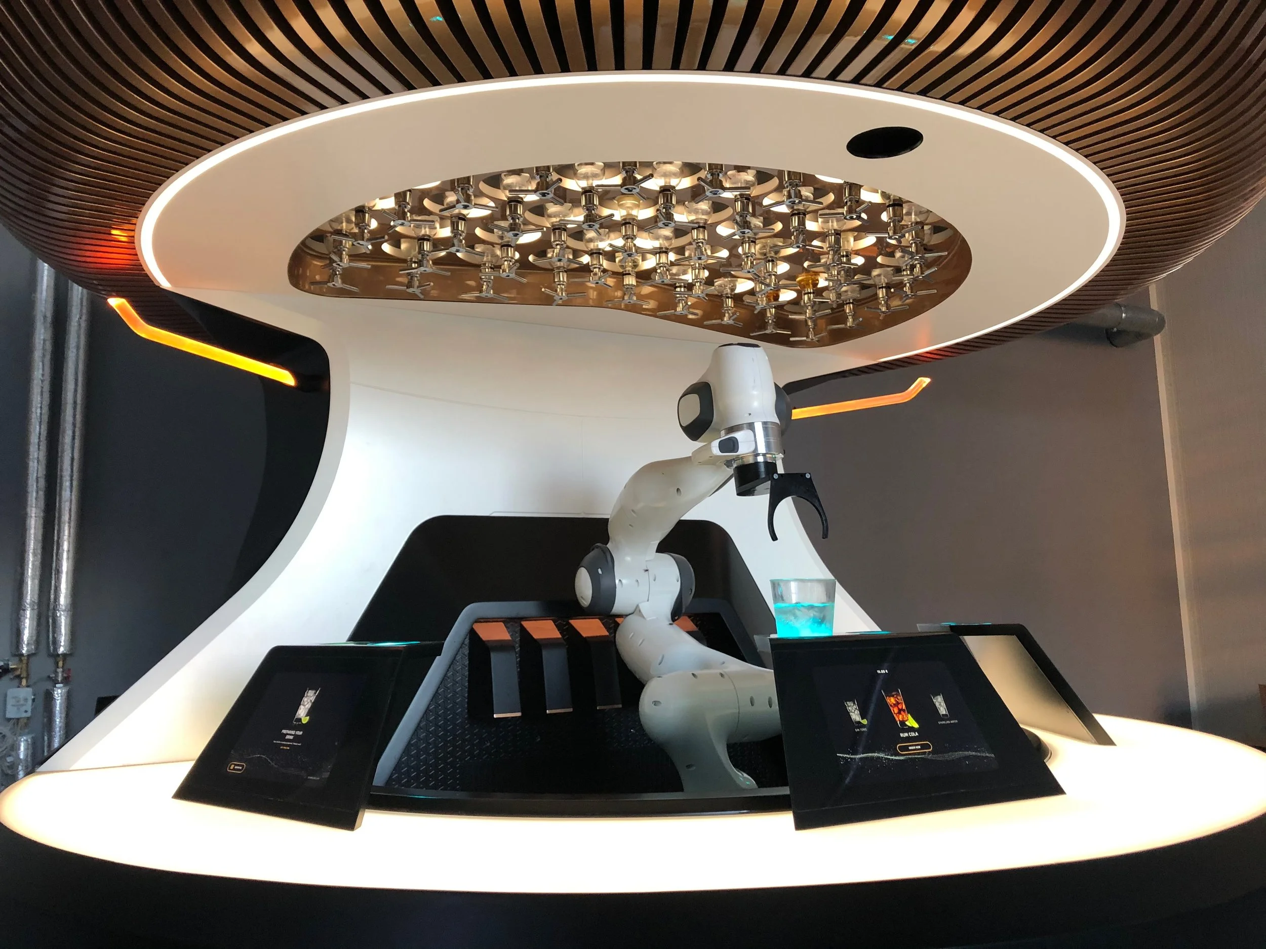
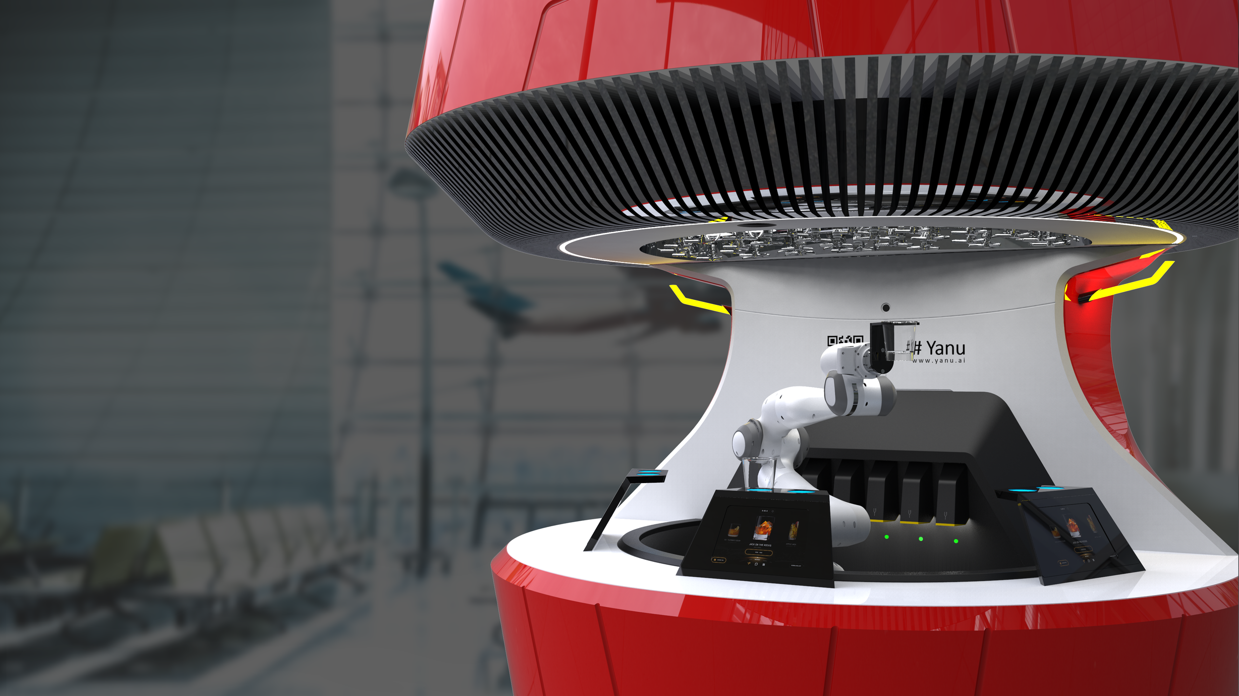
Yanu is a robotics start-up building a fully autonomous bartender that prepares and serves drinks, processes payments, and interacts with users in real time. This project was developed during my time at Havas, where I collaborated closely with a Lead Designer and a team of developers.
The project focused on designing the main landing page and ICO fundraising experience, translating a highly innovative product into a clear, engaging, and visually compelling digital interface. The approach centered on crafting a strong product narrative—showcasing the technology, its real-world applications, and its value for both users and investors through a cohesive and forward-looking design system.
The Challenge
Designing for Yanu meant translating a highly innovative and unfamiliar product into a clear and engaging digital experience.
The core challenge was not just visual, it was about communication. The product sits at the intersection of robotics, AI, hospitality, and automation, which introduces a level of complexity that can easily overwhelm or confuse users if not structured properly.
At the same time, the website needed to serve multiple audiences:
- Potential clients (bars, hotels, event organizers)
- End users interacting with the robot
- Investors exploring the ICO opportunity
Balancing these audiences within a single experience required a careful approach to hierarchy, storytelling, and content flow.
- Complex and technical product difficult to explain quickly
- Low familiarity with autonomous service robots among users
- Need to appeal to both B2B clients and investors simultaneously
- Risk of overwhelming users with technical jargon or abstract concepts
- ICO fundraising required clarity, trust, and credibility
- No established visual system to communicate innovation and reliability
“The challenge was to simplify without oversimplifying, making the product feel both cutting-edge and accessible.”
Design Approach & Direction
The design approach focused on creating a future-forward yet approachable experience, where innovation is clearly communicated without sacrificing usability.
A key principle was progressive disclosure, introducing the product in layers, allowing users to first understand the concept, then explore deeper technical and business details at their own pace.
Narrative-Driven Structure — The landing page was designed as a guided story, starting with a strong value proposition and gradually revealing features, use cases, and benefits
Clarity Through Hierarchy — Content was structured to prioritize essential information first, using clear sections and visual breaks to avoid cognitive overload
Balancing Audiences — Separate content flows and emphasis points were introduced to address both product users and potential investors without fragmenting the experience
Trust & Credibility — Special attention was given to sections related to the ICO, ensuring the design communicates legitimacy, transparency, and professionalism
Future-Oriented Aesthetic — The overall direction embraces a tech-driven look while avoiding clichés, aiming for a refined and believable representation of innovation
The result is a structured and engaging experience that guides users from curiosity to understanding, and ultimately to action.
Visual identity
The visual identity was designed to reflect the core attributes of the product: innovation, precision, and intelligence.
Rather than relying on overly futuristic or exaggerated visuals, the approach focuses on a clean and controlled aesthetic that feels credible and product-driven.
Typography — Modern, geometric typefaces reinforce a sense of technology and precision while maintaining high readability across content-heavy sections
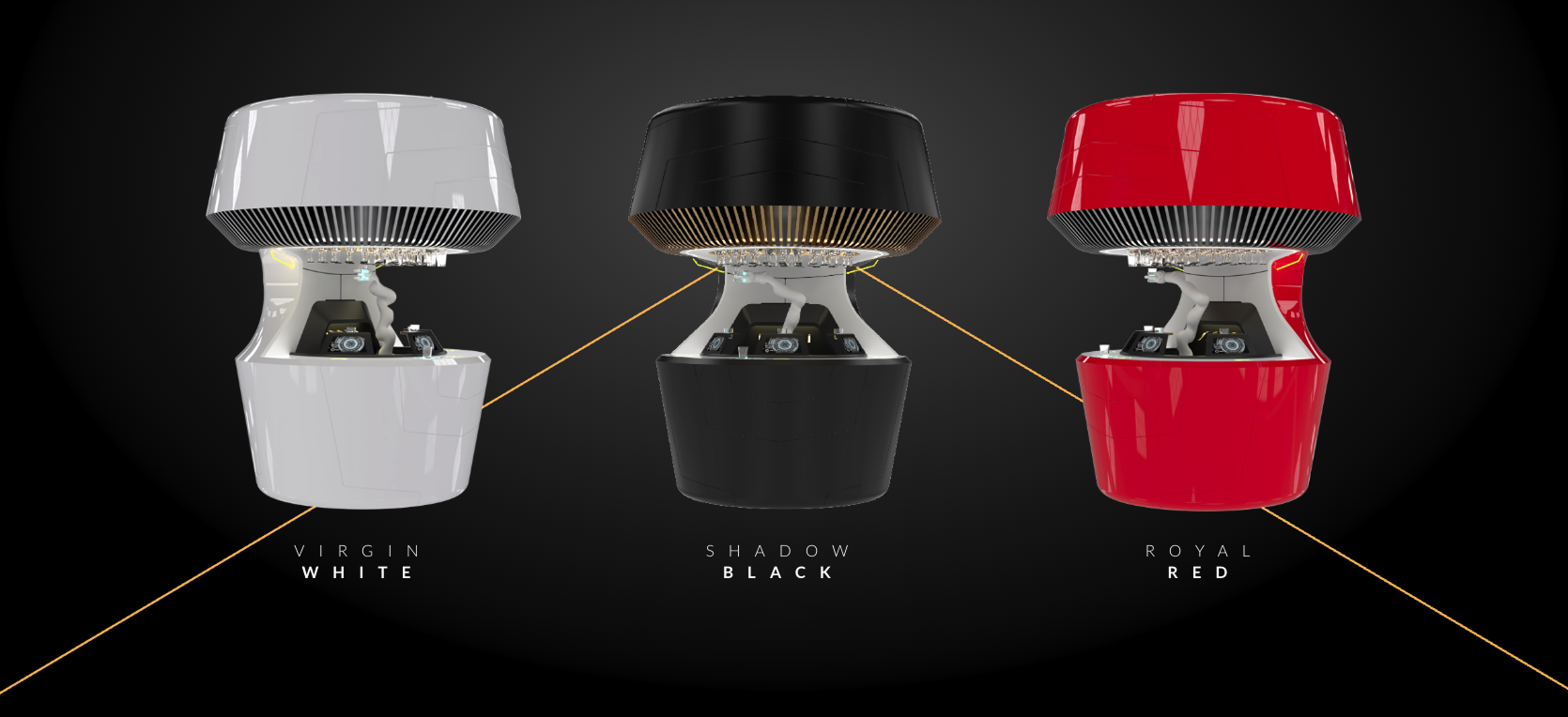
Color Palette — A dark, high-contrast base combined with vibrant accent tones creates a futuristic atmosphere while helping highlight key actions and information
Lighting & Gradients — Subtle gradients and glow effects were used to evoke a sense of energy and movement, reinforcing the idea of automation and intelligence
UI Components — Clean, minimal components ensure that the interface remains functional and scalable, without distracting from the product itself
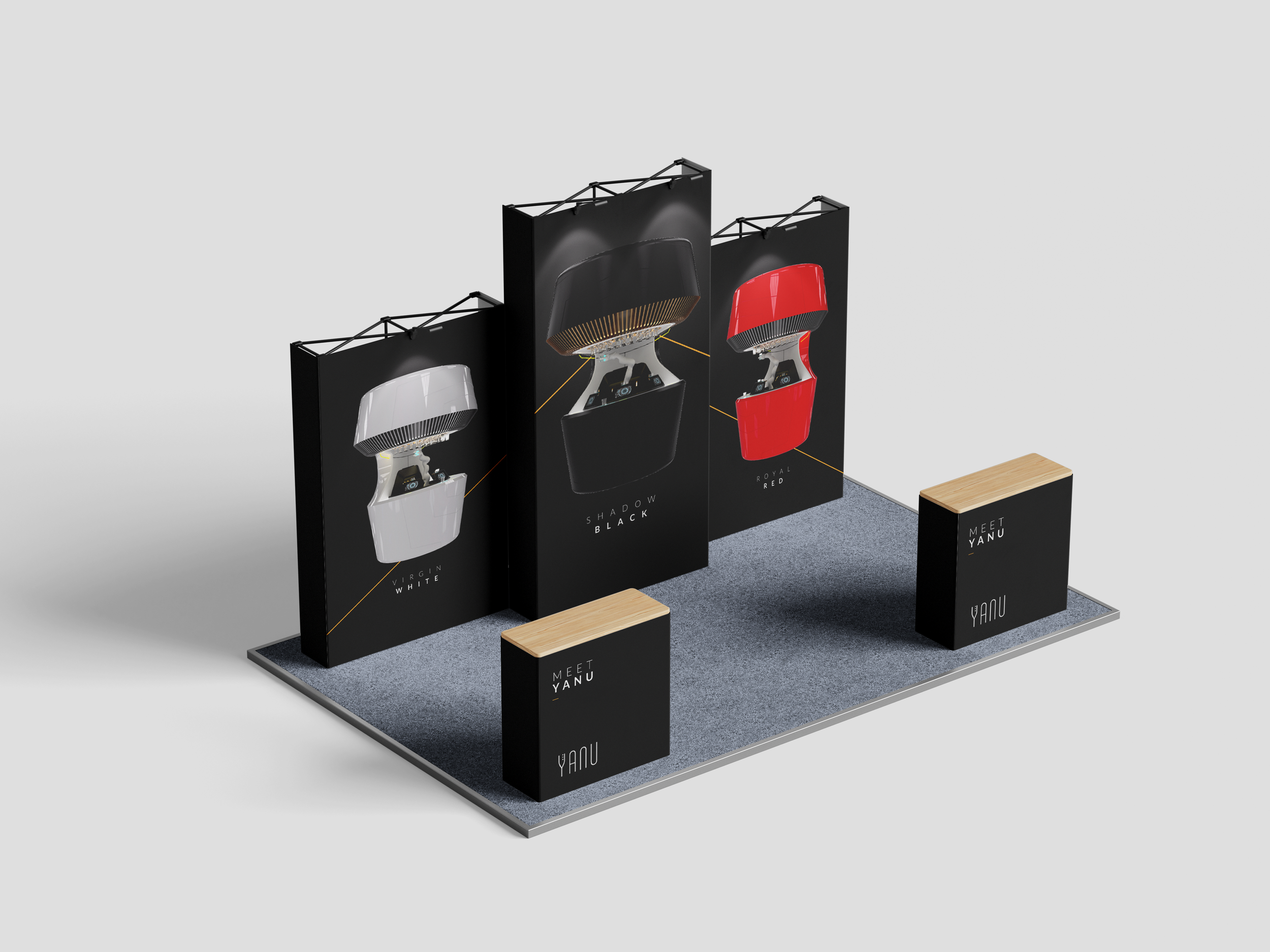
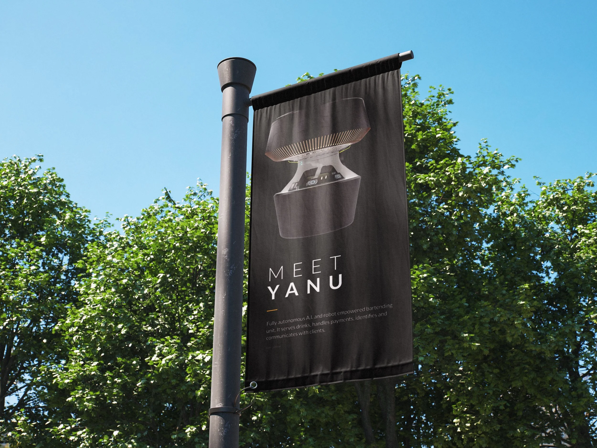
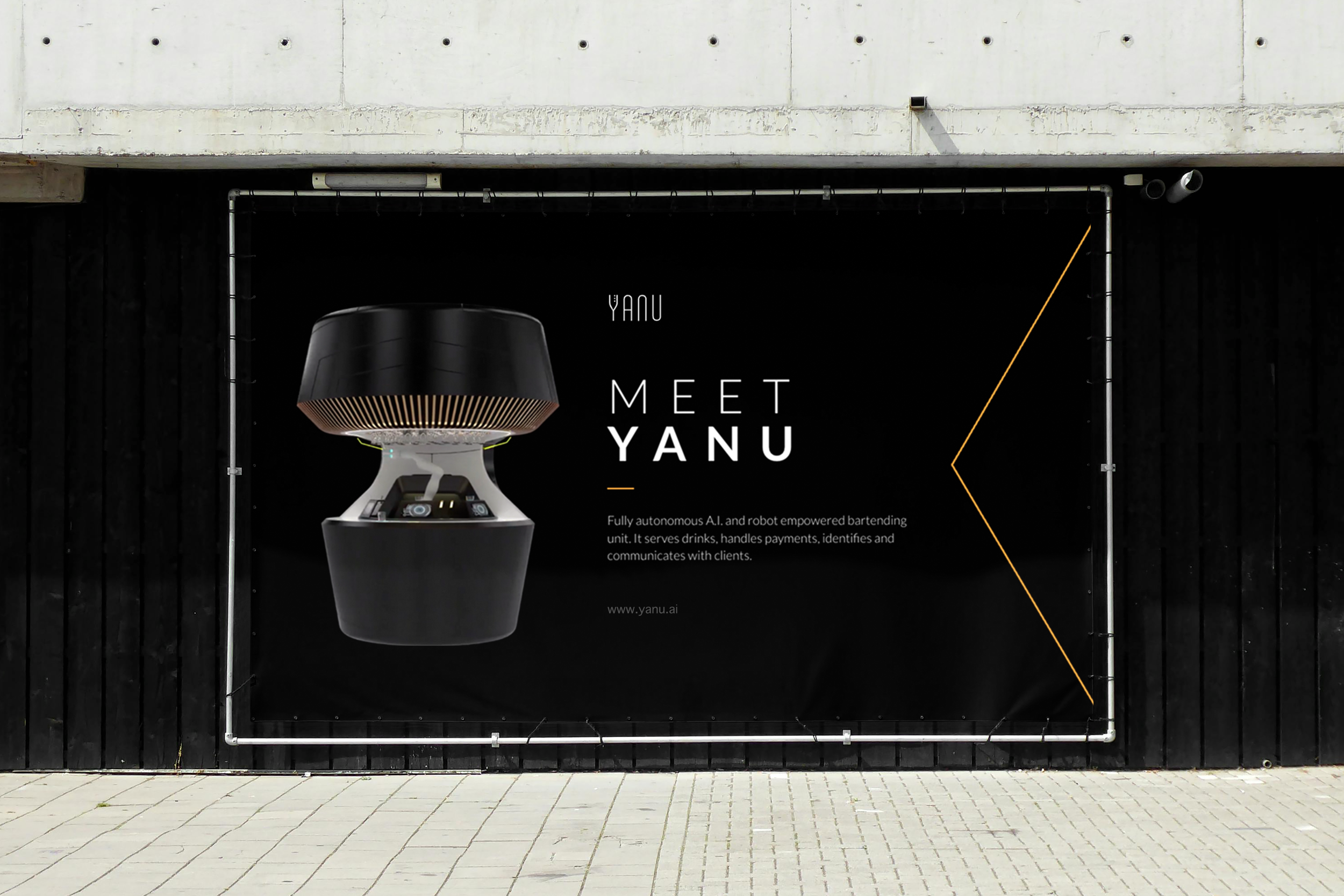
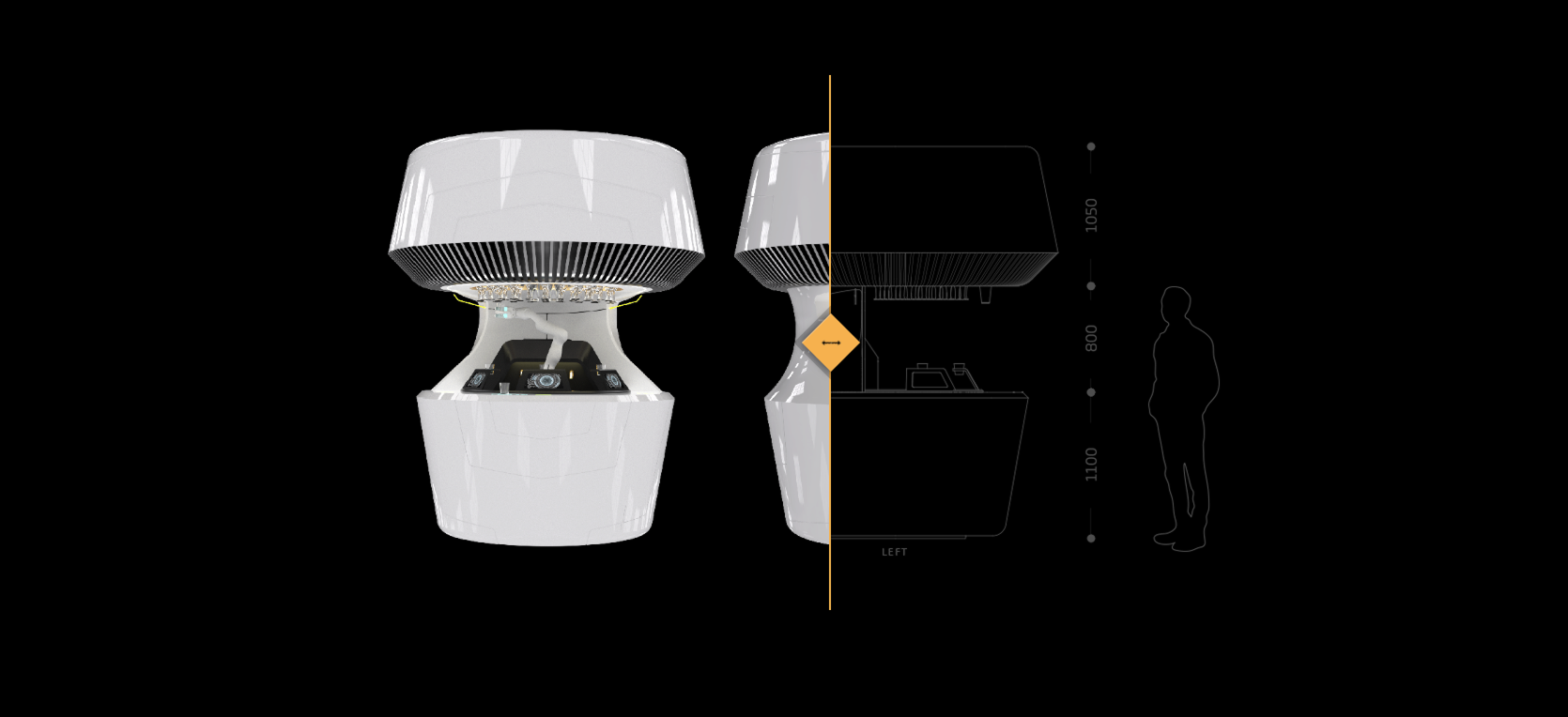
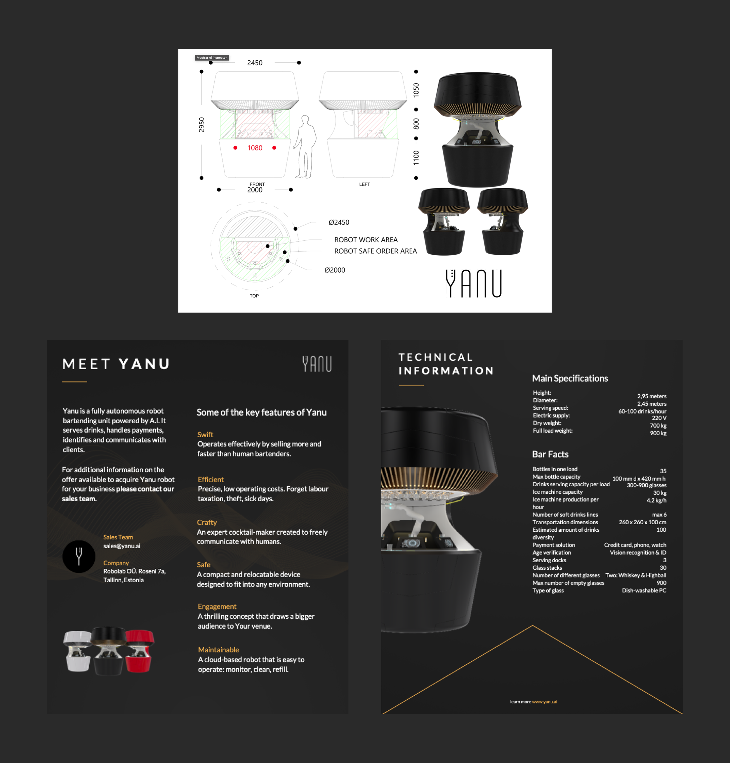
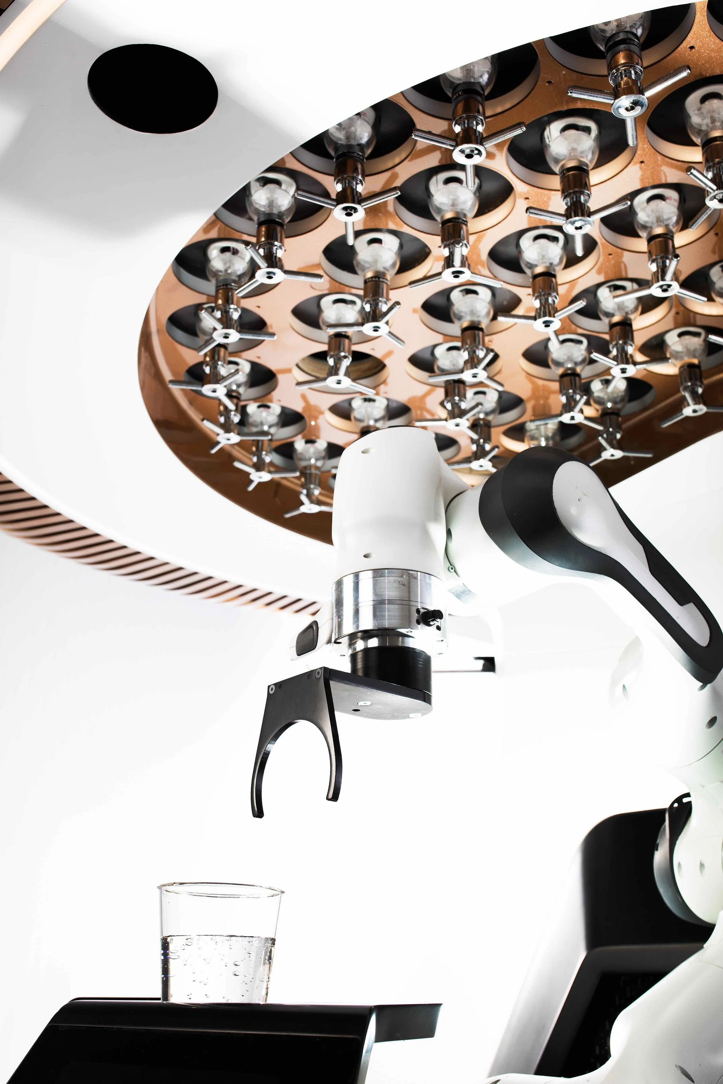
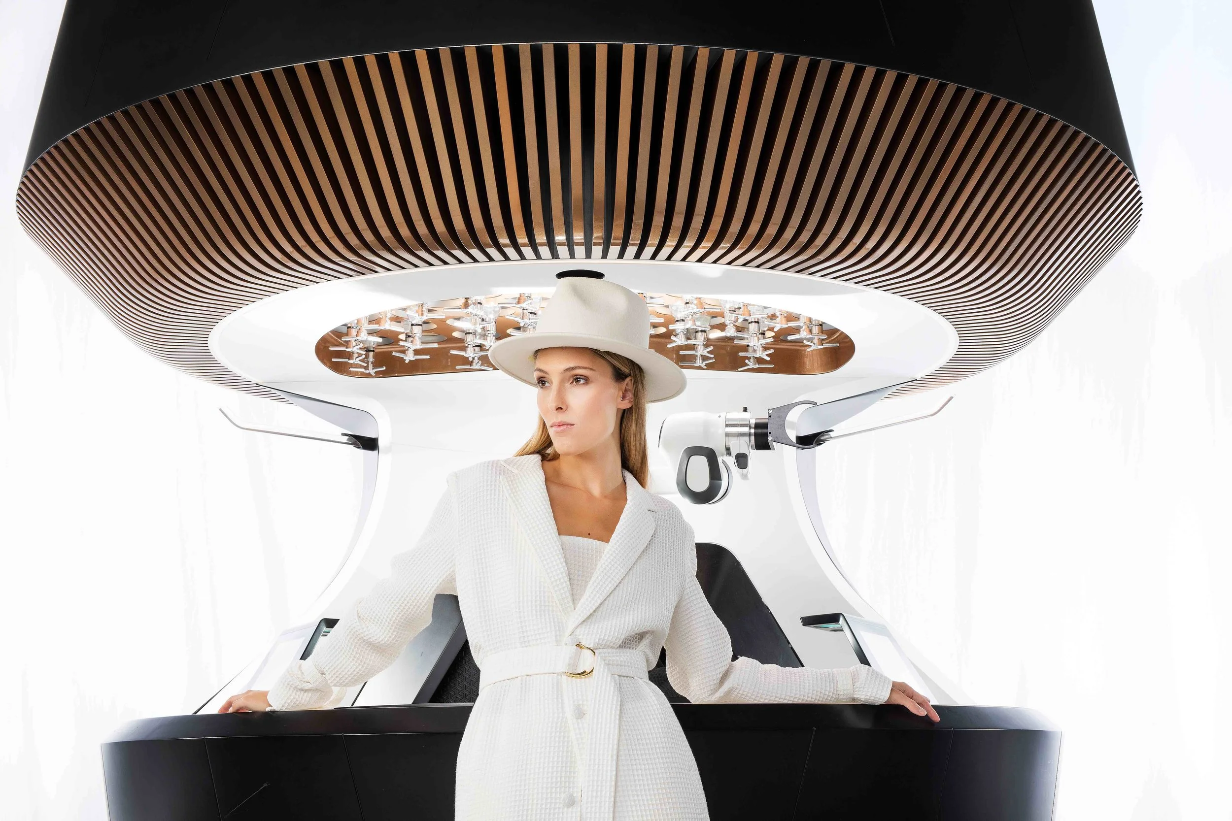
Imagery & Product Focus — The robot is positioned as the hero element throughout the experience, supported by visuals that emphasize interaction, context, and real-world usage
The identity strikes a balance between innovation and clarity, ensuring the product feels advanced but still understandable and trustworthy.
Website
The website was designed as both a product showcase and a conversion tool, supporting multiple user journeys within a single cohesive experience.
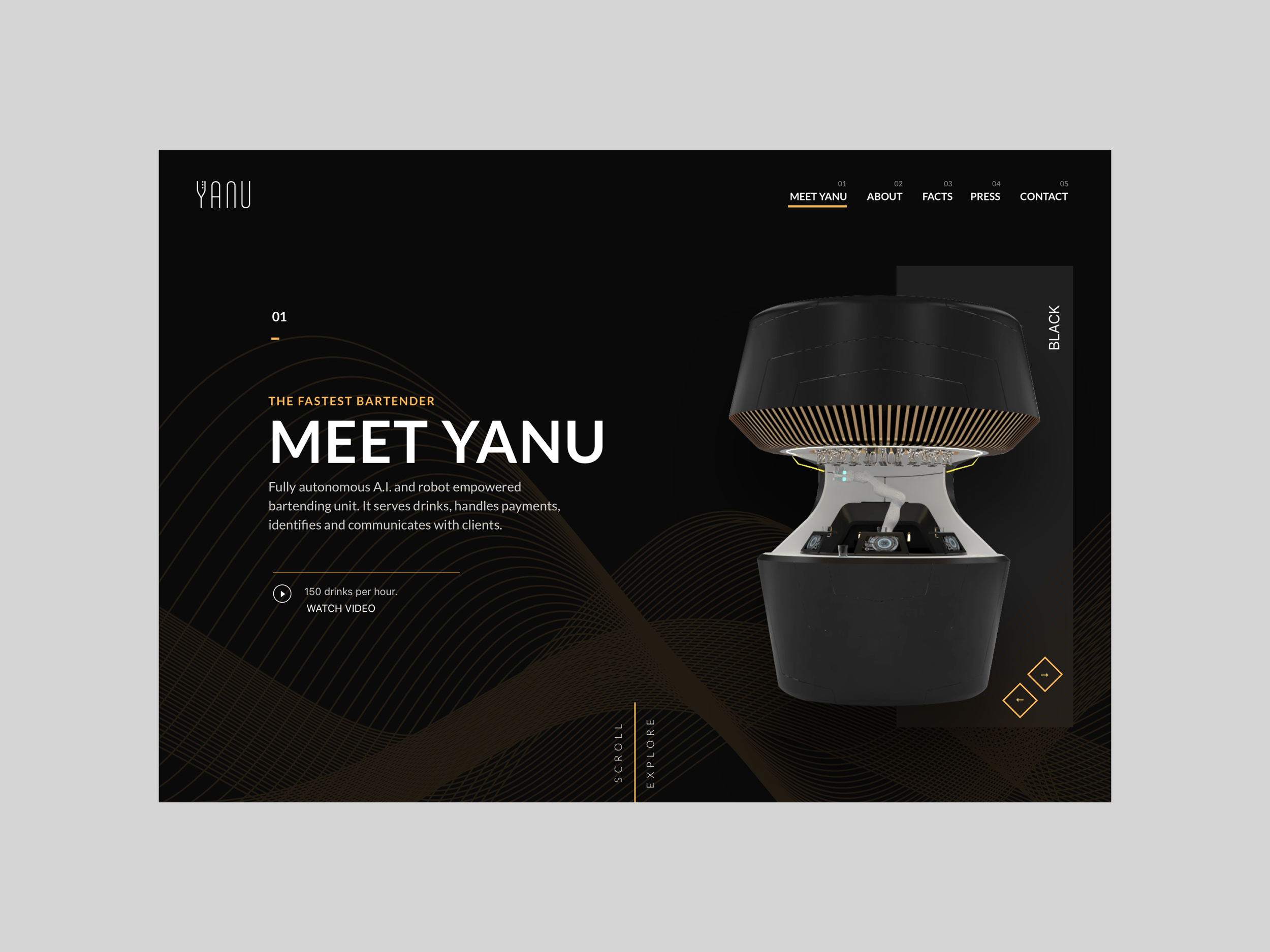
Landing Page Experience
The landing page introduces Yanu through a strong visual and narrative approach:
- Clear value proposition presented immediately
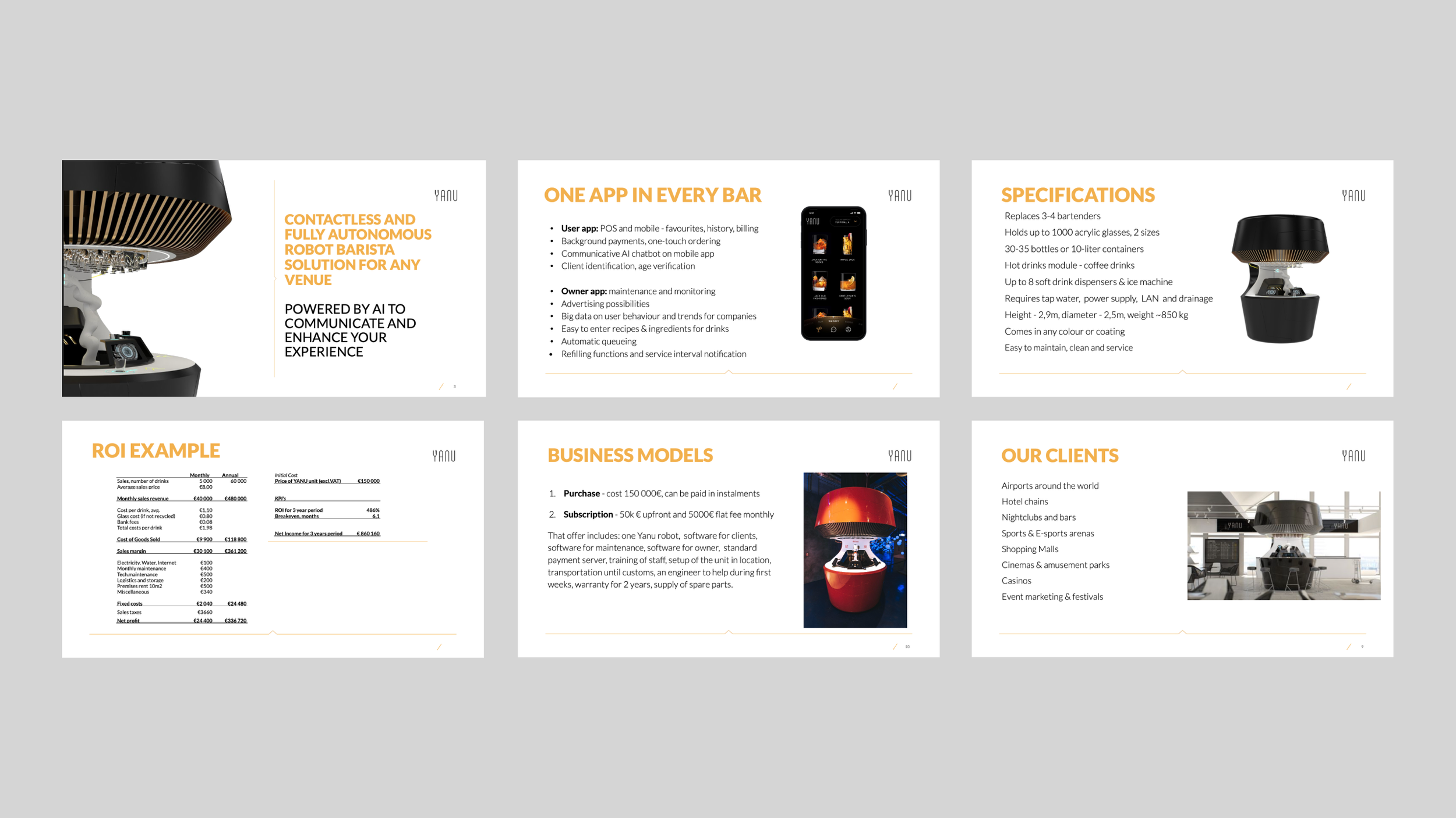
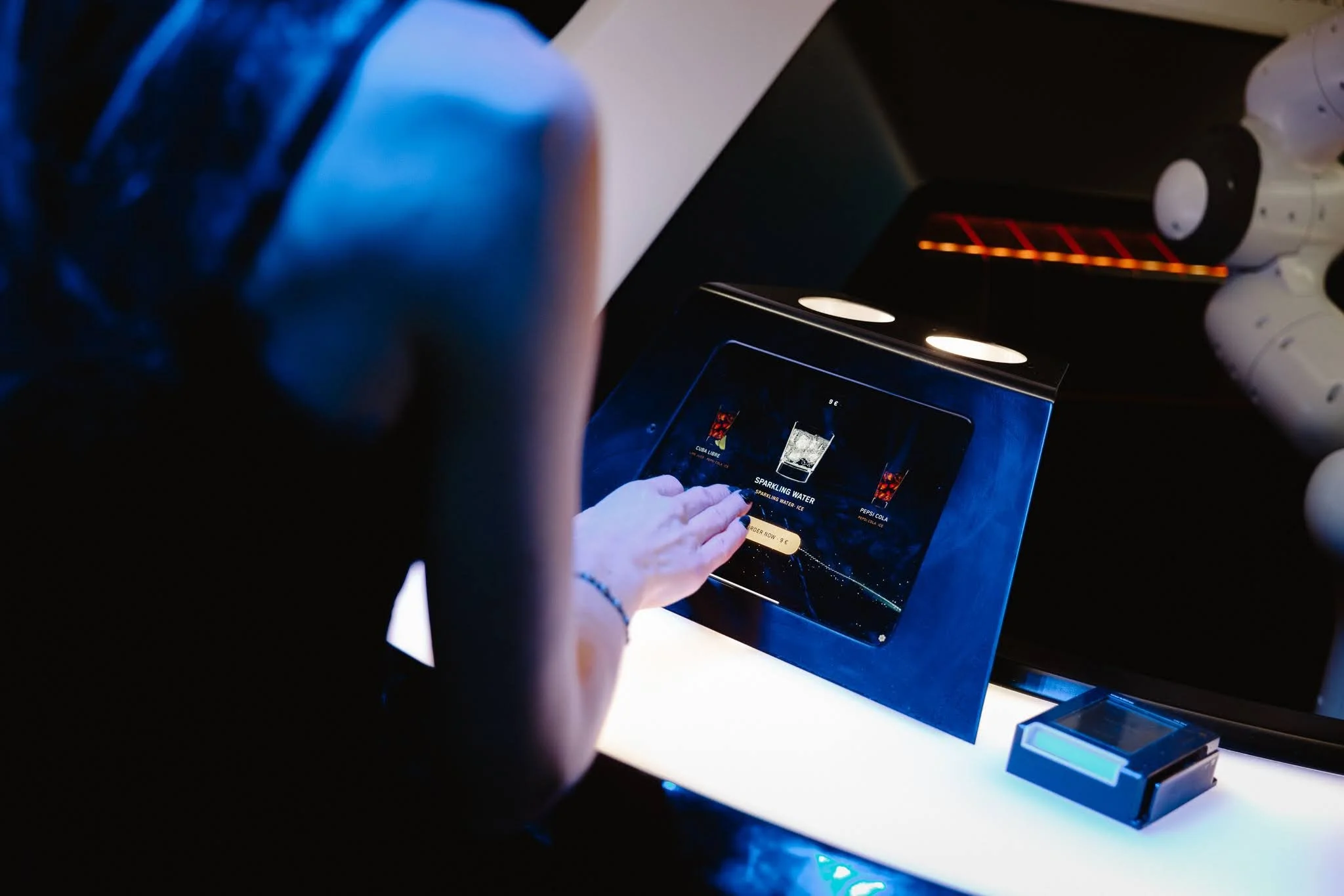
- Product-focused hero section highlighting the robot in action
- Step-by-step explanation of how the system works
- Sections dedicated to benefits, use cases, and real-world applications
- Strategic call-to-actions guiding users toward deeper engagement
The goal is to move users from initial curiosity to a clear understanding of the product’s value.
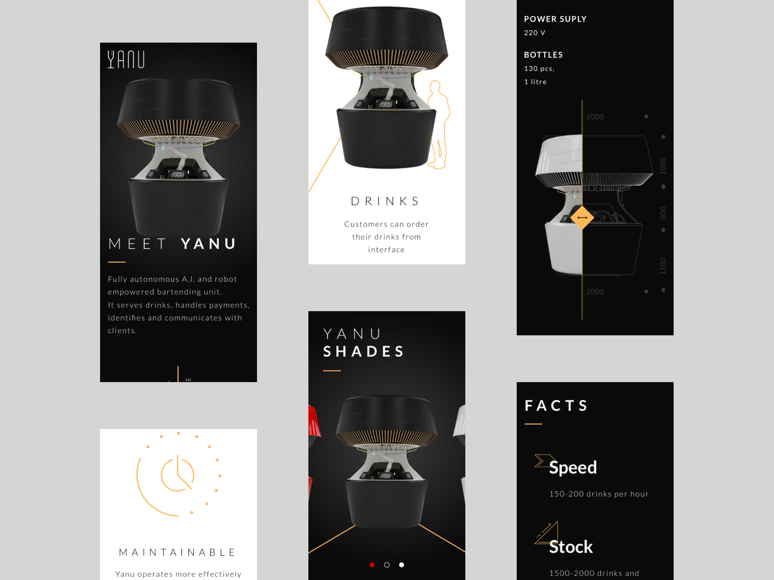
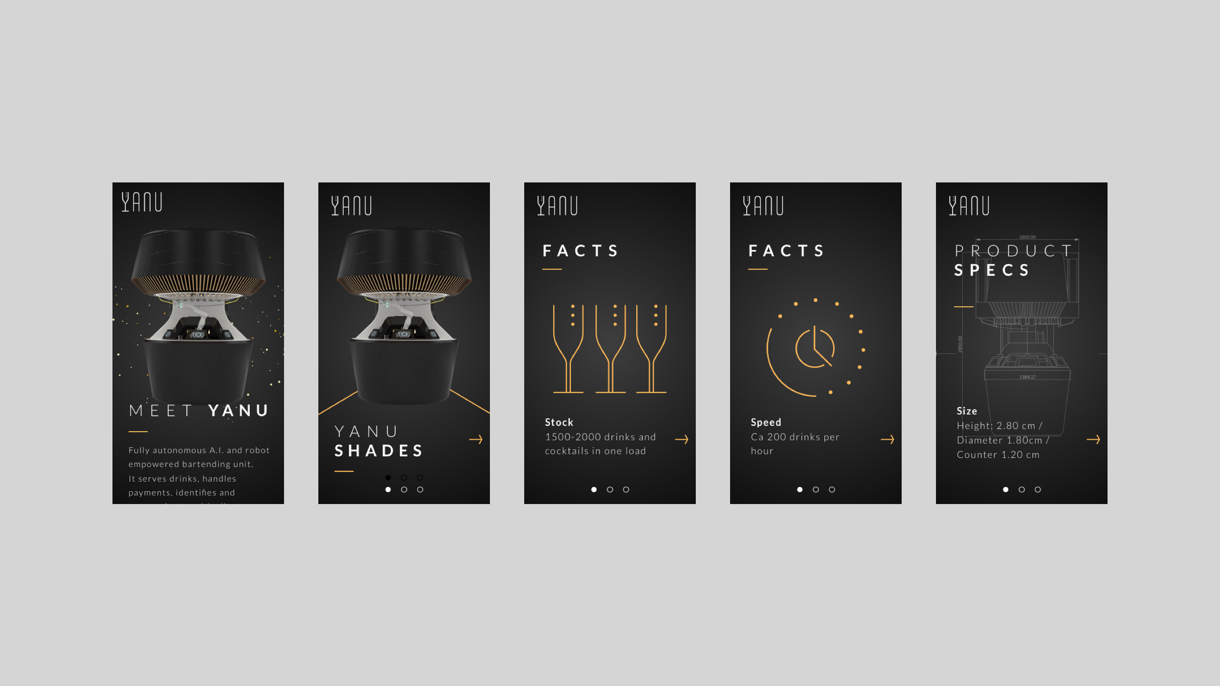
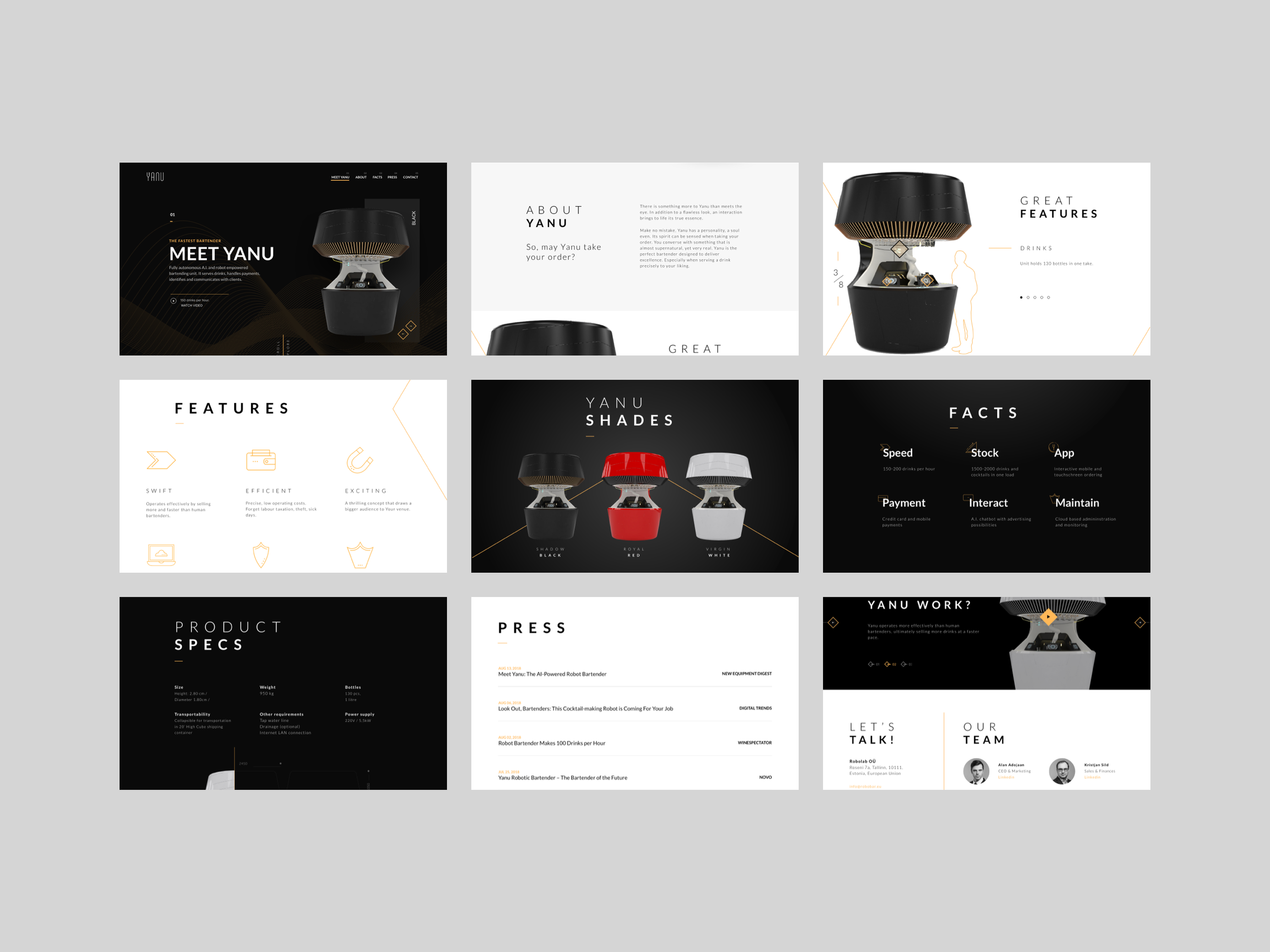
Product & Feature Breakdown
To support comprehension, the product is broken down into digestible sections:
- How the robot prepares and serves drinks
- Payment and interaction flow
- Automation capabilities and efficiency benefits
- Use cases across different environments (bars, events, venues)
Each section combines visuals and concise content to make complex functionality easier to grasp.
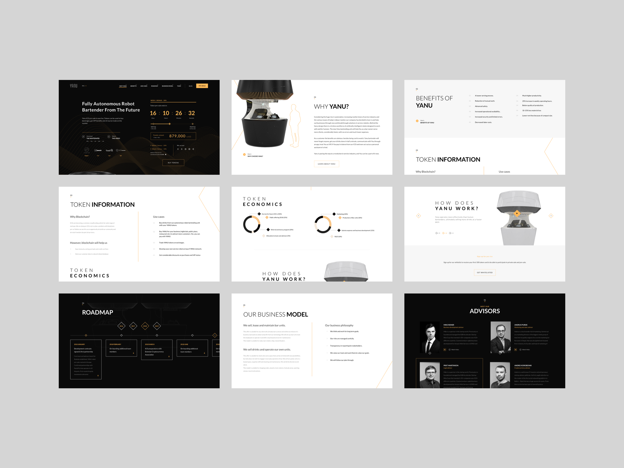
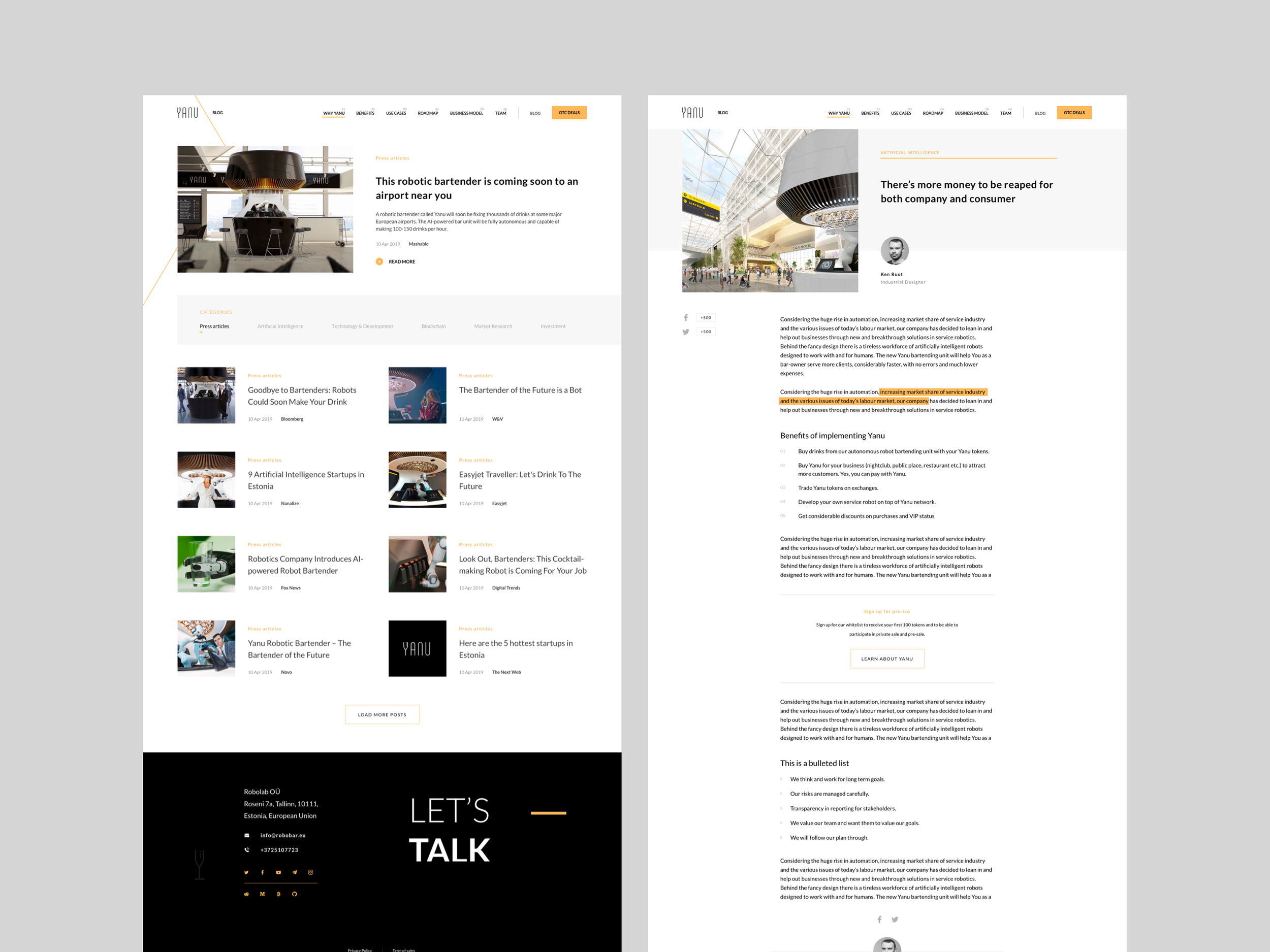
ICO Fundraising Page
A dedicated experience was designed to support investor engagement:
- Clear explanation of the investment opportunity
- Structured presentation of token details and offering
- Emphasis on transparency and credibility
- Strong visual hierarchy to guide decision-making
The design avoids overwhelming users with dense financial information, instead presenting it in a structured and accessible format.
Navigation & Flow
- Smooth scrolling and clear section transitions
- Logical content progression from product to investment
- Consistent layout patterns to reduce cognitive load
Responsive Experience
The interface was optimized for different devices, ensuring that key messaging, visuals, and interactions remain effective across desktop and mobile.
Impact
The redesigned experience positions Yanu as a credible and forward-thinking product, helping bridge the gap between complex technology and user understanding.
Stronger Product Clarity
The structured narrative and simplified content make it significantly easier for users to understand what Yanu is and how it works within seconds
Increased Engagement
A more dynamic and visually compelling interface encourages users to explore deeper into the product and its capabilities
Improved Investor Confidence
The ICO page presents information in a more transparent and professional way, helping build trust and legitimacy
Enhanced Brand Perception
The refined visual identity reinforces Yanu’s positioning as an innovative and cutting-edge solution in the hospitality space
Better Conversion Potential
Clear call-to-actions and improved information hierarchy support user progression from interest to action, whether exploring the product or engaging with the investment opportunity
Overall, the redesign transforms Yanu from a complex concept into a clear, engaging, and investable product experience.

Outcome & Reflection
This project highlights the importance of design as a tool for simplification, especially when dealing with emerging technologies.
Working within a team at Havas, alongside a Lead Designer and developers, reinforced the value of collaboration in shaping both the user experience and the final product. Close alignment between design and development ensured that ideas were not only visually compelling but also feasible and scalable.
One of the key learnings was how critical structure and storytelling are when presenting unfamiliar products. A strong visual design alone is not enough, users need guidance, clarity, and a logical flow to fully understand and trust the product.
The project also emphasized the importance of designing for multiple audiences within a single experience, ensuring that different user needs (product users and investors) can coexist without compromising usability.
If expanded further, the next steps would include:
- User testing to validate comprehension and engagement
- Refinement of the ICO flow based on real user behavior
- Exploration of interactive product demos to further enhance understanding
“Overall, Yanu represents an exploration of how thoughtful design (supported by strong collaboration) can make complex, future-oriented products feel intuitive, credible, and ready for adoption.”