RehearseHQ
✧
RehearseHQ ✧
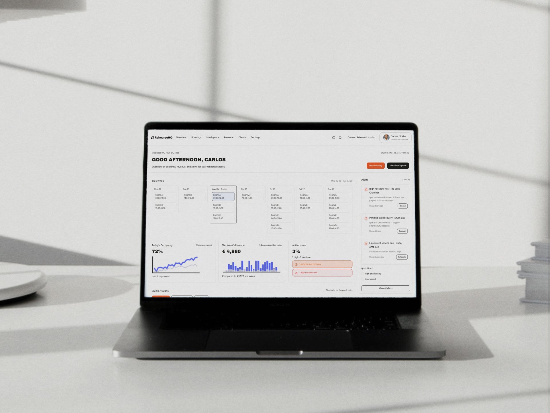
Designing an AI-powered operations tool for the independent music rehearsal and recording studios.
Independent music studios are operationally complex small businesses running on surprisingly primitive tools. In a market where every other booking experience has moved online, the music studio sector has been largely overlooked by the software industry. This project started with that gap: a clear operational problem, a real user who has never had a tool designed specifically for them, and a question about what it would take to close it. The case study that follows is an end-to-end exploration of what a real MVP product could look like using AI tools at every stage of the process to test whether a single designer could take that problem all the way from first insight to implementation-ready concept.
This is not just a project about AI tools. It is a project about a real operational problem experienced by real people, independent studio owners who are running complex small businesses with primitive infrastructure, and musicians who have simply accepted that booking a rehearsal room will always be harder than it should be. AI tools were the method, not the subject. The reason for using them was practical and deliberate: to explore whether the full depth of a UX process (research, synthesis, strategic framing, information architecture, visual design, component documentation and implementation specification) could be conducted by a single designer working with AI as a genuine thinking partner rather than a production shortcut.
Every phase of this project, from the first interview to the final retrospective, was supported by AI in some form (not to replace design thinking, but to expand what a single designer could credibly explore, document, and deliver). The outputs of every tool were evaluated critically, refined, combined and in many cases discarded, because the discipline this project required was not technical fluency with AI tools but curatorial judgment about when their outputs were good enough and when they were not. Every deliverable in this case study reflects that judgment.
The product concept that resulted is one I believe could genuinely exist and that is the standard against which the whole exercise should be measured.
Role: Product Designer
Target client: independent music recording & rehearsal studios
Timeline: Self-initiated project
AI tools used:
Claude: Research strategy, personas, empathy maps, journey maps, HMW statements, competitive audit, design principles, information architecture, AI model specification, handoff documentation, accessibility checklist, token documentation, usability testing plan, A/B test hypotheses, iteration roadmap, all written case study copy
Perplexity: Market research, competitive landscape, industry context and fact-checking
Lovable: Visual direction exploration, UI concept rendering, design system colour and component direction
Uizard: Low-fidelity wireframe generation from natural language prompts across all MVP screens
Dovetail: Interview transcription, tagging, and insight synthesis
Deliverables: Full UX case study covering discovery, definition, design, and implementation phases, including an interactive Figma prototype and a complete implementation-ready handoff package.
Concept & Challenge framing
Problem statement
Living abroad, that experience had become frictionless. Most studios I used had online booking systems where you'd check availability in real time, pick your room, pay, get a confirmation, done. It may wasn't glamorous, but it worked flawlessly.
Then I came back to Spain. The contrast was jarring.
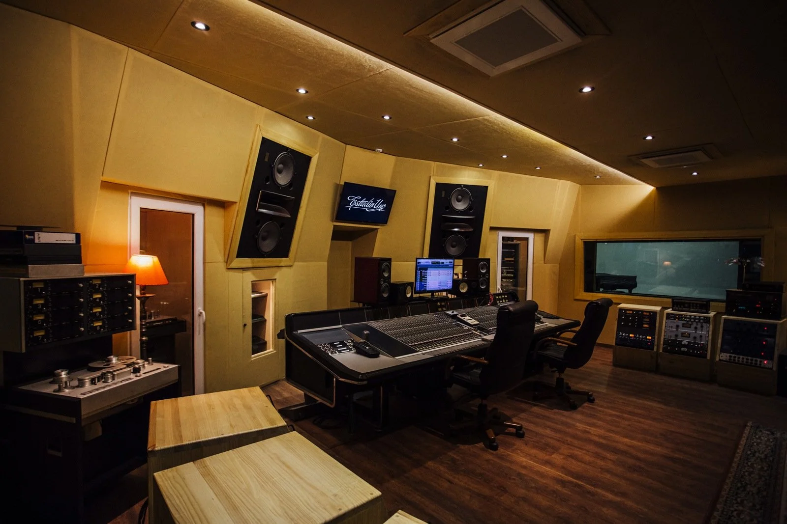
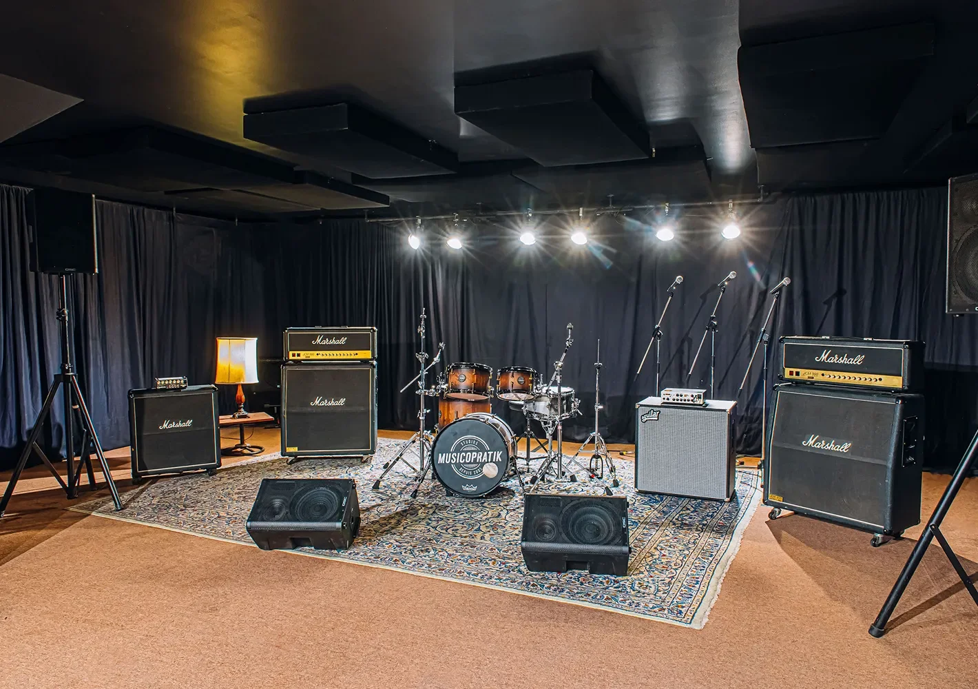
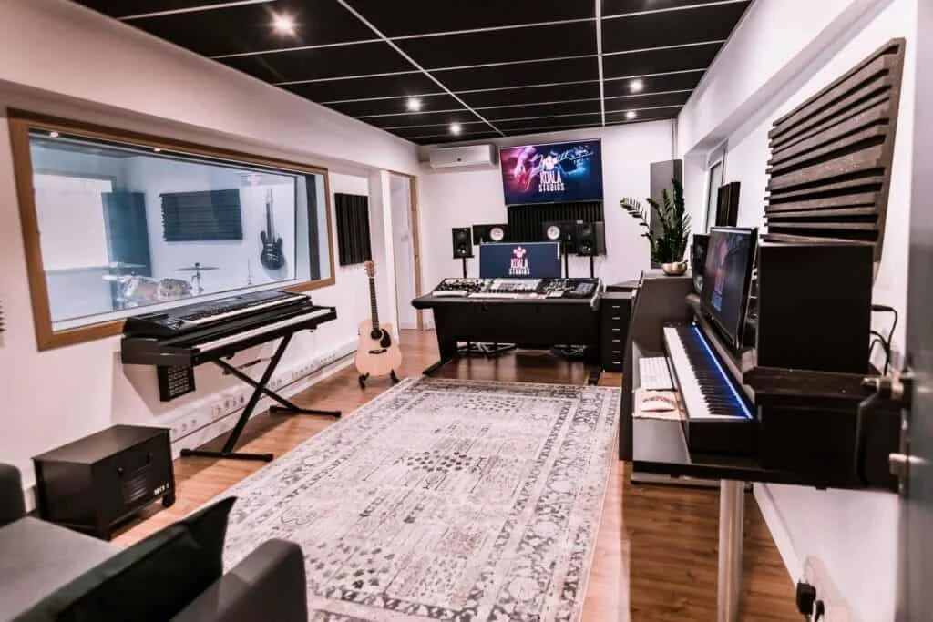
Here, the vast majority of rehearsal and recording studios still operate the way they did fifteen years ago (a WhatsApp message to ask if Saturday afternoon is free or a phone call to confirm, a note in someone's diary…). No real-time availability, no online booking, no paper trail beyond a chat thread. If you want to modify or cancel, you start the conversation over again.
The more I looked into it, the more I realised this wasn't just an inconvenience for the musician, it was a symptom of something deeper on the business side. Studio owners and managers are running operationally complex small businesses with surprisingly primitive tools. They're fielding the same repetitive enquiries all day, manually juggling bookings across phone calls and chat apps with no reliable way to anticipate no-shows or understand which rooms and time slots are actually driving their revenue. The patchwork works, until it doesn't.
AI has changed what's possible here. Booking data, session history, cancellation patterns, demand by day and room type or client behaviour is exactly the kind of structured, repetitive dataset that predictive models handle well. The opportunity here isn't to replace the studio manager; it's instead to give them the kind of operational intelligence that, until now, only large-scale venue businesses could afford.
This project explores what a smart, AI-powered studio operations dashboard could look like. Designed for the independent studio owner who is, more often than not, a fellow musician first and a business operator second.
Opportunity Framing
The music rehearsal and recording studio sector is largely made up of independent, owner-operated businesses. Unlike hotels, coworking spaces, or sports facilities (all of which have seen significant investment in booking and operations software) studios have been largely overlooked by the SaaS industry. The few tools that exist are either generic booking platforms not tailored to studio workflows or overly complex venue management systems built for a different scale and budget.
This leaves a clear gap: a purpose-built operations tool designed around the specific rhythms of a music studio.
The operational data that studio owners already generate (booking history, cancellation rates, room occupancy by time slot, repeat client behaviour) is exactly the kind of structured, recurring dataset that AI prediction models are most effective with. Until recently, the cost and complexity of building on top of ML infrastructure made this inaccessible to small businesses. That barrier no longer exists.
This creates a specific opportunity: not to automate the studio manager out of the picture, but to surface the patterns hidden in their own data and turn reactive decision-making into proactive operations. For example, knowing a Friday evening slot has a 40% no-show rate is actionable, knowing that Room B consistently underperforms on weekday mornings is actionable. Today, most studio owners don't know either.
The studio owner persona presents a distinct design challenge: they are domain experts in music and sound, not in data or business operations. A dashboard that surfaces AI-driven insights needs to earn trust quickly and never make the owner feel like the tool is smarter than they are. This project explores that intersection.
Market landscape snapshot
The studio booking software market is more active than it might appear but almost entirely concentrated in the Anglo-Saxon market. GDPR support, cross-border payment handling, and country-specific operational details are factors that can meaningfully affect how well scheduling software works in markets like Spain, and most of these platforms offer minimal localisation.
The tools that currently exist fall into three distinct categories, each with its own limitations when viewed through the lens of this project:
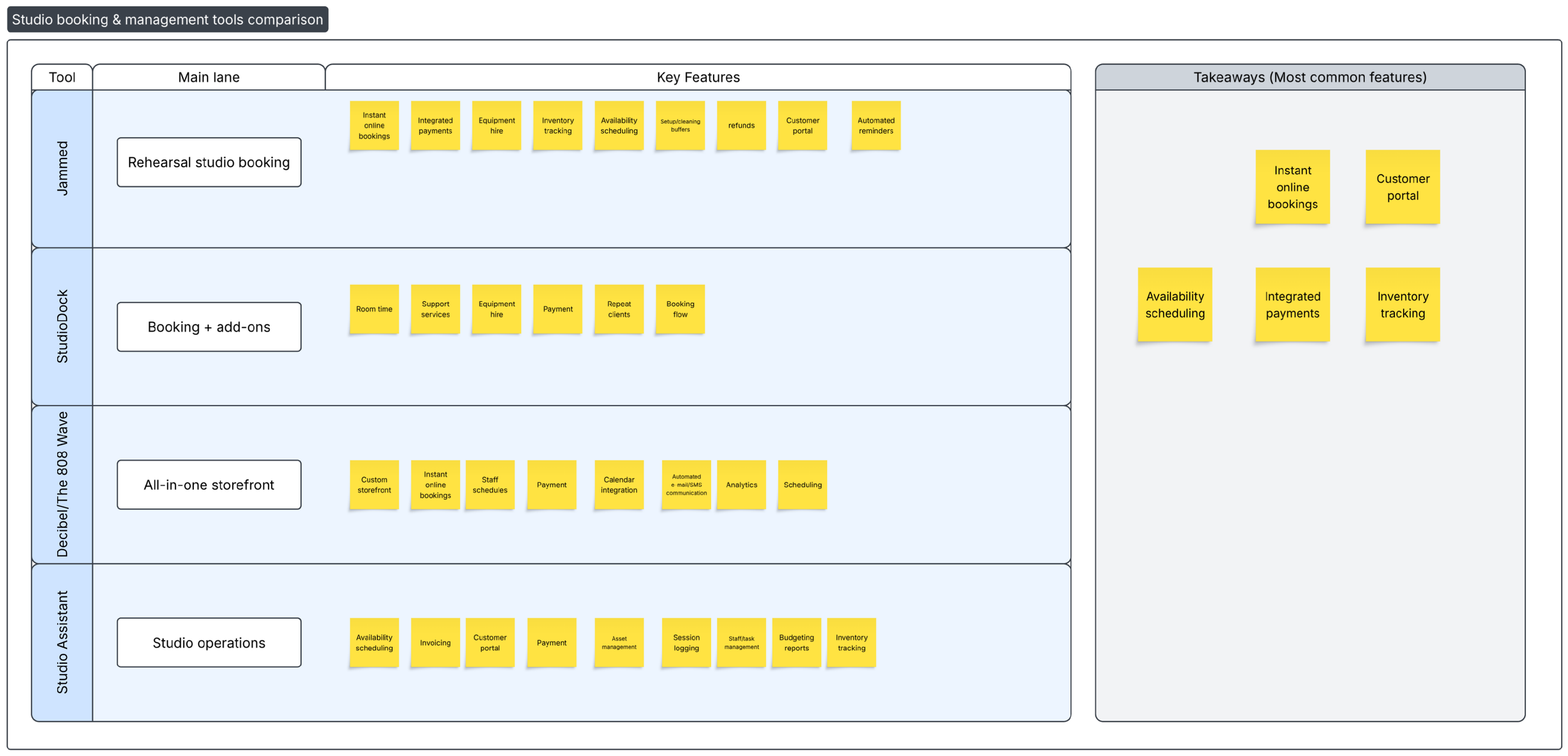
Platforms like Skedda, CozyCal, Acuity Scheduling and Koalendar were built as horizontal scheduling solutions and have been stretched to cover studio use cases. Skedda's standout feature is its customisable booking rules, minimum and maximum time blocks, buffer times, and access permissions based on user roles. But it was designed for shared spaces broadly, not music studios specifically. CozyCal positions itself as a straightforward solution focused on getting clients to self-book, with calendar sync, Stripe payments and intake forms, but offers nothing tailored to the context of a rehearsal or recording environment. These tools solve the booking problem adequately but they don't touch operations or intelligence
A handful of tools have been designed specifically for music studios. Jammed is built for independent rehearsal studios and creative spaces, it handles real-time room availability, automatic reminders, cancellation and refund policies and even equipment hire inventory. AllBooked similarly allows studios to configure individual rooms, define availability and minimum session lengths and manage reservations in real time with over 4,000 customers on the platform. StudioHero goes further, targeting professional recording facilities with engineer scheduling, project tracking, and financial oversight in one workspace. These are credible products but they are operationally focused, not intelligence-driven.
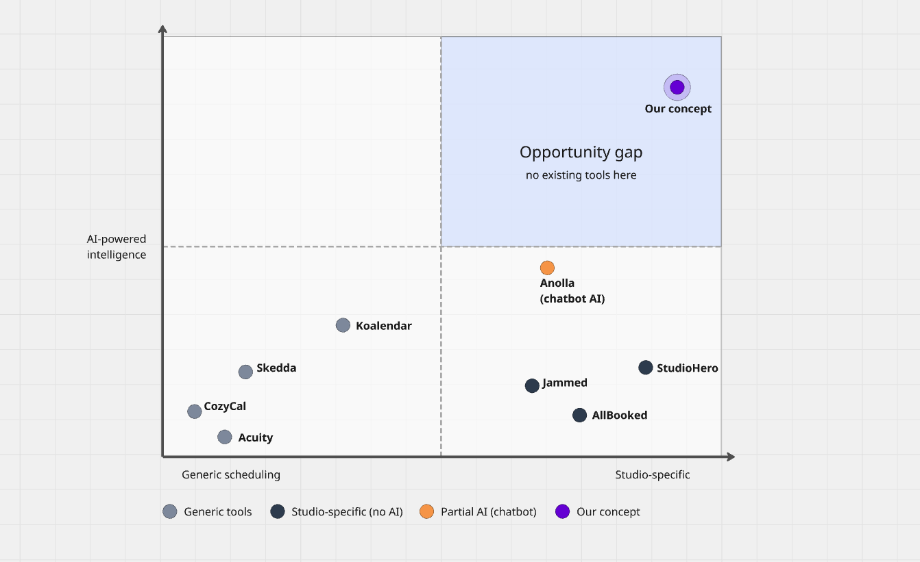
Anolla markets itself as an AI-powered platform, claiming a contextual AI assistant that can resolve up to 79.3% of repetitive booking enquiries in real time. However, the AI layer here is essentially a customer-facing chatbot that handles FAQ automation, not operational prediction. No tool in the current market appears to surface demand forecasting, no-show risk, or revenue optimisation as core features.
Mapping the competitive landscape reveals a clear white space: there is no tool that combines purpose-built studio operations with AI-driven intelligence designed specifically for the independent owner-operator who is not a business analyst. The products that come closest to this vision either lack the AI layer entirely, or (like Anolla) apply AI only at the customer communication layer rather than the operational core.
Research phase & Direction
User interviews
With a clear picture of the competitive landscape (a market largely untouched by meaningful AI integration) the next step was to get out and talk to the people this tool would actually serve to get first-hand information about how people operate regarding music studios.
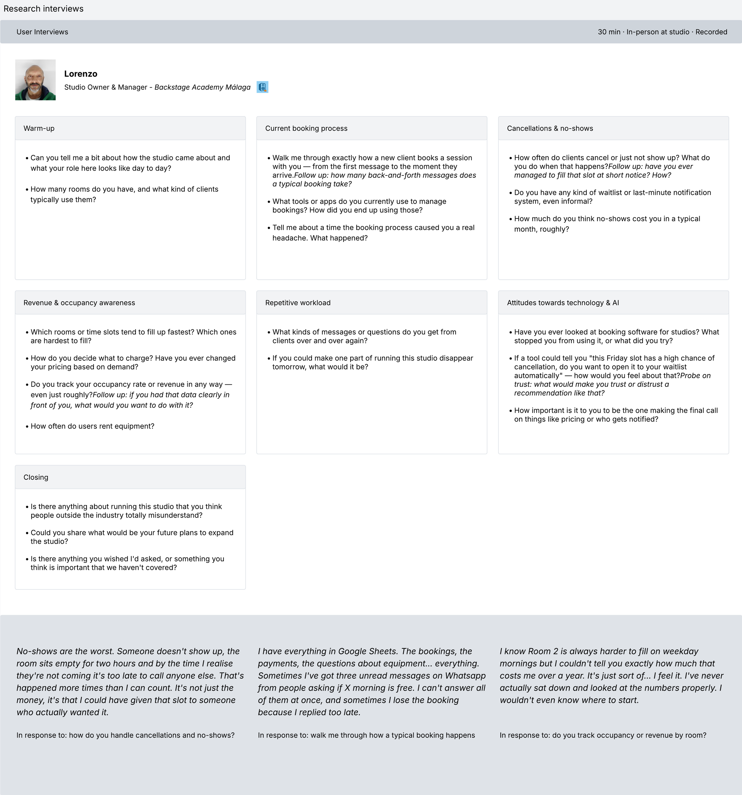
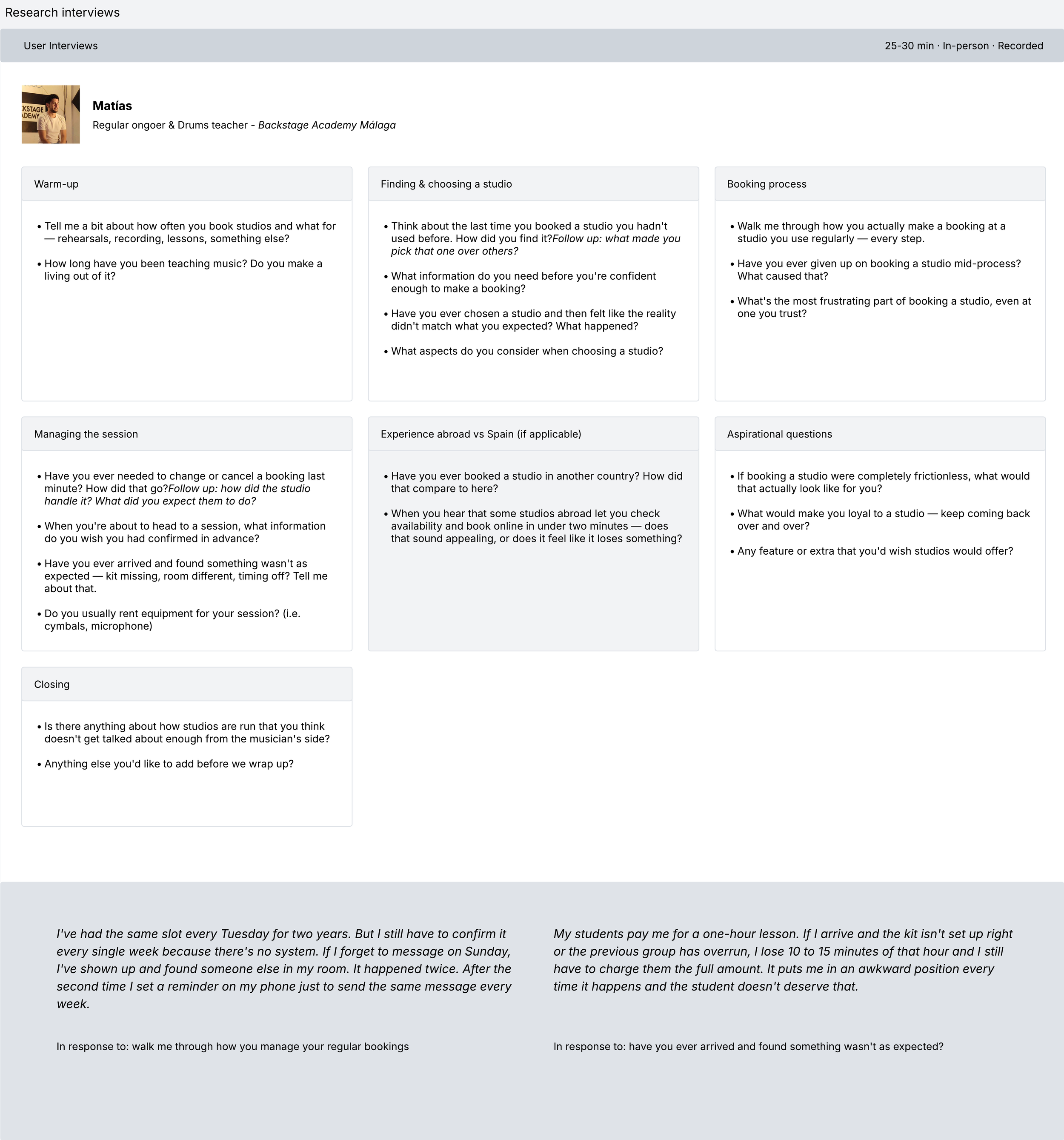
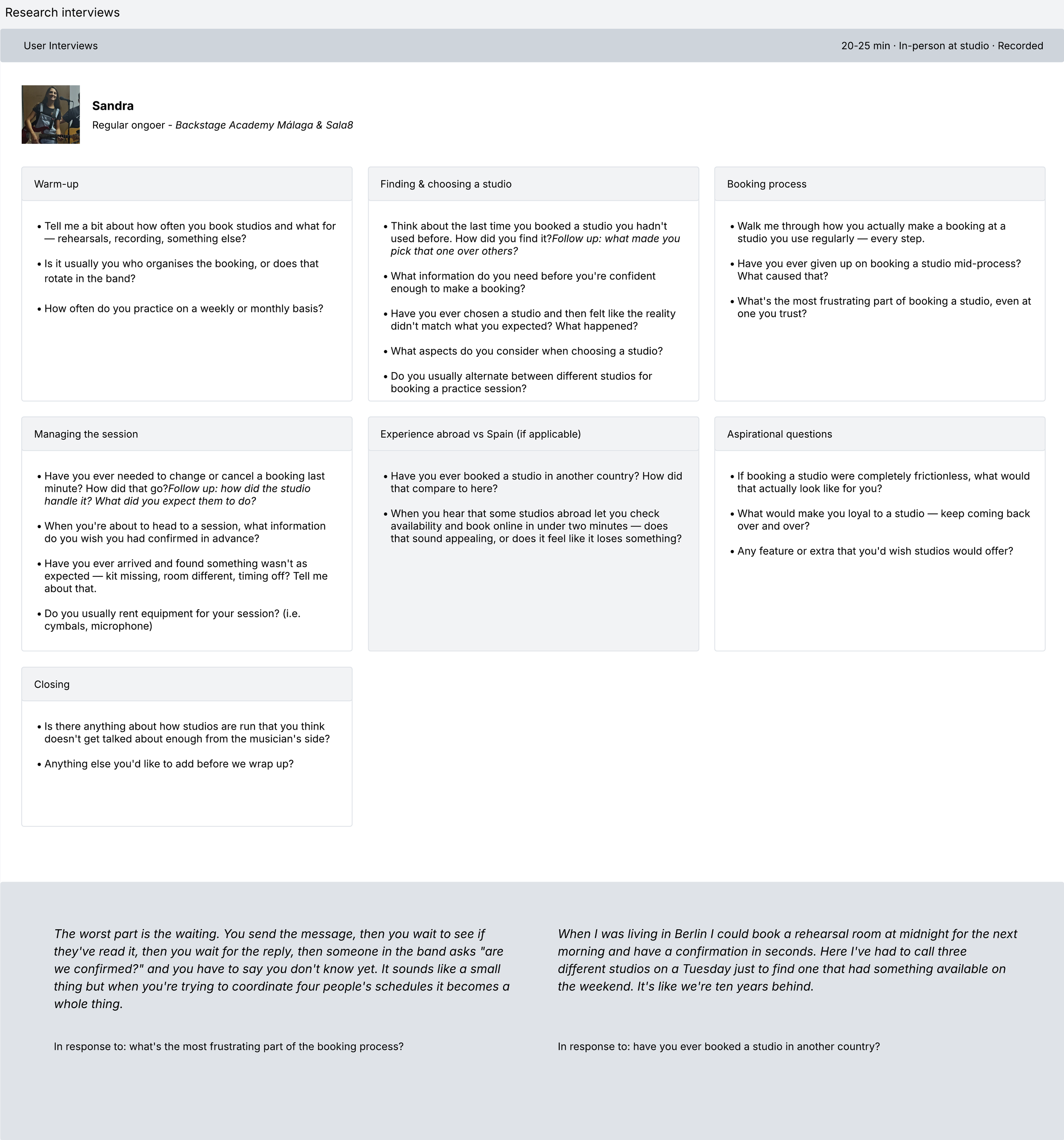
I conducted three interviews across two distinct user profiles: the owner of a local rehearsal studio in Málaga where I regularly go myself to practice, and two of its habitual users (one a musician who books the space for band rehearsals, and one a drums teacher who uses the studio on a recurring weekly basis).
The fact that I already had a relationship with this studio as a client myself shaped the approach from the start. I wasn't walking into an unfamiliar business to ask cold questions, I was talking to people I knew in a space that I understood. That familiarity made the conversations more candid and sincere than a formal research setting typically allows, and it also meant I could read the room in a way that's harder to do as an outside observer.
All three sessions were conducted in person at the studio, which proved as informative as the conversations themselves. Seeing the booking system in its natural habitat (a Google sheet, WhatsApp conversations, a price list taped to the wall…) grounded every answer in a reality that no remote interview could have captured with the same texture. Sessions ran between twenty and thirty minutes. With consent from all participants, interviews were recorded and later transcribed using Dovetail, which allowed me to tag key moments, surface recurring themes, and identify shared pain points across profiles without losing the nuance of individual responses. Working this way meant I could stay fully present during the conversations rather than splitting attention between listening and note-taking.
The interviews were structured loosely around three areas: understanding the current booking workflow end to end, identifying the moments of highest friction and exploring attitudes toward technology and automation, without steering participants toward any particular solution. The goal at this stage was to listen, not to validate.
What emerged challenged some of my initial assumptions and sharpened others considerably.
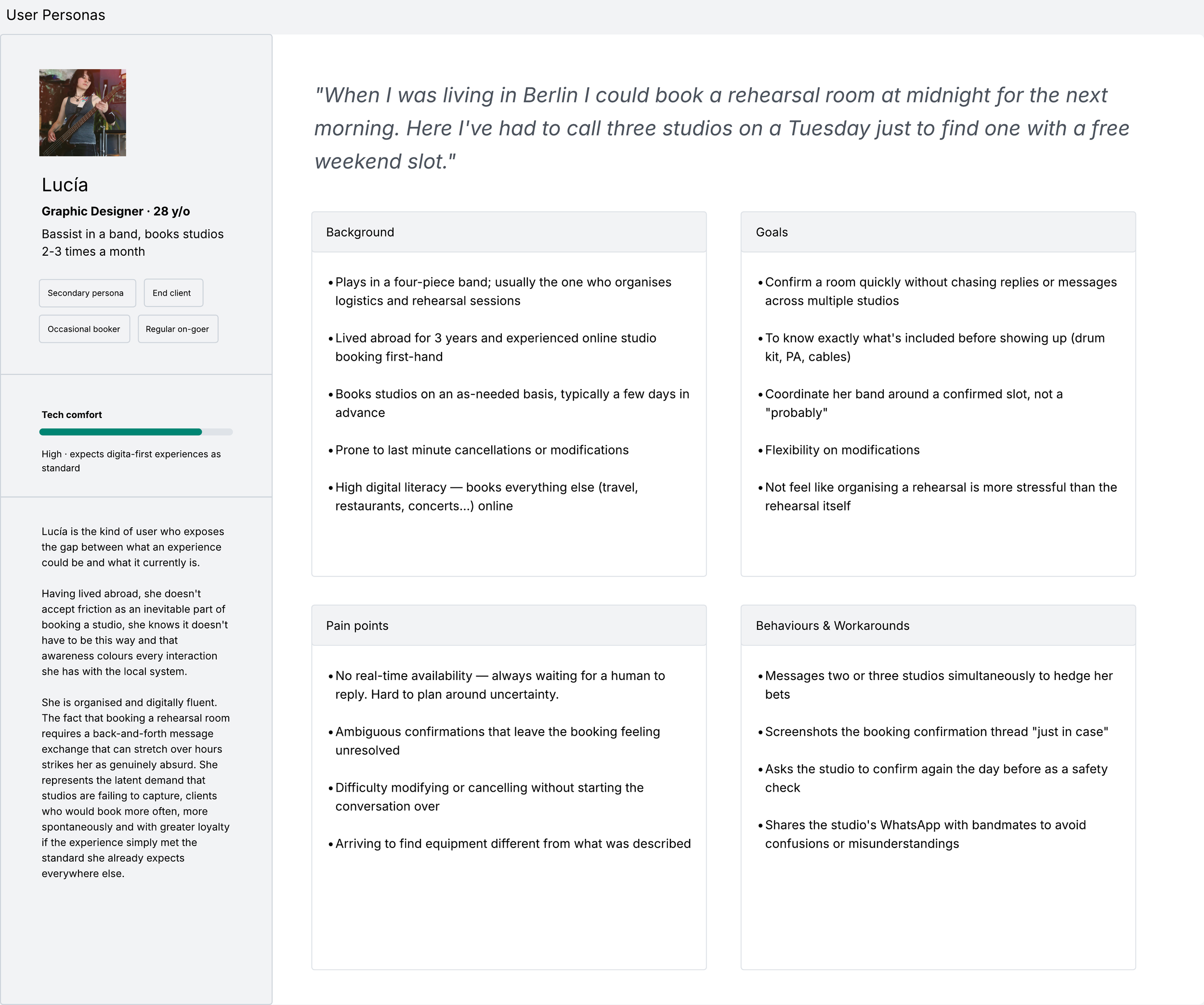
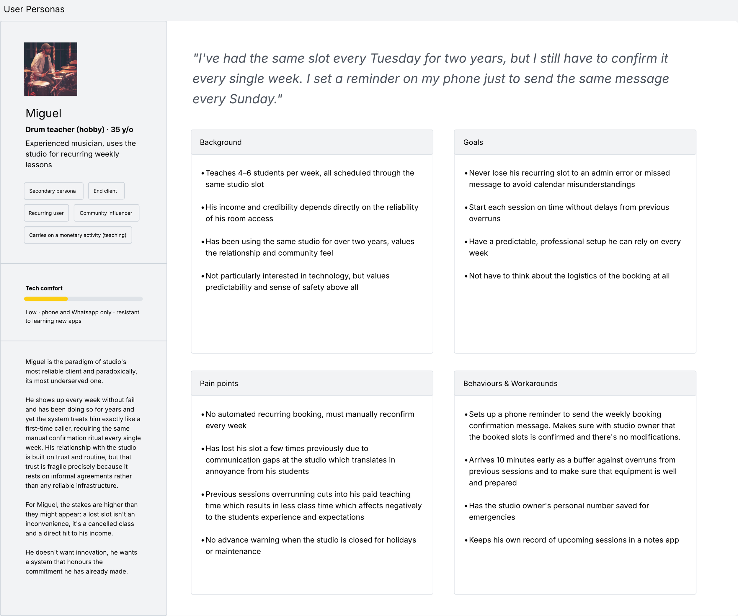
User personas
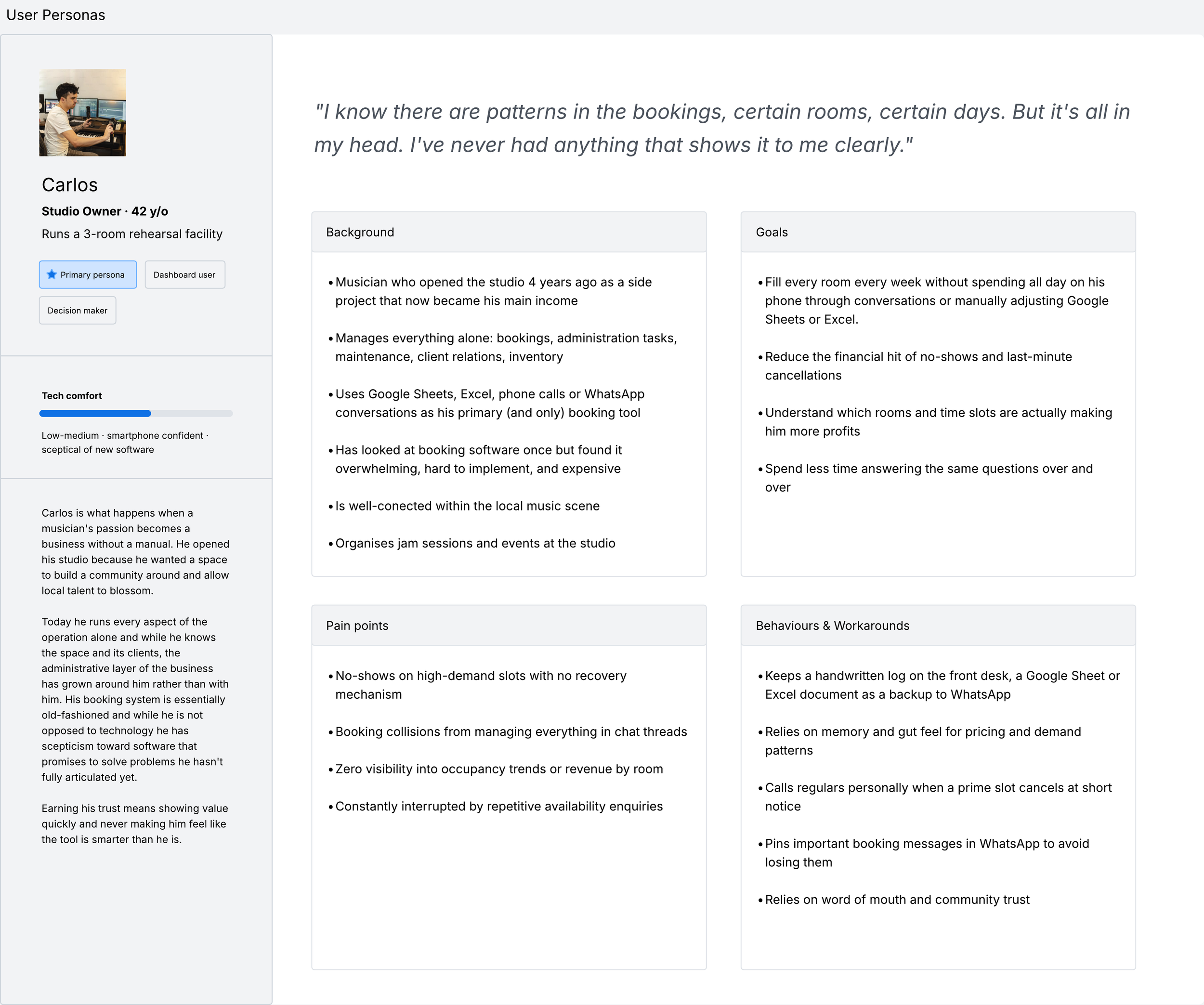
After interviews completed and the findings transcribed in Dovetail, clear patterns began to emerge in how users had quietly adapted their behaviour to work around a system that wasn't reliable. These workarounds were the real signal and pointed to unmet needs that became the foundation for translating raw research into something the design process could actually use.
From the interviews I distilled three personas, one primary and two secondary. Carlos, the studio owner, is the primary user of the tool being designed: every decision needs to serve his mental model, level of technical confidence and the reality of running such business. Lucía and Miguel represent the two distinct and most common type of client profiles. Understanding them is not incidental to the design, it is the reason the AI layer has anything meaningful to say.
Rather than treating these personas as static profiles, the goal was to capture the tension each person lives with: the gap between what they need the experience to be and what it currently is. That tension is what the product exists to resolve.
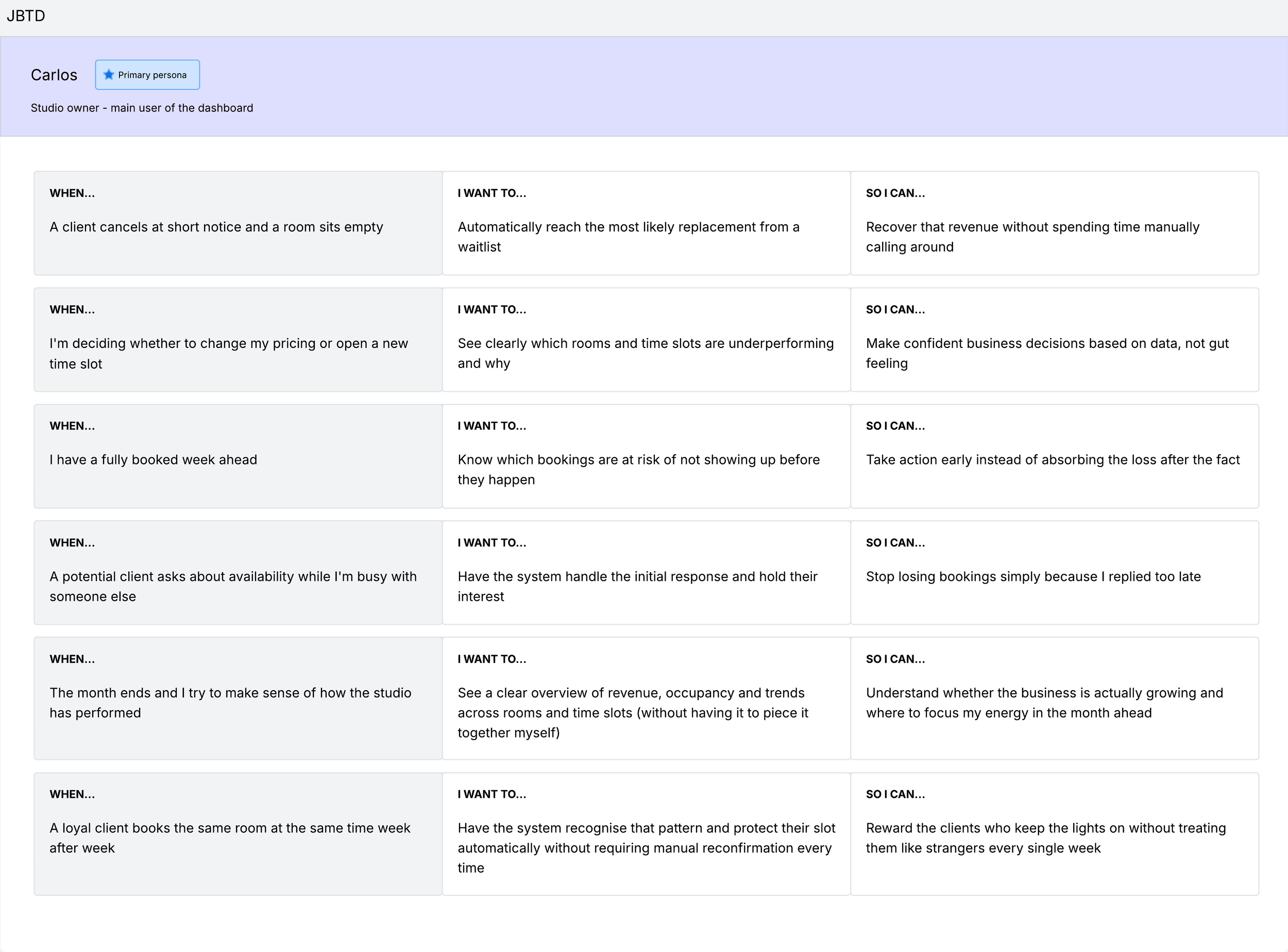
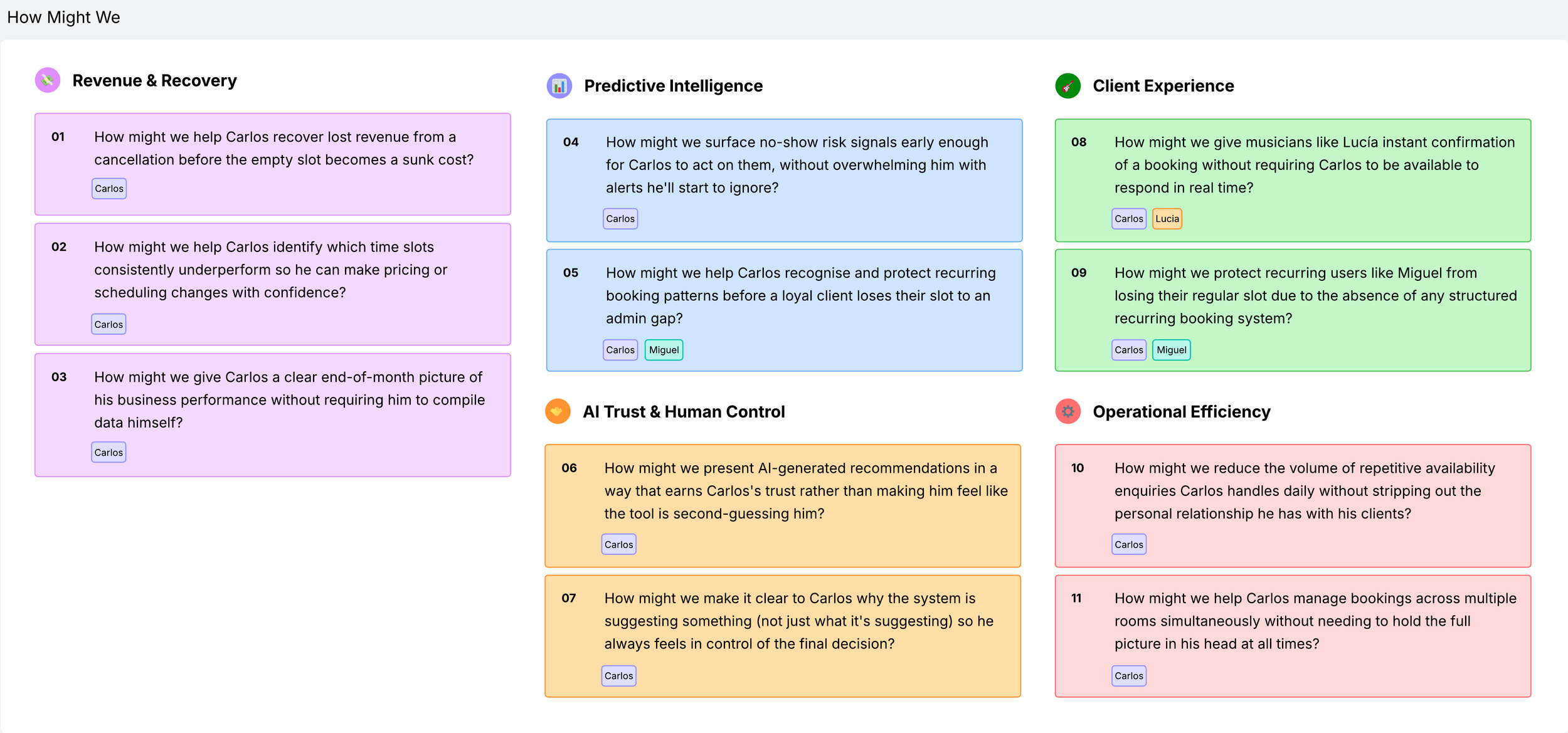
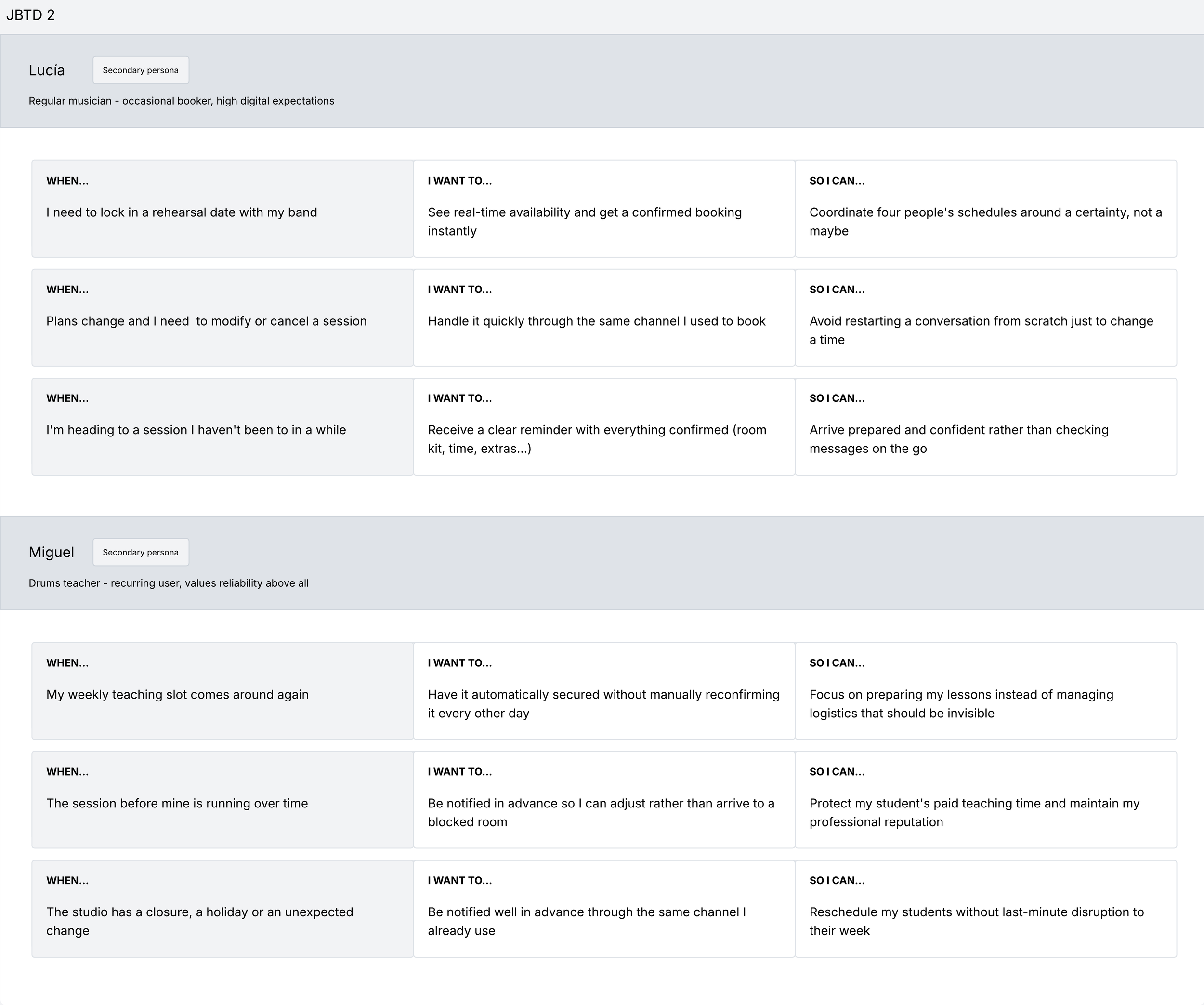
Jobs to be done (JBTD) & How Might We
Personas tell us who the users are. Jobs to be done tell us what they are actually trying to accomplish and why. Rather than focusing on features or demographics, the JTBD framework reframes each user need as a job with a specific trigger, a motivation, and a desired outcome. This shift in perspective is particularly useful when designing AI-powered tools, because it keeps the focus on the human intent behind the data rather than the data itself. Each statement follows the same structure: when a specific situation arises, I want to take a particular action, so I can achieve a meaningful result.
HMW statements are the bridge between what the research revealed and what the design will solve. Each one reframes a pain point or unmet job as an open design opportunity, specific enough to be actionable, broad enough to allow more than one solution.
Empathy Maps
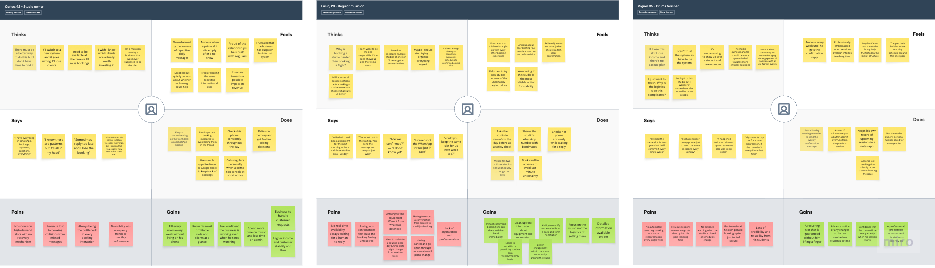
Empathy maps capture the full texture of how each person experiences the problem: not just what they say and do, but what they think and feel when no one is asking them a direct question.
For this project, building empathy maps from the interview findings was a deliberate exercise in reading between the lines. The most revealing moments rarely came from the answers themselves, but from the behaviour that surrounded them. These are not complaints. They are adaptations. And adaptations are the clearest signal a designer can have that a system has failed the people using it.
The maps reveal a pattern that no single interview surfaced on its own: every person in this ecosystem has quietly built a workaround to compensate for the absence of a reliable system. The product being designed exists to make those workarounds unnecessary.
Competitive Audit & Mind Maps
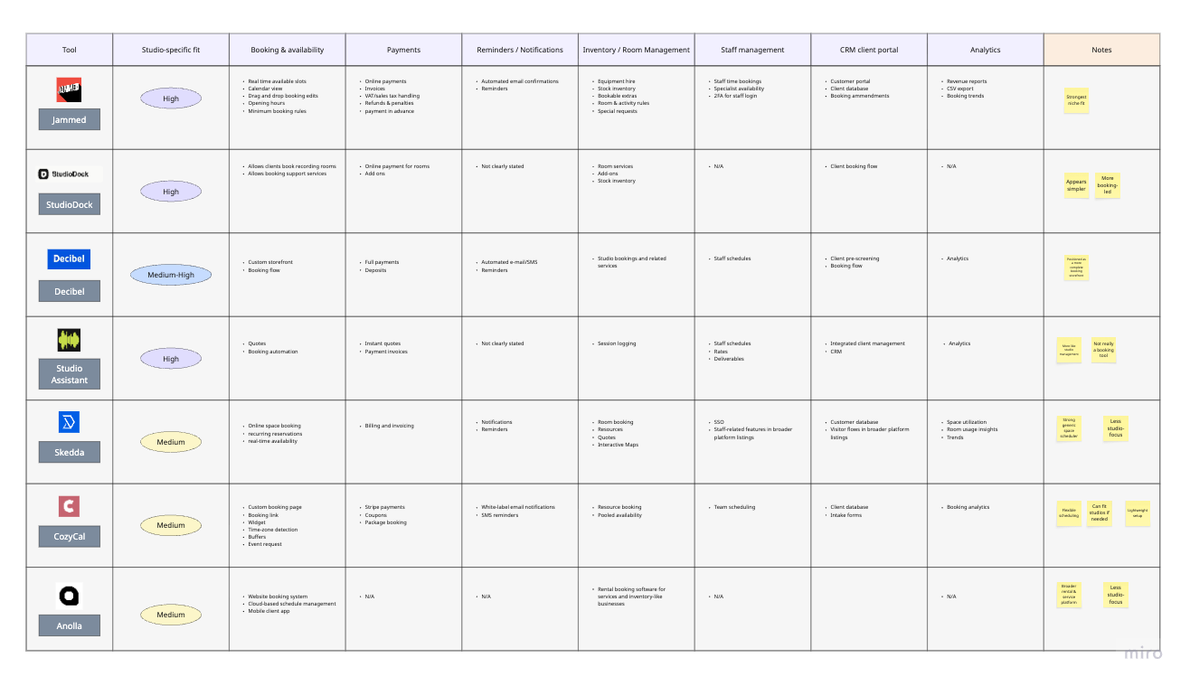
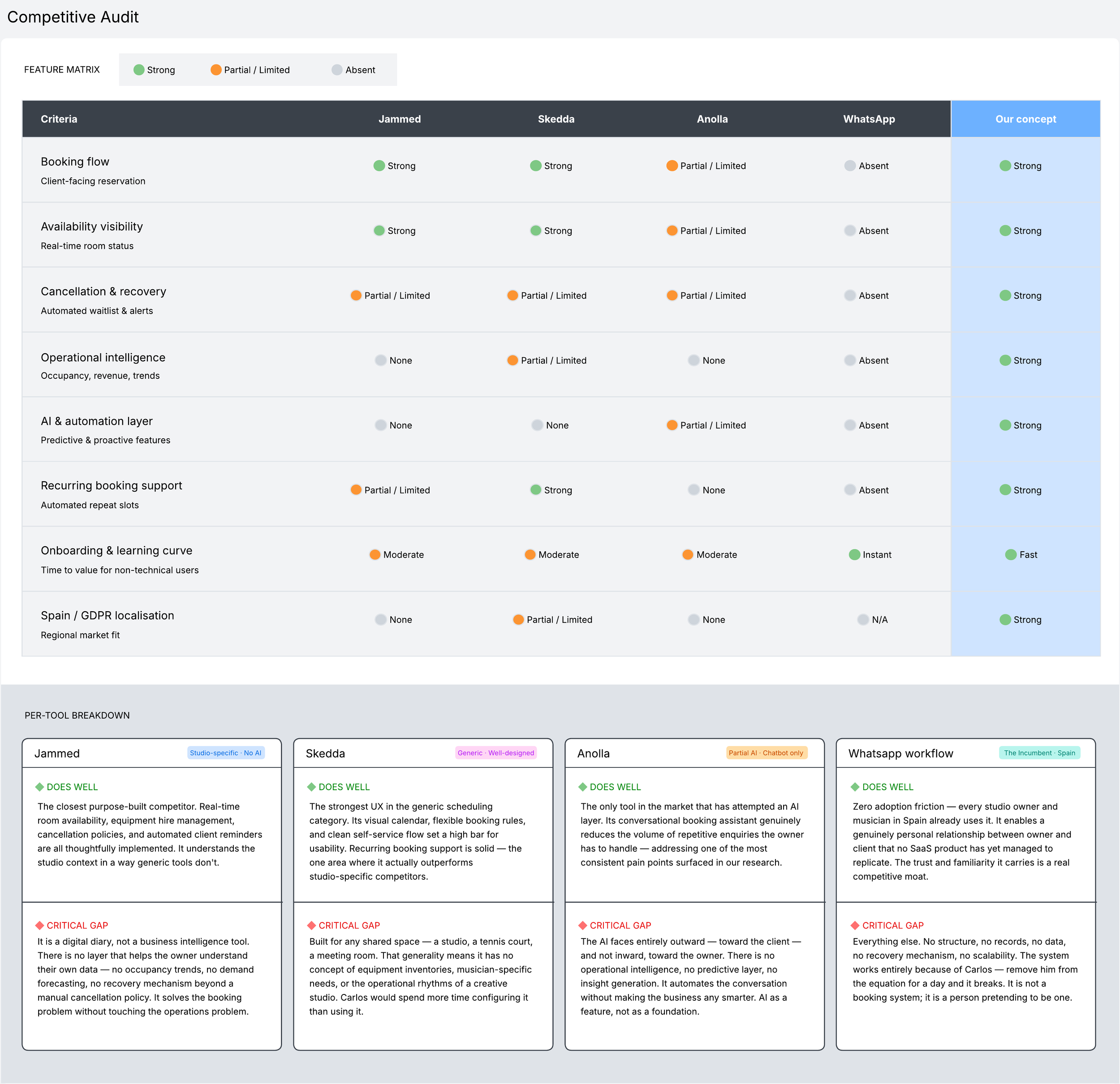
The market landscape snapshot established where existing tools sit relative to each other. The competitive audit goes one level deeper. It examines how they actually work, where the experience breaks down, and what each product does well enough to learn from. The goal is not to catalogue features exhaustively, but to build a clear-eyed picture of the space our design is entering and to ground every decision that follows in something more rigorous than intuition.
Four products were selected for the audit, each representing a distinct position in the competitive landscape.
Each tool was evaluated against eight criteria drawn directly from the research findings and the jobs to be done. These are not generic audit dimensions, each one maps to a specific pain point surfaced in the interviews or a design opportunity identified in the HMW statements.
Two findings from the audit are worth foregrounding before the detail. First, no existing tool combines studio-specific functionality with any meaningful layer of operational intelligence. Second, the only product attempting AI (Anolla) applies it entirely toward the client-facing side of the experience, leaving the owner's decision-making completely unsupported. Both gaps point in the same direction, and both inform the design that follows.
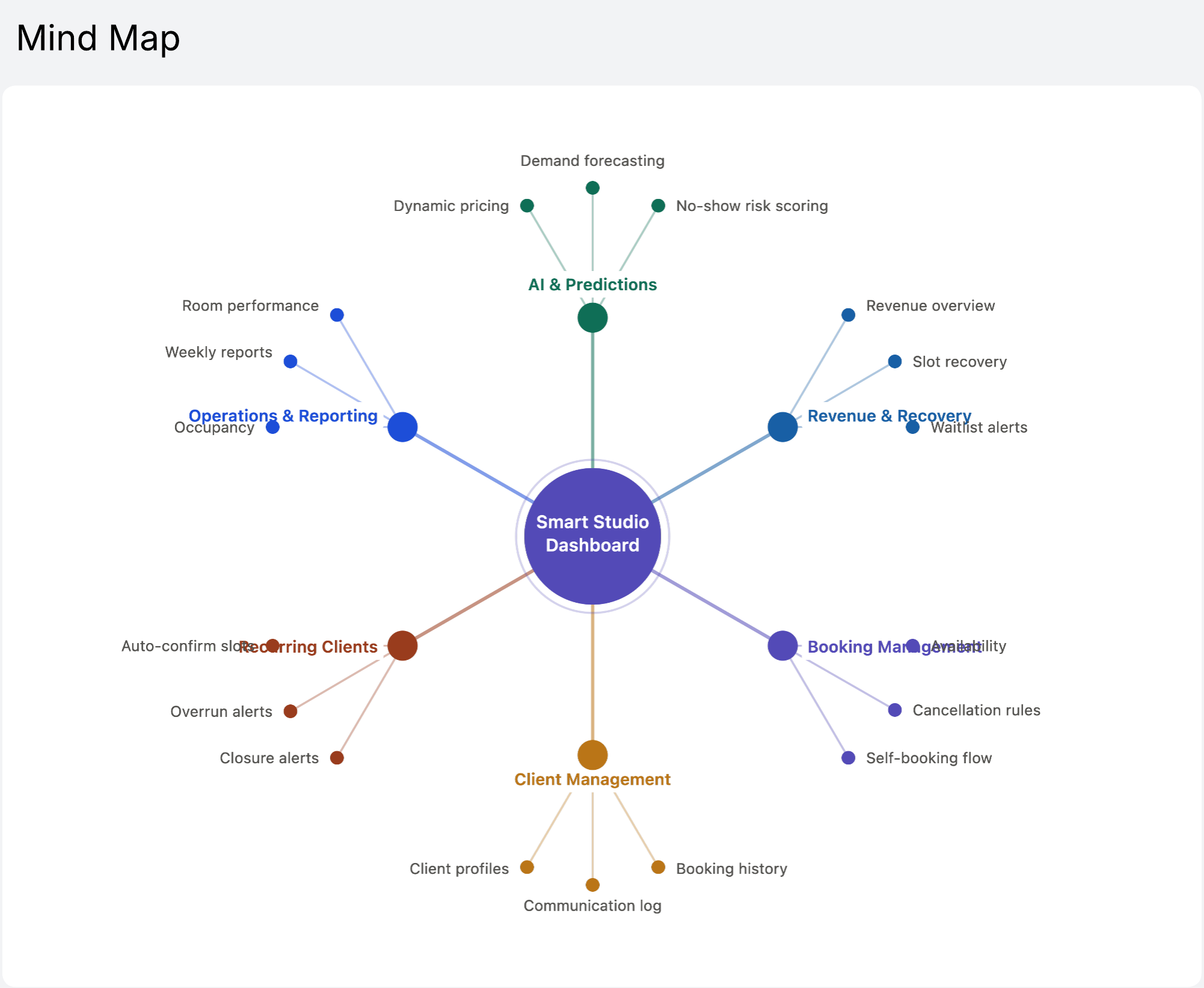
User Journey Maps
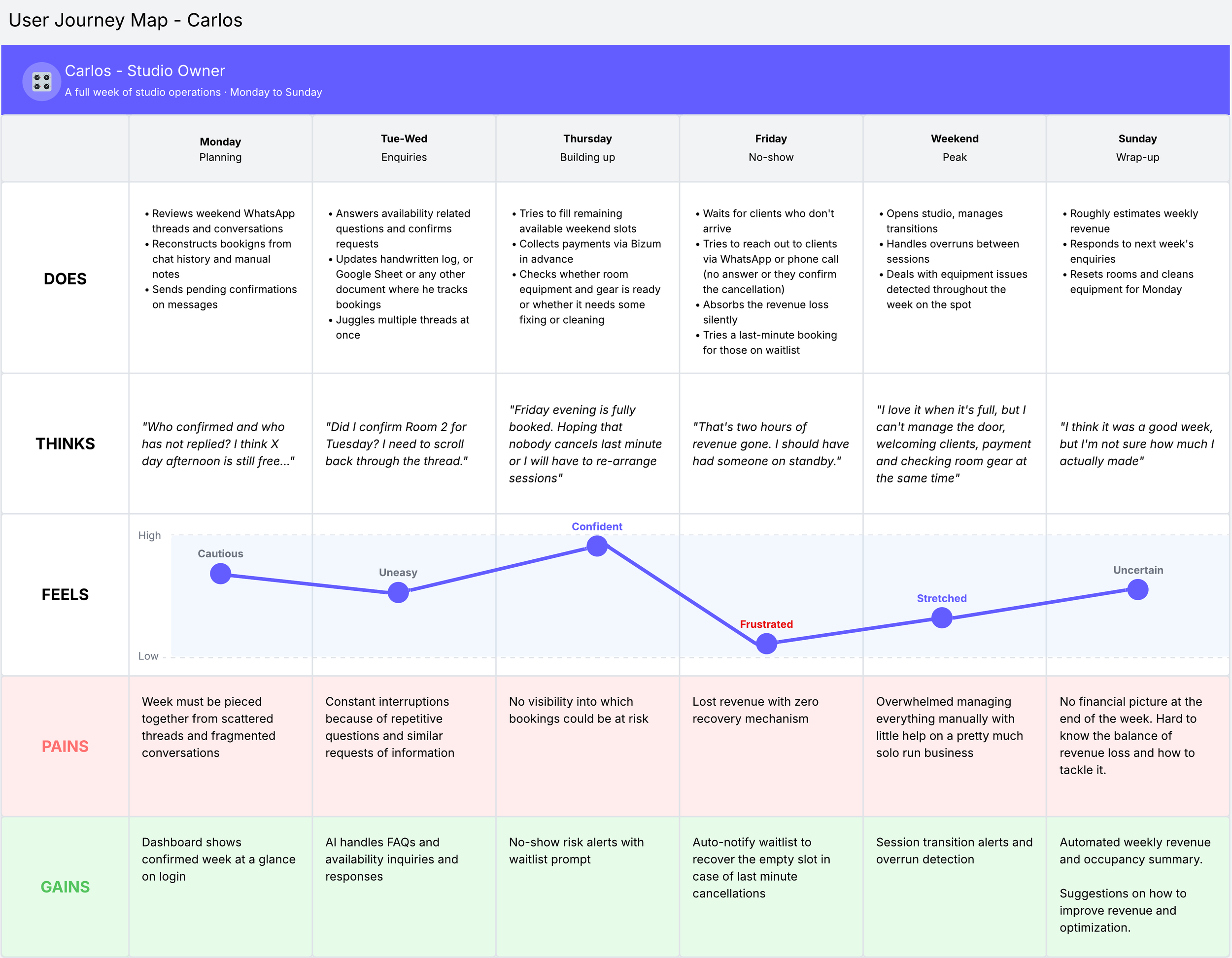
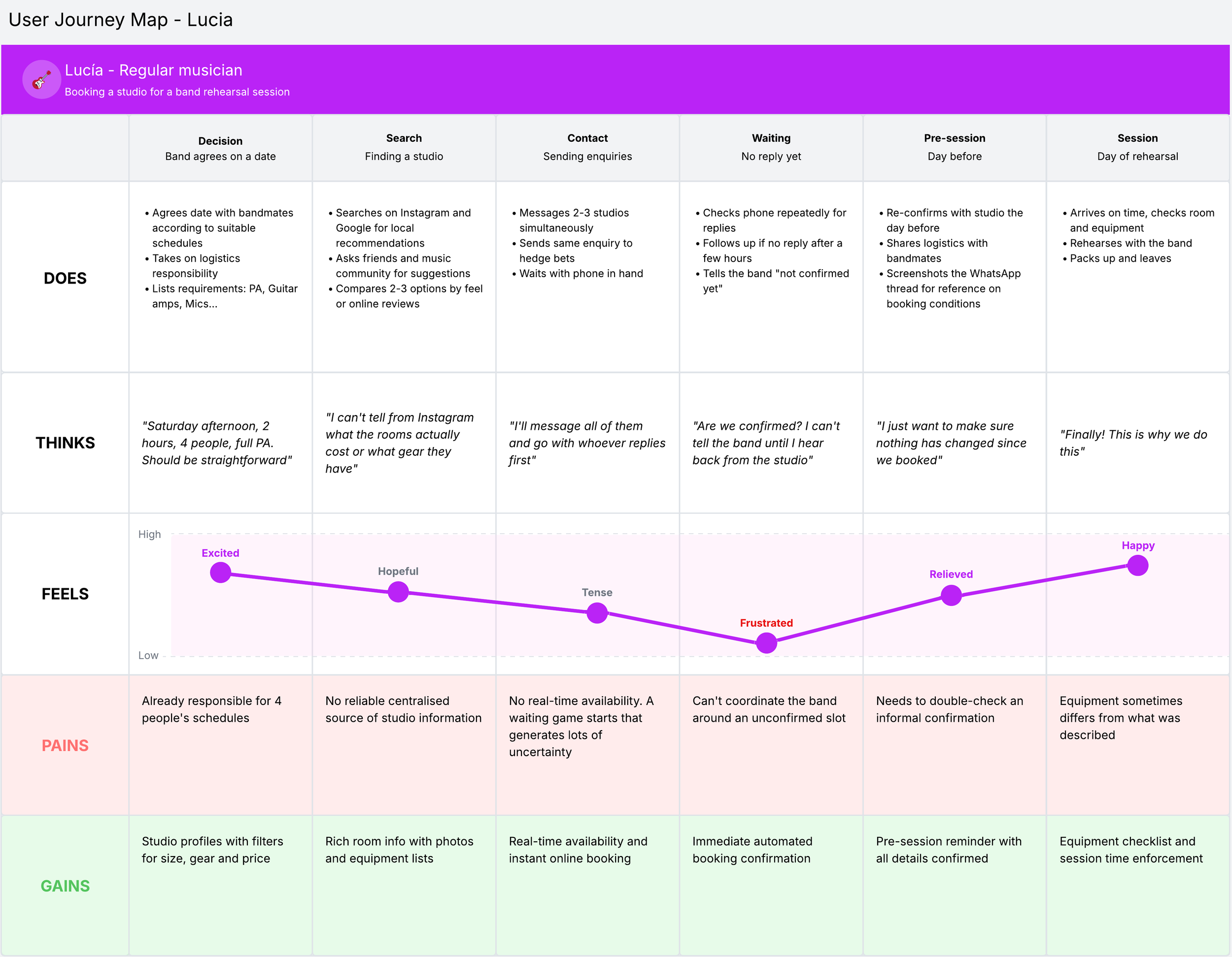
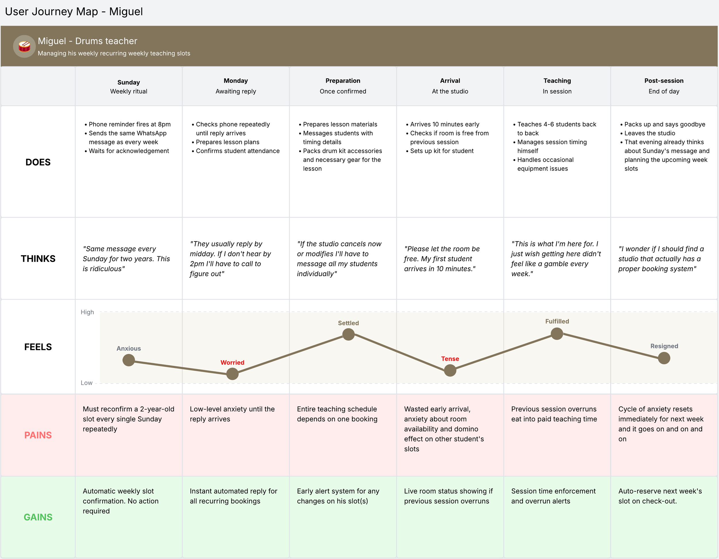
Journey maps show what actually happens as each person moves through a specific scenario. And it is in that sequence, more than anywhere else, that the real shape of a design problem reveals itself. Three journey maps were produced, one per persona, each covering a scenario chosen to surface the highest concentration of friction and unmet need.
Each map is structured across five layers: what the user does, think, feel at each stage, where the experience breaks down and where the design has an opportunity to intervene. The emotion curve makes visible the moments where the experience drops, and more importantly it shows whether those drops are recoverable within the same journey or whether they leave a residue that carries into the next one. These are not isolated pain points. They are connected, recurring, systemic and the product being designed needs to address them as such.
Synthesizing insights & project scope
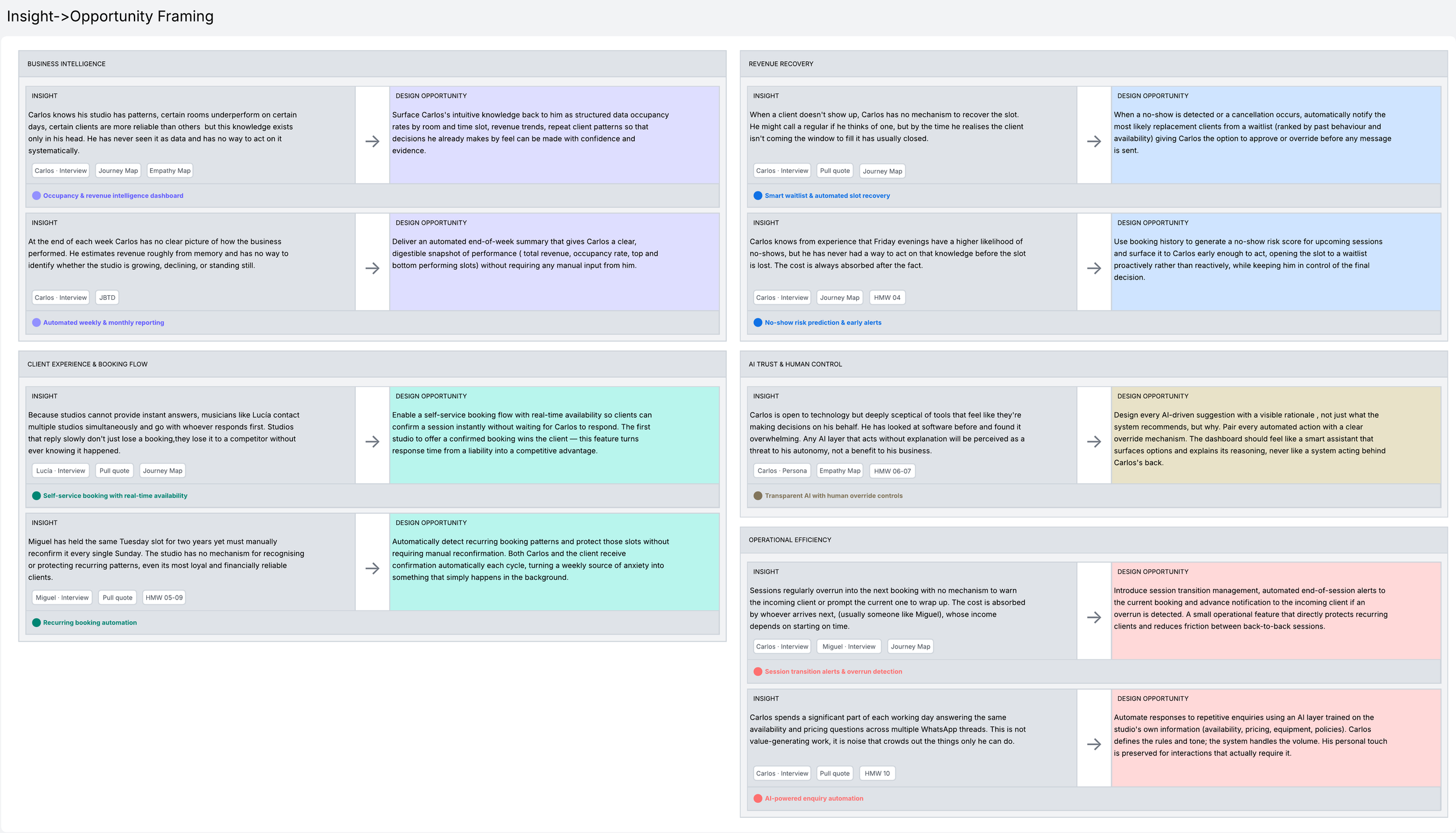
Insight → Opportunity mapping
The insight → opportunity mapping is the critical bridge between the research phase and the design phase. Each insight is a distilled truth extracted from the research (specific, evidence-based) and stated as a fact about the users or the problem. Each opportunity is what that insight makes possible from a design perspective. Together they create a transparent, auditable chain of reasoning that shows every design decision in the UI phase has a root in something real.
Feature Prioritisation (MoSCoW)
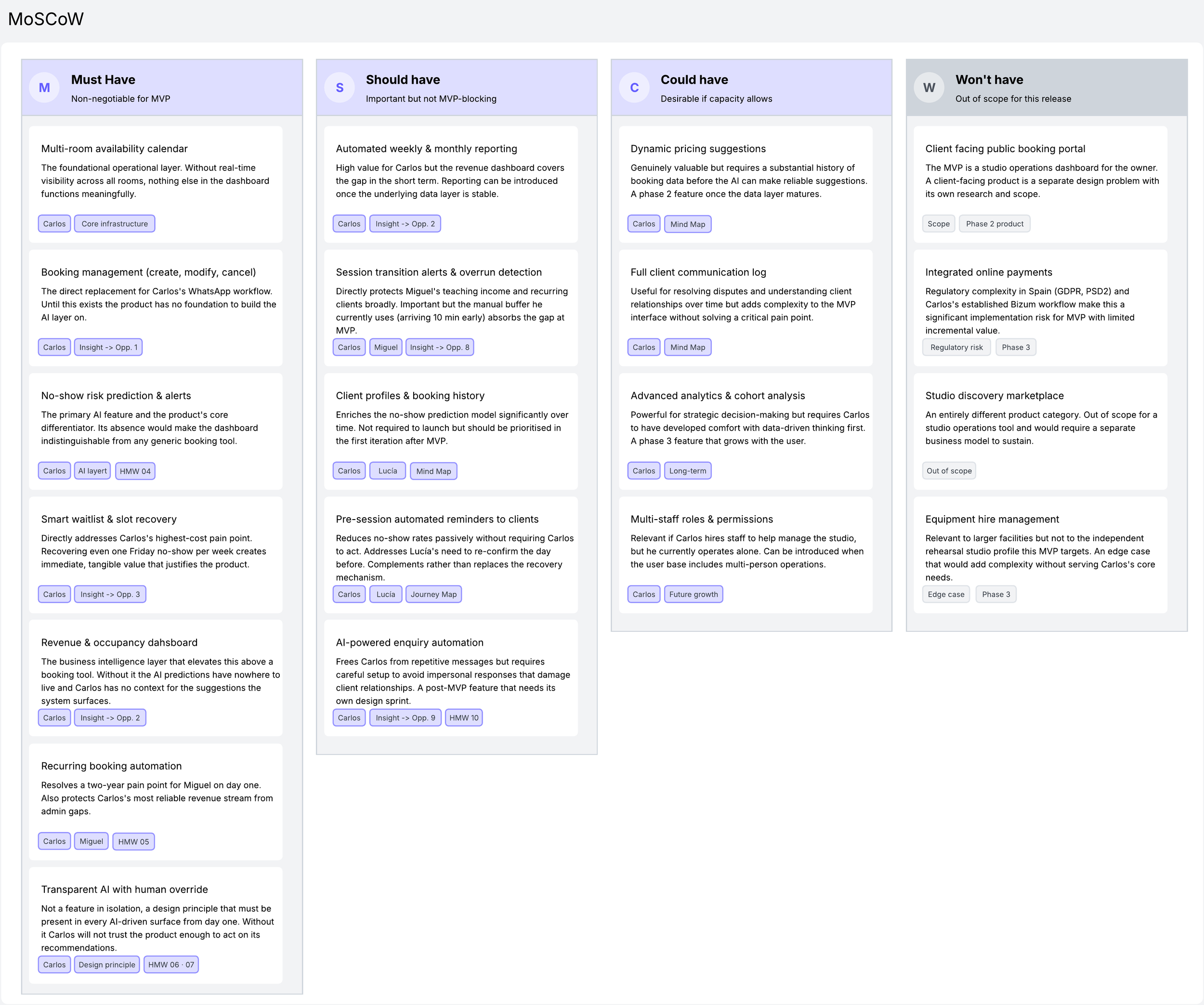
With the insights mapped to design opportunities and the full solution space explored through the mind map, the next step was to make deliberate decisions about what to build, and equally importantly, what not to. The MoSCoW framework was applied to bring structure to that process, sorting every identified feature into one of four categories: must have, should have, could have, and won't have in this release. The prioritisation was driven by three criteria working in combination: research grounding, dependency logic and trust & adoption risk.
Scope definition (Roadmap)
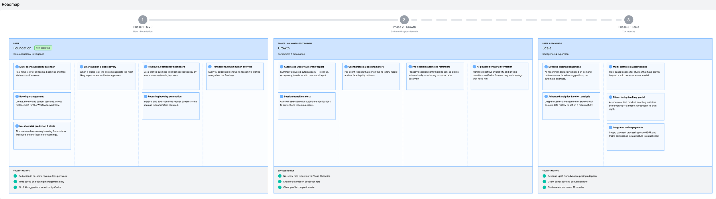
With the MoSCoW prioritisation complete, the final step before moving into design was to translate those decisions into a clear, phased product roadmap, a document that defines not just what will be built, but when, and in what order, and how success at each stage will be measured before the next one begins.
The roadmap is structured across three phases. Phase 1, the MVP, establishes the foundation. Phase 2 builds on that foundation by enriching the data layer and introducing automation features that compound in value the longer the product is in use. Phase 3 represents the long-term vision (deeper intelligence, multi-operator support, and a client-facing booking product that extends the platform beyond the owner's dashboard entirely).
The sequencing is not arbitrary. Phase 1 must do two things simultaneously: solve a real operational problem from day one, and build enough trust with a sceptical, low-tech user that he is willing to act on AI recommendations. If either of those conditions fails (if the product is useful but not trusted, or trusted but not useful) Phase 2 never gets a chance to prove its value. Every design decision in the MVP phase is therefore shaped by that constraint: the product must be intelligent, but it must feel like an assistant, not an authority.
It is also worth being explicit about what this project covers. The design work that follows focuses exclusively on Phase 1, the MVP layer. Phases 2 and 3 are included in the roadmap because a product without a forward trajectory is not a product, it is a prototype. But the wireframes, the design system, and the prototype that follow are all scoped to the seven features that make up the foundation. That is the right scope for an MVP, and it is the right scope for a case study that aims to do one thing thoroughly rather than three things superficially.
Design principles
Research tells you what the problem is. Prioritisation tells you what to build. Design principles tell you how to build it and more importantly, how to make consistent decisions when the answers aren't obvious.
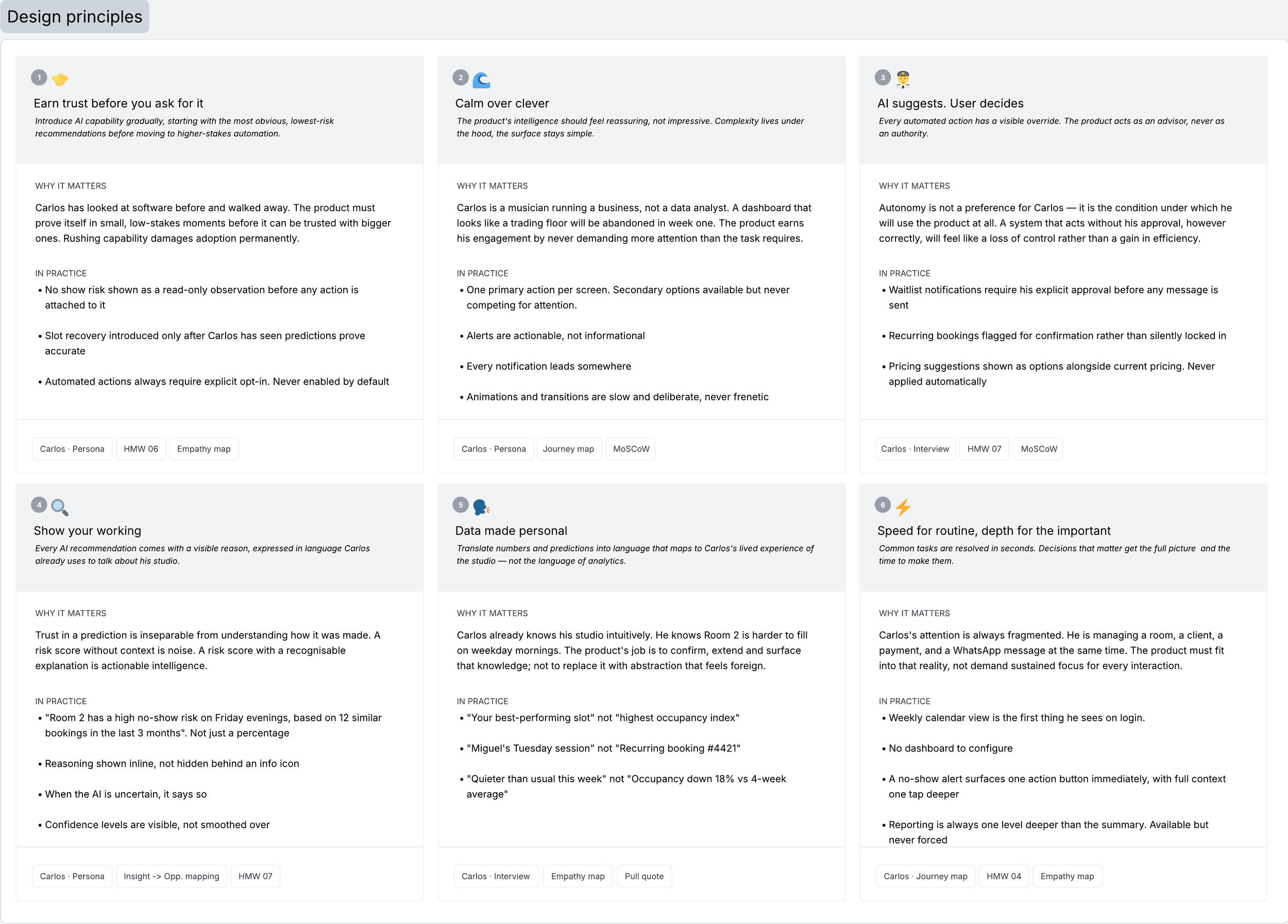
Six principles were defined for this product, each one derived directly from the research and the specific constraints of designing an AI-powered tool. They are not aspirational statements about simplicity or delight. They are working beliefs that carry real implications for every design decision in the UI phase.
Two principles deserve particular attention because they shape the product's relationship with AI more specifically than the others. The first is about time: earn trust before you ask for it. The design response to that finding is a deliberate strategy of progressive capability and only introducing automated actions once the accuracy of those observations has been felt, not just explained.
The second is about control: AI suggests, user decides. This is not a concession to a difficult user. It is the correct design position for any AI product where the stakes of a wrong decision are personal and financial, and where the user's sense of professional identity is bound up in their ability to manage their own business.
Taken together, these six principles form a brief that the visual design and interaction design must answer.
Information Architecture
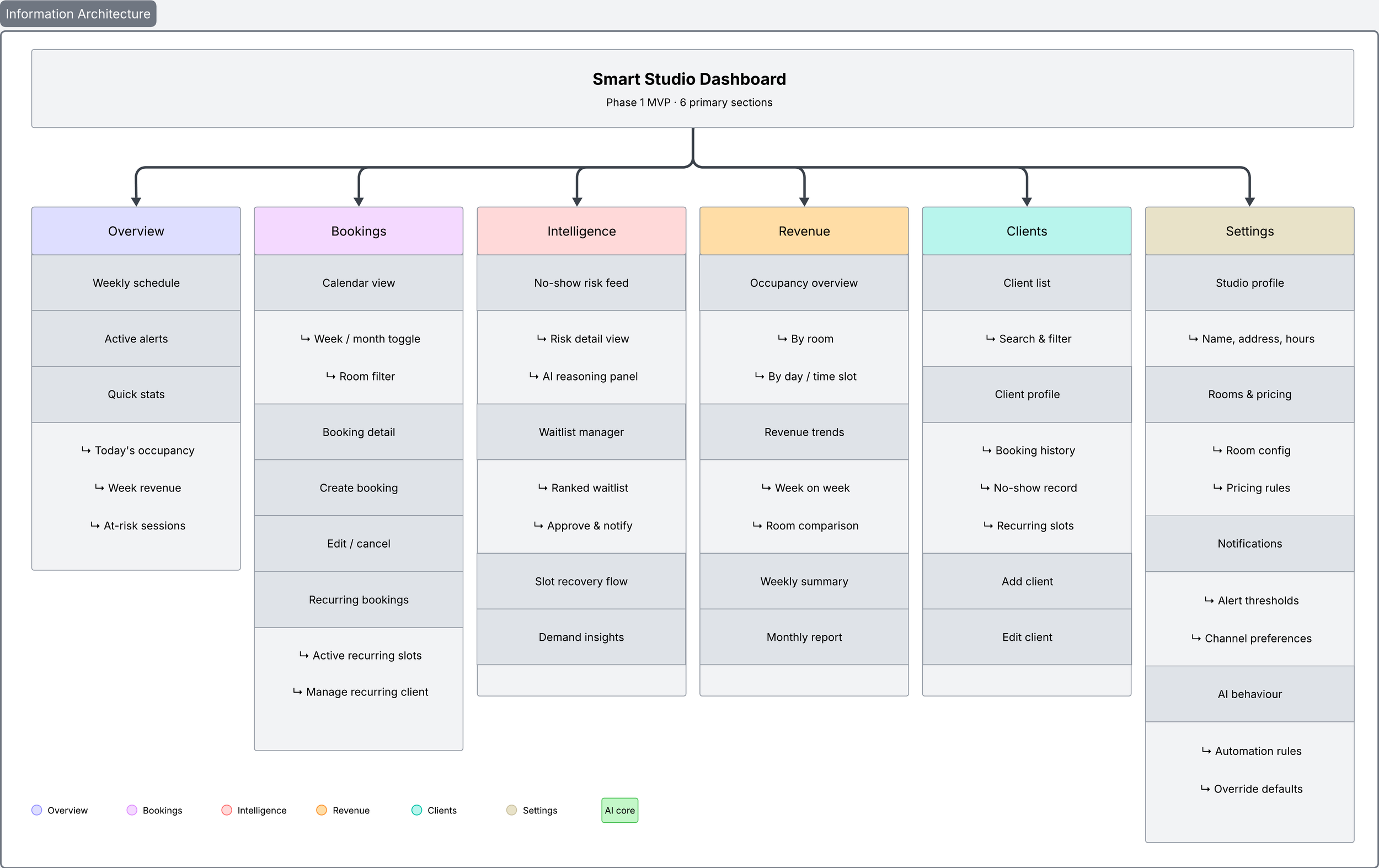
Before a single screen is designed, the product needs a skeleton, a clear map of every section, every screen, and every state that the design will need to account for. Information architecture is that map. It defines how the product is organised, how a user moves through it, and where every piece of functionality lives relative to everything else.
For a product like this one, getting the IA right carries particular weight. The architecture needs to feel immediately intuitive and organised around the categories that make sense to an engineer or a product manager. The IA is structured across six primary sections. Overview is the entry point. Bookings is the operational core, housing the calendar, the booking management tools, and the recurring booking system. Intelligence is the product's defining section (the AI layer made visible). Revenue houses the business intelligence layer: occupancy data, revenue trends, and the weekly and monthly summaries. Clients brings together the client profiles and booking histories that enrich the AI predictions over time. And Settings provides the controls that make the product the user’s own.
Two structural decisions are worth making explicit. The first is that Intelligence sits as a primary navigation item, not as a sub-section of Bookings or Revenue. This is intentional as it signals from the architecture outward that AI is not a feature added on top of a booking tool, but a first-class capability that shapes how the entire product operates. The second is that AI behaviour lives in Settings, not buried in a help menu or an onboarding flow.
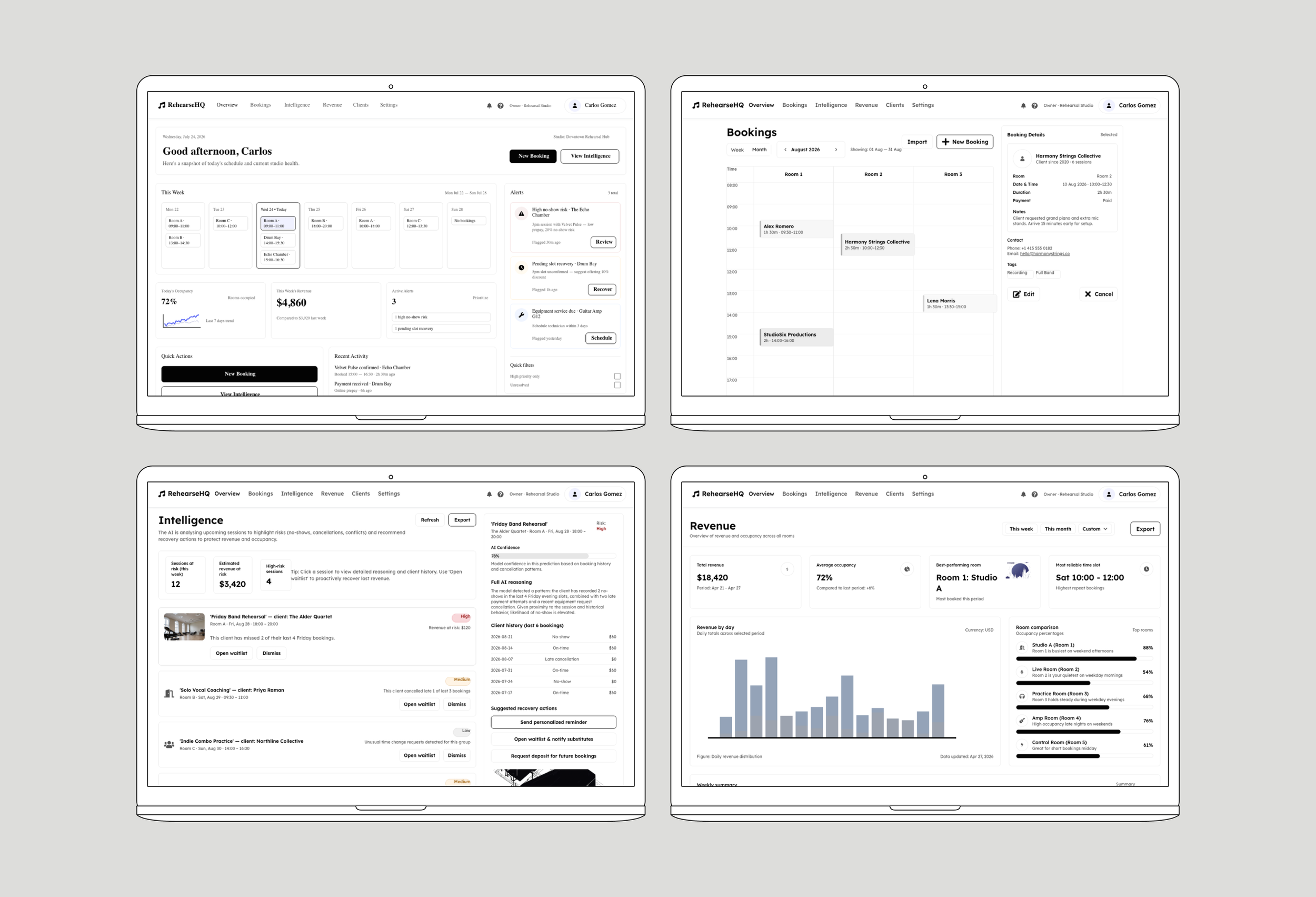
UI Design & Prototype
Low-fi wireframes
With the information architecture defined and the scope locked to seven MVP features, the next step was to translate structure into layout to move from what the product contains to how it actually looks and behaves on screen.
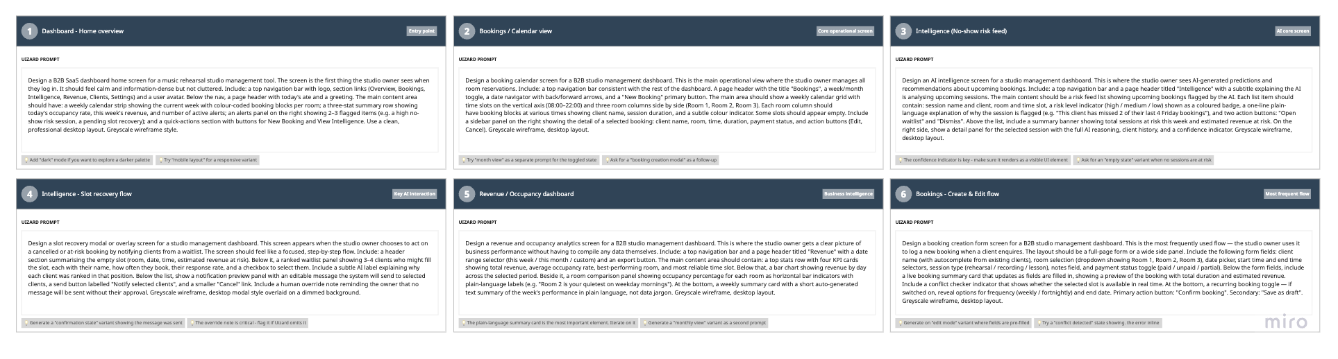
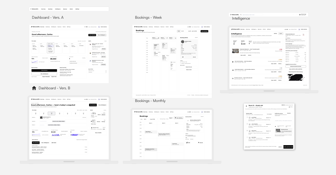
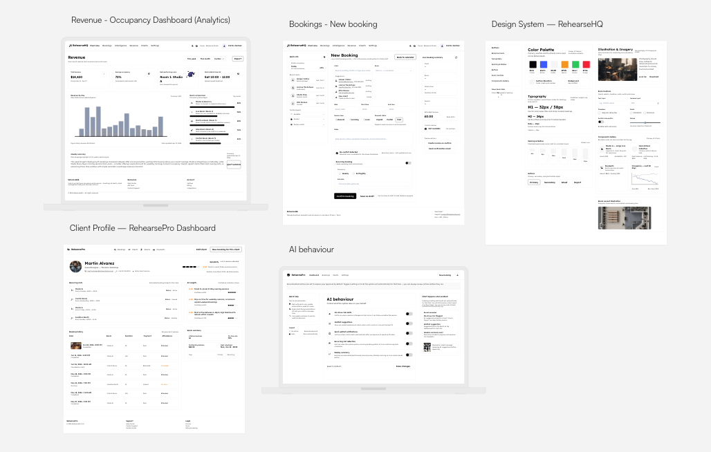
The wireframes were produced digitally using Uizard, an AI-assisted design tool that generates screen layouts from natural language prompts. Uizard was chosen deliberately at this stage for two reasons. First, it accelerates the low-fidelity phase significantly, allowing multiple layout directions to be explored in parallel rather than sequentially. Second, using an AI tool to design an AI product creates a productive tension that sharpens the design thinking, when a generated layout handles a prediction or a recommendation poorly, it becomes immediately obvious what a human-centred design would do differently.
Each screen was generated from a detailed prompt describing the context, the key UI components, and the specific interaction logic required. The outputs were then reviewed critically and annotated with the reasoning behind each structural decision. The wireframes are the result of a deliberate dialogue between AI generation and human design judgment, which is precisely the working relationship this product is designed to enable for users.
Design system
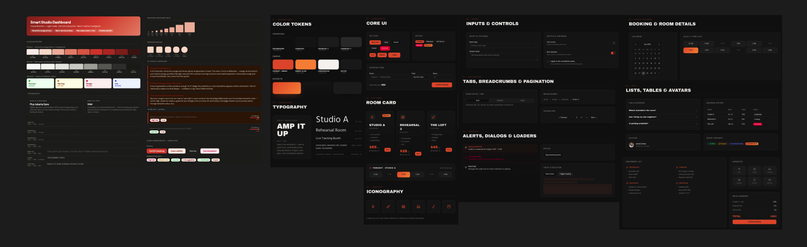
A design system is not a deliverable that comes after the design. It is the foundation that makes consistent, scalable design possible in the first place. Before a single high-fidelity screen was produced, the visual language of the product needed to be defined: the colour palette, the type scale, the spacing logic, the component behaviour, and the visual grammar that would make AI-generated content immediately distinguishable from manually entered data. Getting these decisions right at the system level means every screen that follows is coherent by default, not by accident.
The visual direction for this system was developed through a deliberate process of AI-assisted exploration, one that is itself worth describing, because the how is as relevant to this case study as the what.
Two AI tools were used in combination to develop and stress-test the visual concept. Claude was used to define the strategic rationale behind each design decision, i.e. generating the colour scale, articulating the token structure, establishing the AI visual language rules, and documenting the reasoning that connects each visual choice back to the research. Lovable was used to render visual concepts quickly and explore how the same design system behaved across different UI contexts, making the outputs tangible and comparable rather than purely theoretical.
The reason for using both tools rather than just one was intentional. Different AI tools produce different kinds of output. Claude reasons through decisions and produces structured documentation. Lovable generates rendered interfaces and visual explorations. Using them in combination meant the system could be interrogated at two levels simultaneously: does it make sense conceptually, and does it actually look and feel right in practice?
Component Library
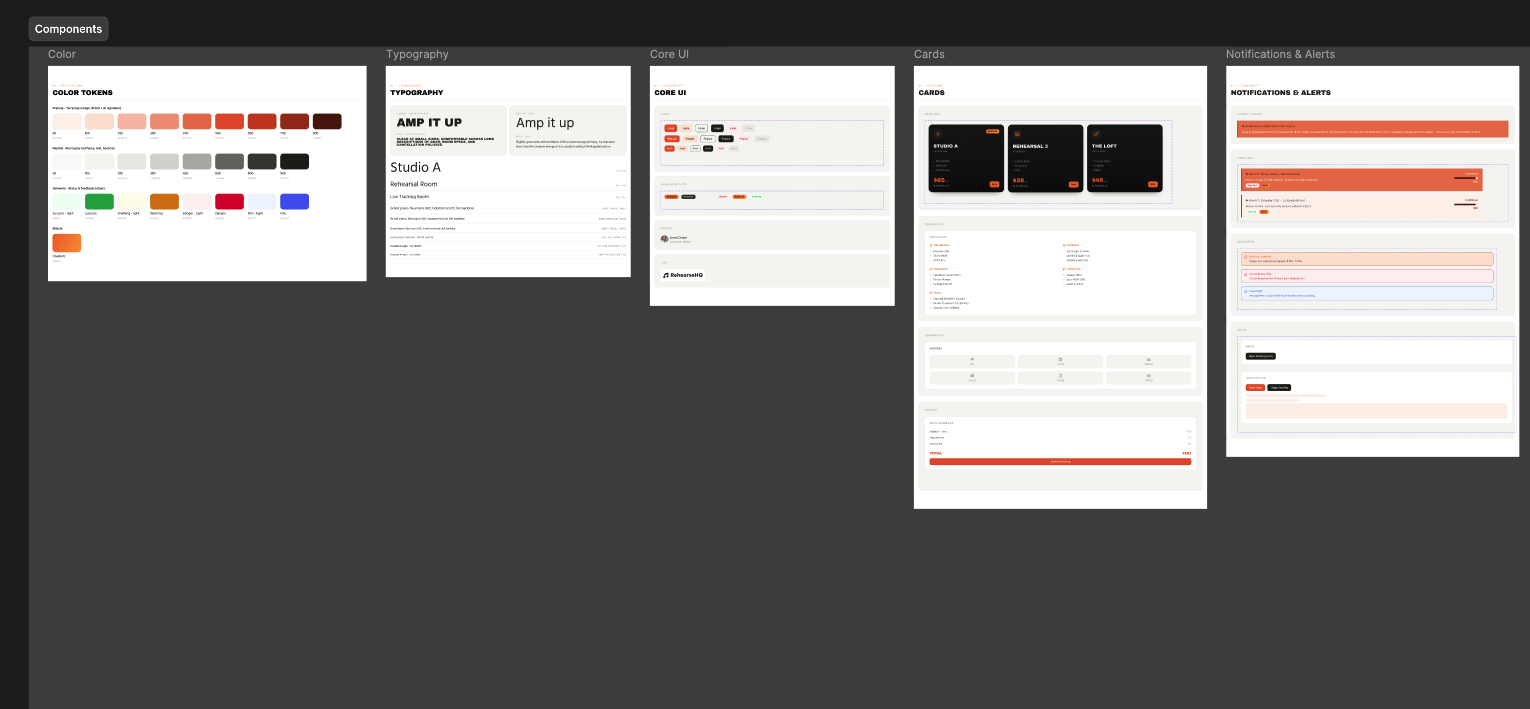
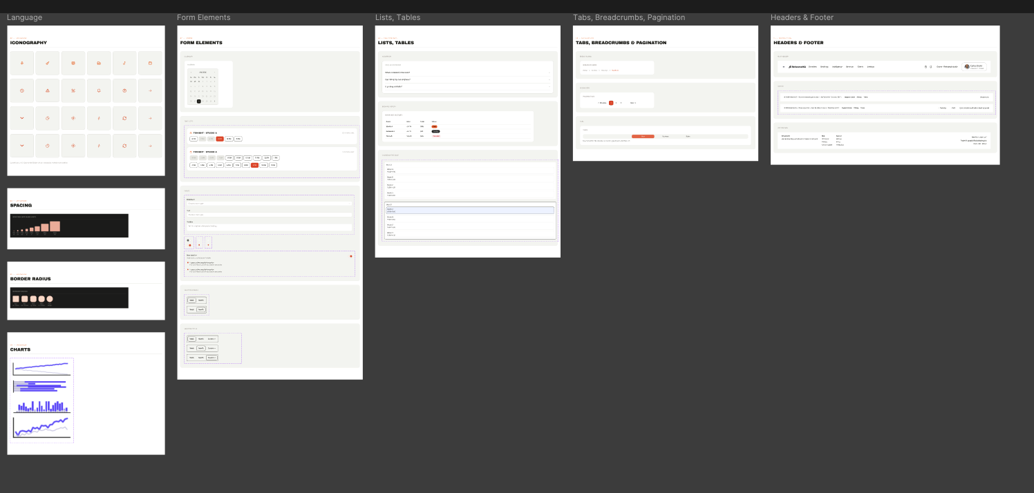
The component library for this project was developed in Figma, following the visual direction established through the AI-assisted exploration phase. Rather than generating components automatically or accepting any single tool's output wholesale, the approach was deliberately synthesising: taking the most coherent extracts from what Claude and Lovable had each produced (where one reasoned clearly about component logic and the other rendered it convincingly in context) and using those as raw material to craft something more considered and internally consistent than either tool had produced alone.
This distinction matters and is worth being explicit about in a project where AI tools play a visible role. Claude produced structured documentation (token hierarchies, component behaviour rules, usage guidance, the reasoning behind decisions). Lovable produced rendered interfaces (visual explorations that made abstract system decisions tangible and comparable). Neither output was a finished component library. What both outputs provided was a high-quality starting point and a set of creative constraints to react to. The actual library, (the one with properly structured variants, auto-layout behaviour, connected token references, and the interaction states that only become visible when you try to use a component in a real screen) was built by hand in Figma, through the kind of considered iteration that no generative tool currently replaces.
The AI-specific components are the most original contribution of the library and the ones that required the most iteration. No existing kit ships a confidence indicator that communicates both certainty and uncertainty honestly, or a suggestion card that makes the AI's reasoning legible without overwhelming the primary action. These had to be designed from first principles, informed by the research and the design principles. The component library is where those principles stopped being words and became structure.
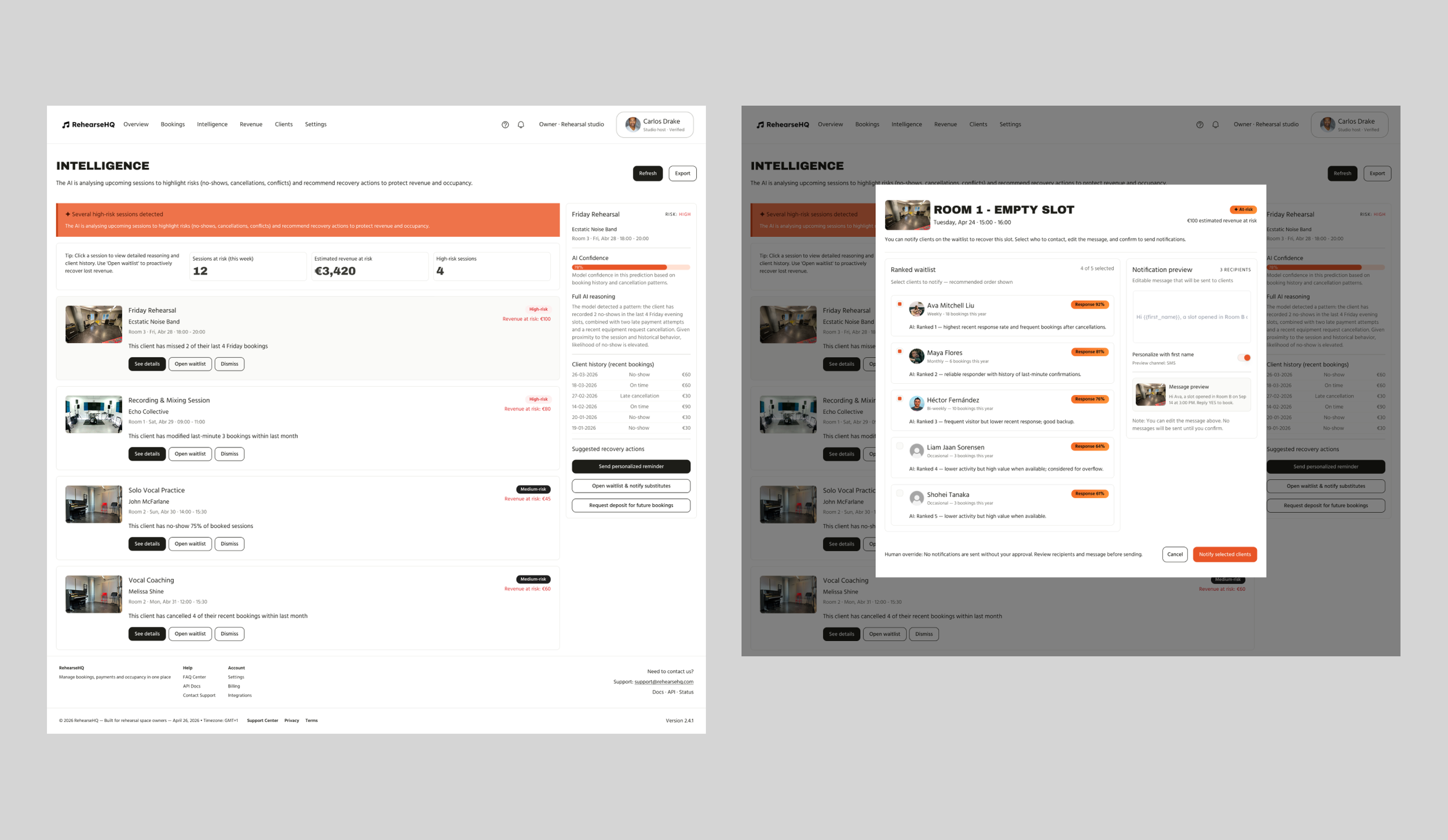
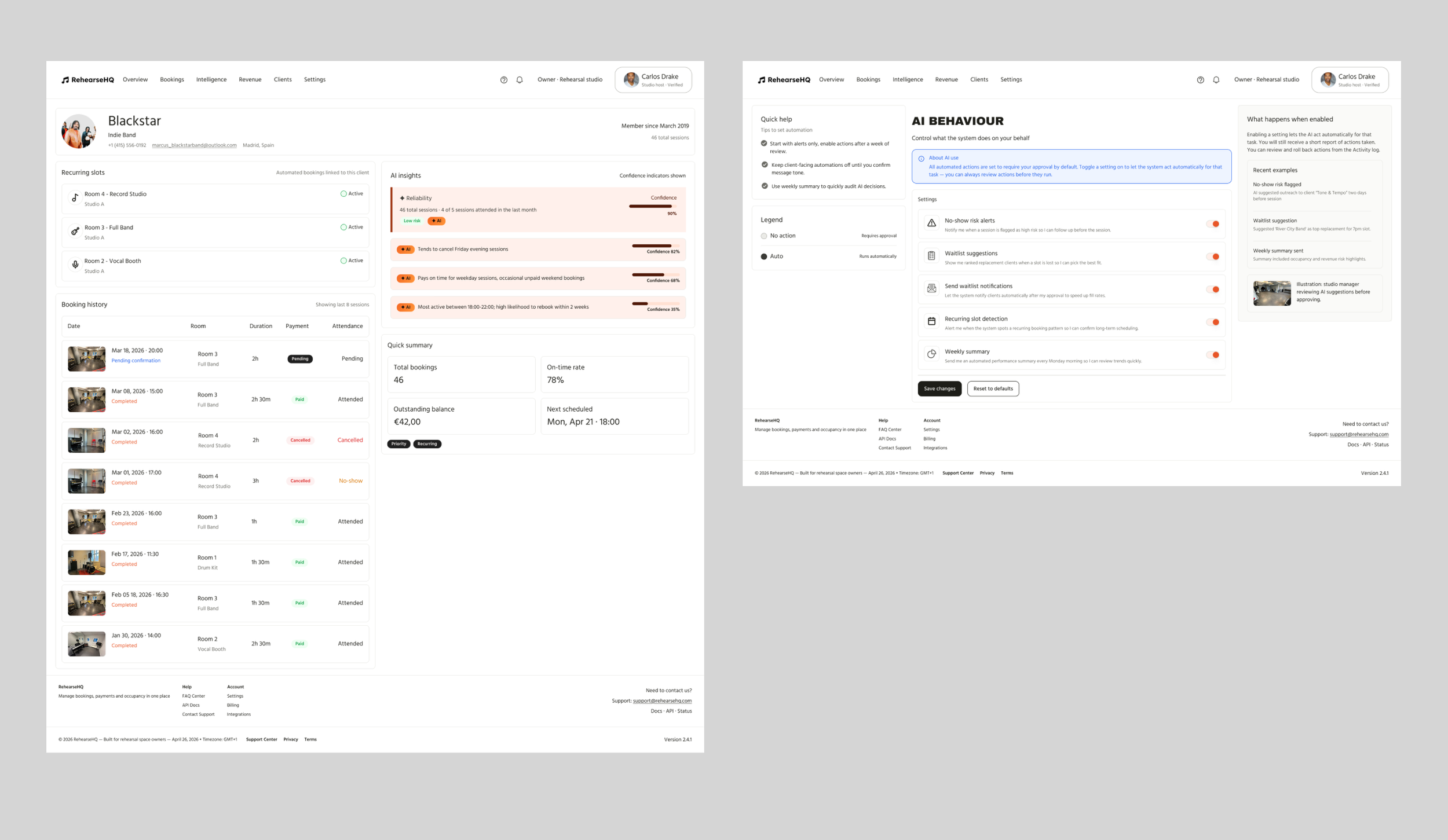
High-fi mockups
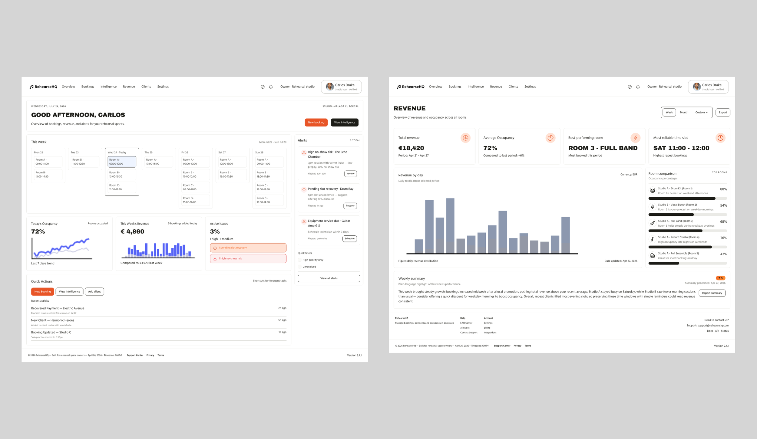
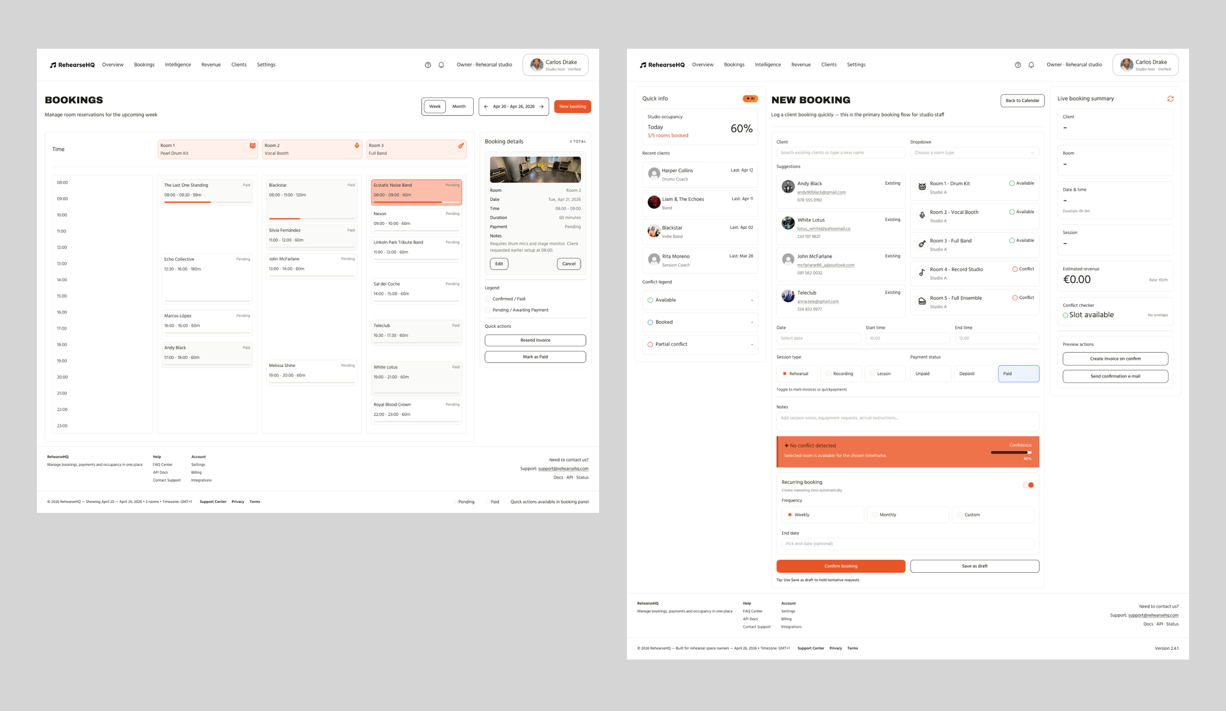
High-fidelity mockups answer the question of what the product actually feels like to use, whether the visual language earns trust, whether the hierarchy guides attention to the right place, whether the AI-generated content reads as intelligent and legible rather than intrusive or opaque.
Uizard's AI-generated screens had served their purpose in the wireframing phase: producing layout explorations quickly, forcing early decisions about screen structure, and giving a concrete visual reference to react to rather than starting from a blank canvas. But those outputs were starting points, not destinations. They lacked the precision, the component consistency, and the design logic that a product of this ambition required. Moving them directly into a prototype would have been like submitting a rough sketch as a finished illustration.
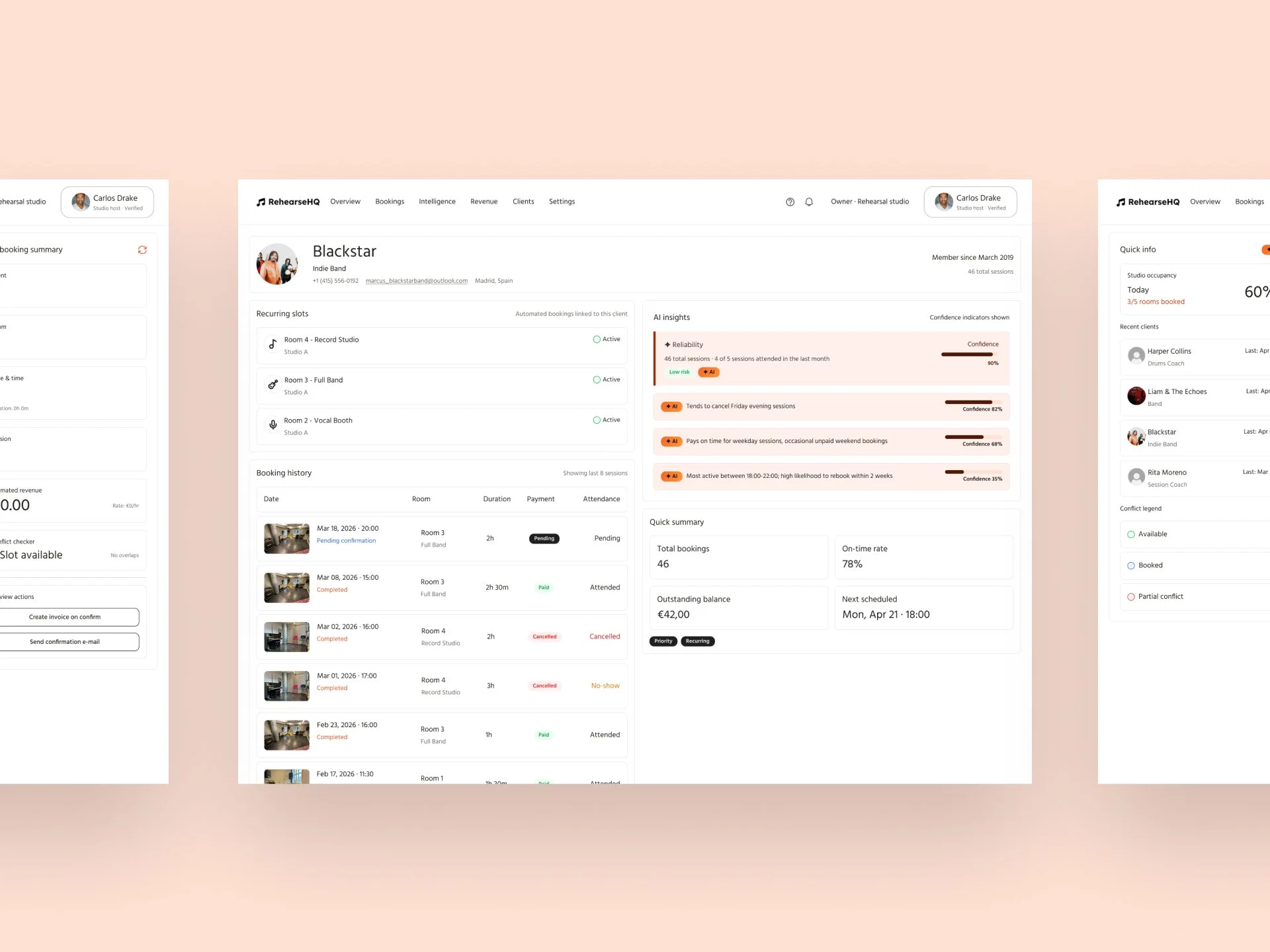
The intermediate step (building the component library in Figma) was what made high fidelity possible at scale. Because every element of the visual system had already been defined and structured as a reusable component with properly connected tokens, moving from wireframe layout to finished screen was largely a process of substitution and refinement rather than reinvention.
The screens designed at high fidelity cover every primary section of the MVP and include the key interaction states that a static mockup alone would miss. Together they form a complete, navigable picture of the product that was used directly as the basis for the interactive prototype that follows.
Interactive Prototype
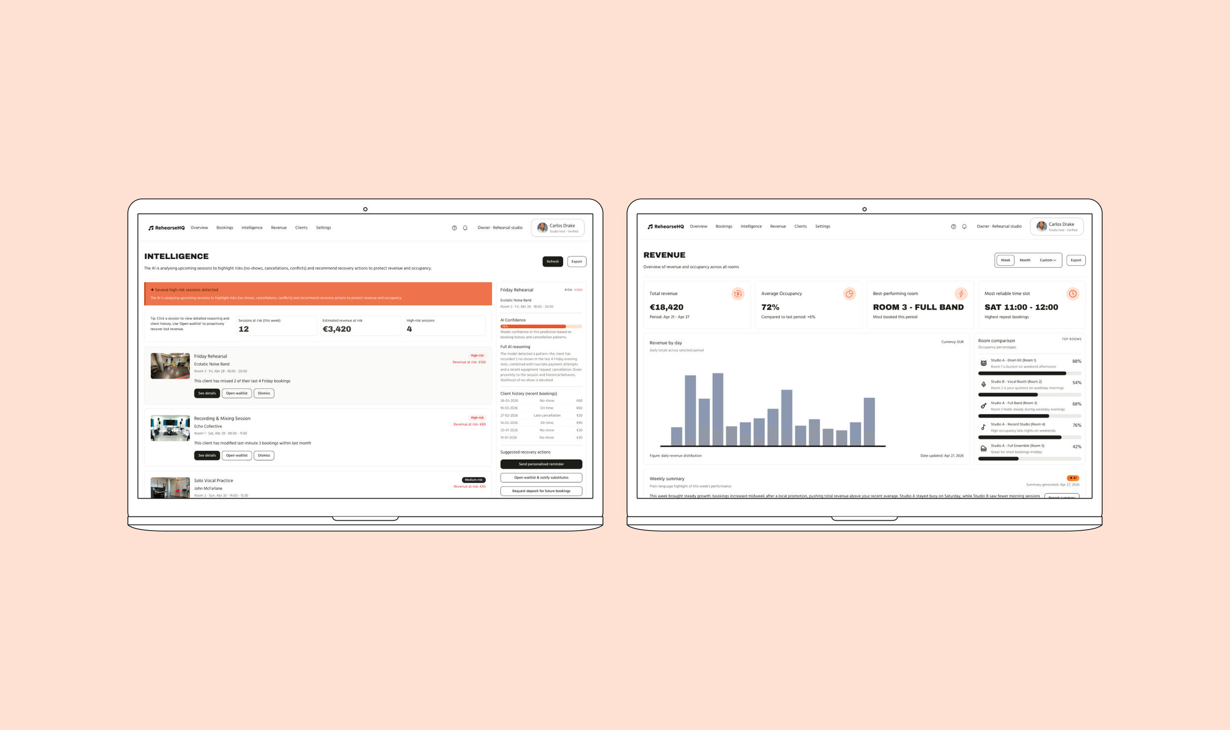
The interactive prototype brings together the twelve high-fidelity screens into a navigable experience, one where the design decisions made over the course of the research, synthesis, and UI phases can finally be felt in sequence rather than evaluated in isolation. Clicking through a prototype reveals things that even the most carefully considered static screen cannot: whether a flow feels intuitive or hesitant, whether the transition between an AI alert and the action it requests feels natural or abrupt, whether Carlos would actually know what to do next at every step.
The prototype was built in Figma, connecting the high-fidelity screens through interaction triggers and transitions designed to approximate the real product experience as closely as possible within the constraints of a prototyping tool. It is not a fully functional build but it is sufficient to demonstrate the core value proposition of the product and to invite meaningful feedback on the experience rather than just the visuals.
AI feature UI patterns
When a product has AI at its core, there are certain recurring design challenges that appear again and again across different screens that standard UI component libraries don't have pre-built answers for, because they are specific to the experience of interacting with machine intelligence rather than static data or manual inputs.
AI feature UI patterns are the design solutions to those recurring challenges. They're not full screens (they're the smaller, repeatable UI moments that govern how the AI communicates with the user throughout the product). Think of them as micro-patterns that live inside your screens and define the character of the AI layer.
The specific patterns that apply to this product
Based on everything we've designed, there are five AI UI patterns that appear across your twelve screens and deserve to be documented and named explicitly in the case study:
1. The reasoning disclosure pattern
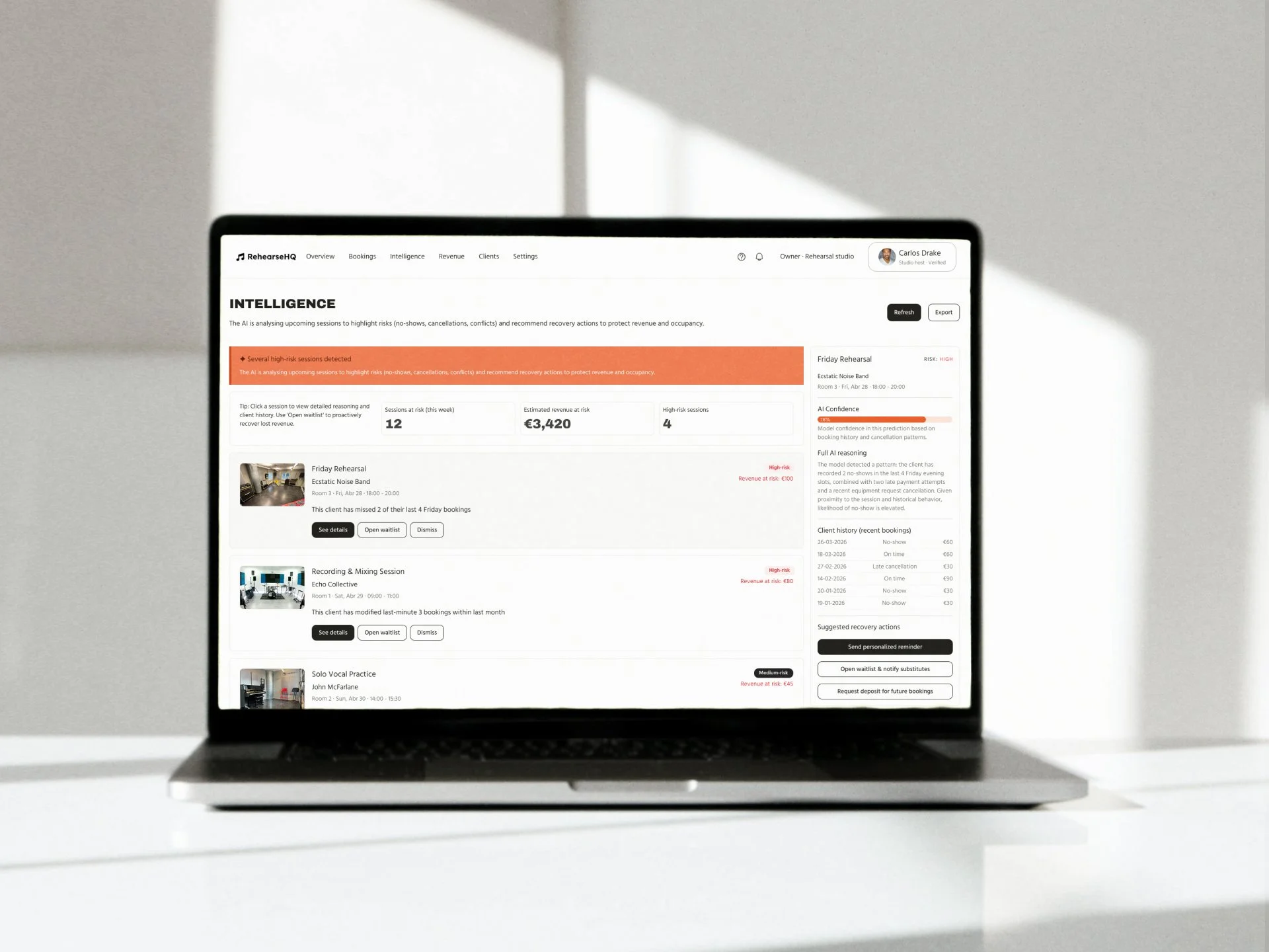
The way the product shows why the AI is flagging something, not just that it is. The one-line plain-language explanation beneath a risk badge ("This client has missed 2 of their last 4 Friday sessions") is an instance of this pattern. It appears on the risk feed, inside the booking detail panel, and on the client profile. The design challenge is how much reasoning to show by default versus on demand and where the threshold between helpful context and cognitive overload sits.
2. The confidence indicator pattern
The orange progress bar showing a percentage alongside each AI prediction. This pattern communicates that the AI is not certain (that it is operating on probability, not fact) which is critical for building the kind of trust that makes Carlos act on suggestions rather than dismiss them. The design challenge is making uncertainty legible without making it alarming.
3. The human override pattern
The consistent pairing of every AI-driven suggestion with a visible, friction-appropriate escape route. The override is never buried. It is never made to feel like the wrong choice. The design challenge is making the override feel genuinely available without visually competing with the primary action to the point of paralysing the decision.
4. The proactive surface pattern
The way the system initiates a conversation with Carlos rather than waiting for him to navigate somewhere. The recurring booking detection modal is the clearest example: the AI noticed something, and it surfaced that observation without Carlos asking. The design challenge is making proactive suggestions feel helpful rather than intrusive, and calibrating the threshold above which the system should and shouldn't speak up.
5. The AI authorship signal
The consistent use of the orange ✦ AI badge across every surface where content is system-generated. This pattern creates the visual grammar that tells Carlos at a glance which information came from the product and which came from his own inputs. The design challenge is applying it consistently enough to be legible as a system without it becoming visual noise that gets ignored.
Implementation process
Handoff specs
Designing a product is one thing. Making sure it can be built correctly, consistently, and by someone who wasn't in the room when the design decisions were made is another problem entirely. Handoff specifications are the bridge between the two, the documentation that translates design intent into engineering reality without losing precision or nuance in the translation.
For this project, the handoff was prepared with two goals in mind. The first was completeness: ensuring that every element a developer would need to implement the product faithfully was defined, named, and documented in a single coherent reference. The second was specificity: going beyond the visual surface to document the behavioural logic that lives underneath it — particularly for the AI-driven features, where the interaction between design intent and system behaviour is more complex than any standard design token or spacing value can capture on its own.
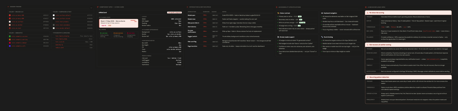
The handoff package is structured across five areas. The design token reference covers every named value in the system using a consistent naming convention that maps directly to the component library and can be exported for use in code. The component specification documents the AIRiskCard in detail, the most distinctive and technically novel component in the product, covering its layout properties, visual states, Figma props, and the precise measurements a developer would need to implement it correctly. The interaction and motion specification defines the timing, easing, and behavioural logic for every key transition in the product, with particular attention to the moments where the AI layer communicates with users. The AI behaviour logic specification is the document that exists nowhere else in a standard design handoff, it defines the triggering conditions, data inputs, confidence thresholds, approval requirements, and fallback states for each of the three core AI features: no-show risk scoring, slot recovery, and recurring pattern detection. And the accessibility specification documents the colour contrast ratios, keyboard navigation behaviour, screen reader support, and touch target sizing that bring the product into WCAG compliance.
Beyond these five areas, the handoff also includes grid and responsive breakpoint documentation, edge case and empty state definitions, asset export specifications, and a Figma file prepared for Dev Mode inspection, giving the engineering team direct access to all token values and component properties without needing to cross-reference a separate document for every measurement.
The AI behaviour logic specification deserves a particular note. Most design handoffs stop at the visual layer. This handoff goes further because this product requires it. When the system decides whether to surface a no-show prediction, the decision involves minimum data thresholds, confidence floors, and fallback states that have direct implications for how users perceives and trusts the product. A developer implementing this without that documentation would make their own assumptions, and those assumptions might produce a product that looks exactly right but behaves in ways that quietly undermine everything the design was trying to achieve. The specification exists to prevent that gap from opening.
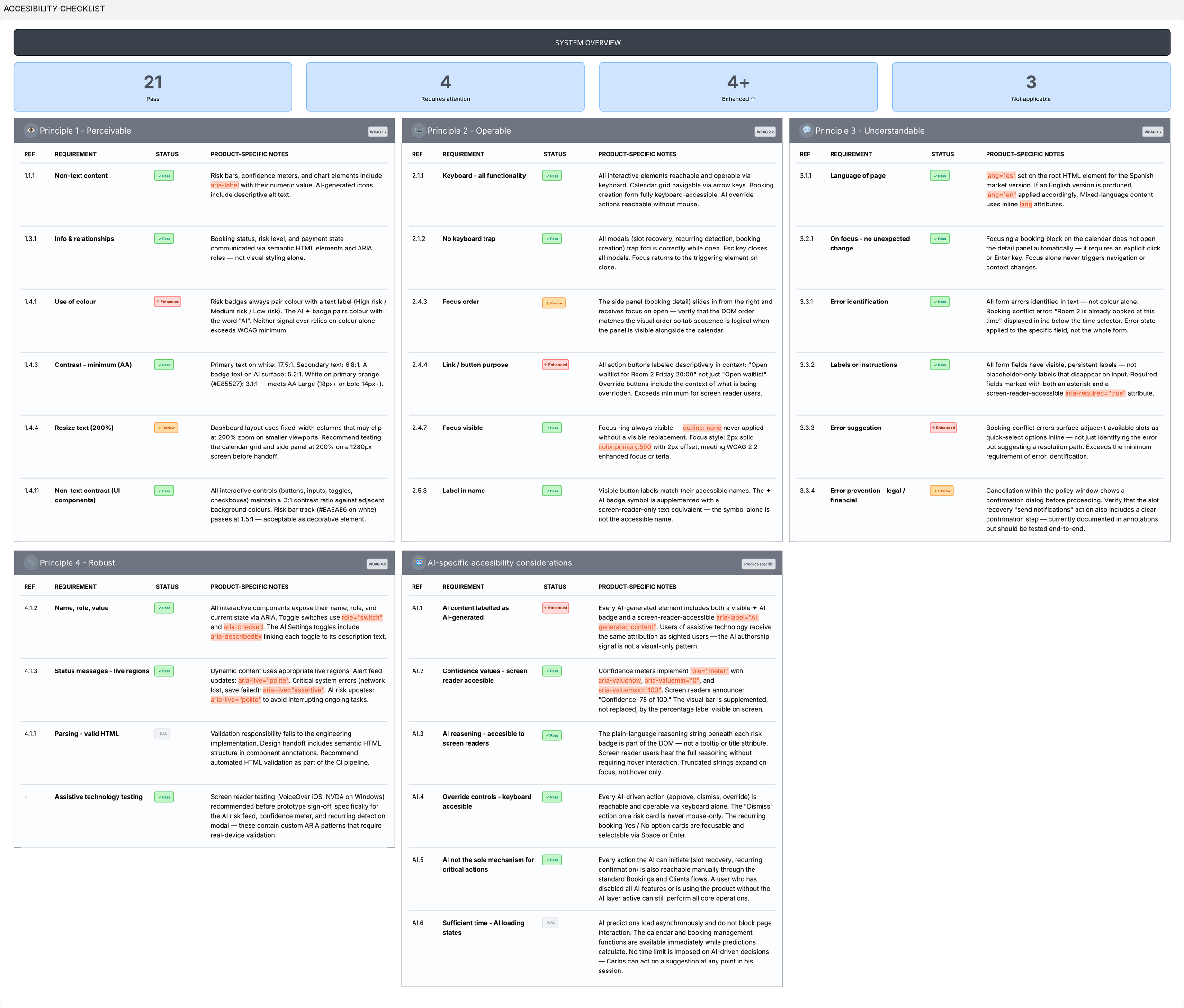
Dev annotations
Dev annotations explain the decisions, the specific, screen-level notes that tell a developer not just what a component looks like, but why it behaves the way it does, what happens in states the happy path never reaches, and which details are non-negotiable versus which are open to implementation judgement.
For a product where AI is a core feature rather than a decorative layer, annotations carry more weight than they would in a standard interface. Many of the most important design decisions in this product are invisible at first glance, none of these decisions are legible from a static screen alone. Without annotation, a developer implementing this product faithfully would have to guess at the intent behind each of them and some of those guesses would be wrong in ways that quietly undermine the trust the design was built to create.
Annotations were prioritised because they contain the highest concentration of AI-driven behaviour, the most edge cases, and the most copy that carries deliberate, research-informed wording that must not be altered in implementation.
Each annotation is tagged by type (Behavior, Visual, Data, Accessibility, State, or Copy) to help the developer understand at a glance what kind of constraint they are reading. Visual annotations describe implementation specifics that are not visible in the component spec alone. Behavior annotations describe interaction logic that no static mockup can convey. Copy annotations flag exact wording that was validated in research and must be preserved verbatim. State annotations define what to show when the default condition does not apply (because in a product that relies on AI predictions, the empty state, the loading state, and the fallback state are not edge cases).
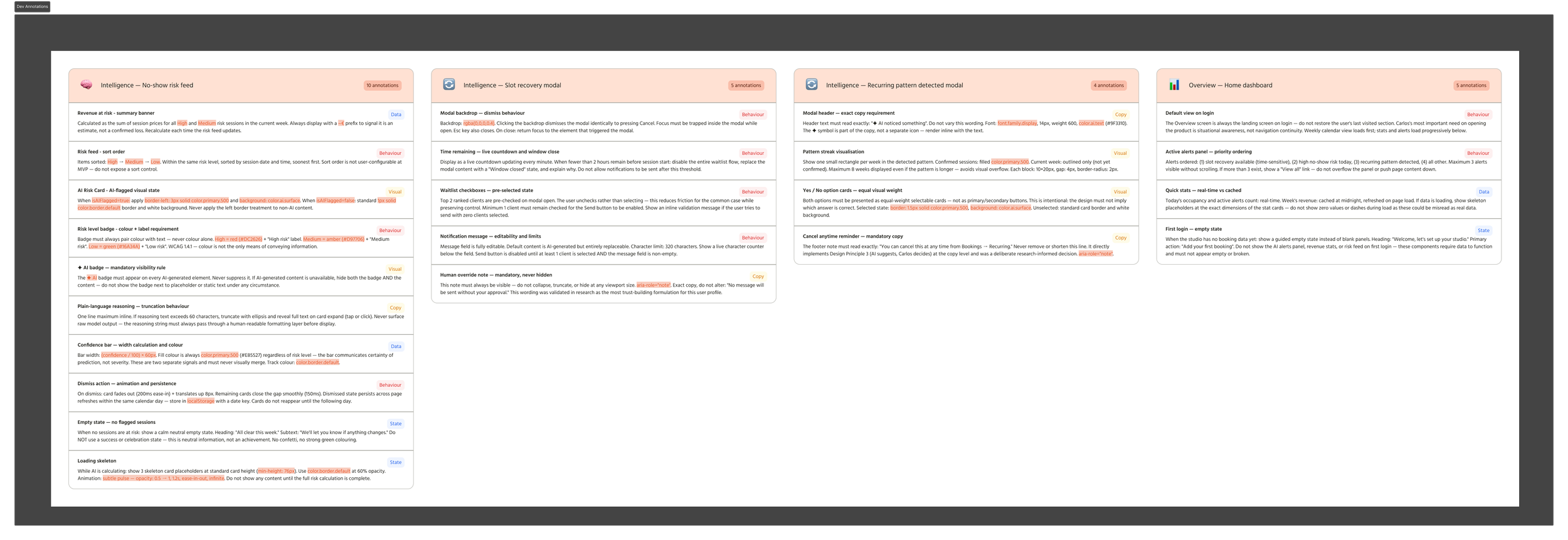
Edge cases & error states
Documenting edge cases and error states is one of the most telling exercises in a design process, because it forces a confrontation with the gap between the ideal experience and the real one. Every happy path assumption gets stress-tested. Every AI feature has to answer the question of what it does when it can't do what it was designed for. Every flow has to have an end state, not just a success state, but a resolved state, even when resolution means failure.
Fourteen edge cases and error states were identified and documented across four categories: AI intelligence failures, booking management errors, empty and first-use states, and system and connectivity errors. Each is documented with its trigger condition, the UI response it produces, and the recovery path (because an error without a clear route back to normal operation is not a handled error, it is a dead end).
The AI-specific cases deserve particular attention, because they are the most distinctive and the most consequential. When the model has insufficient data, showing a score would be worse than showing nothing at all. When confidence falls below threshold, suppressing the prediction is the more honest design choice. And when a recurring pattern breaks after months of reliable automation, the system must notice, surface the observation at the right moment, and give a clear set of options.
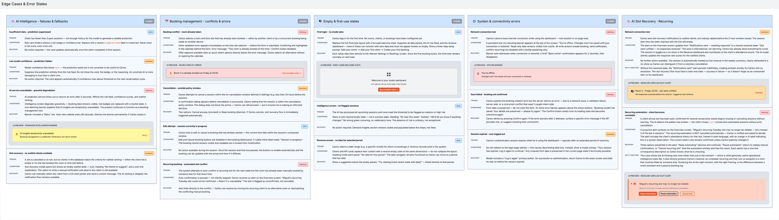
AI model spec
The AI model specification is the document that sits between the design system and the engineering implementation, describing not how the product looks, but how it thinks. It defines the three models that power the product's AI layer, the data they consume, the outputs they produce, the thresholds that govern when those outputs are surfaced to users and when they are withheld, and the conditions under which each model fails gracefully rather than failing silently.
Two principles run through all three specifications and are worth naming explicitly. The first is that the models operate within strict confidence thresholds, predictions below 50% confidence are suppressed entirely, and predictions without sufficient historical data are replaced with honest fallback states rather than fabricated scores. An uncertain AI that stays quiet is more trustworthy than an uncertain AI that speaks. The second is that no model triggers any autonomous action without users explicit approval, unless they have chosen to enable automation through the AI Behaviour settings. The models surface observations. Users makes decisions. That boundary is enforced at the specification level, not just at the design level.
The specification also documents what the system cannot do (cold start limitations, the absence of causal reasoning, the per-studio training scope that protects client privacy at the cost of early prediction accuracy). These are not omissions or weaknesses to be buried. They are the honest edges of what the product is in its first release, and documenting them is part of designing a product that earns trust rather than one that overpromises and quietly disappoints.
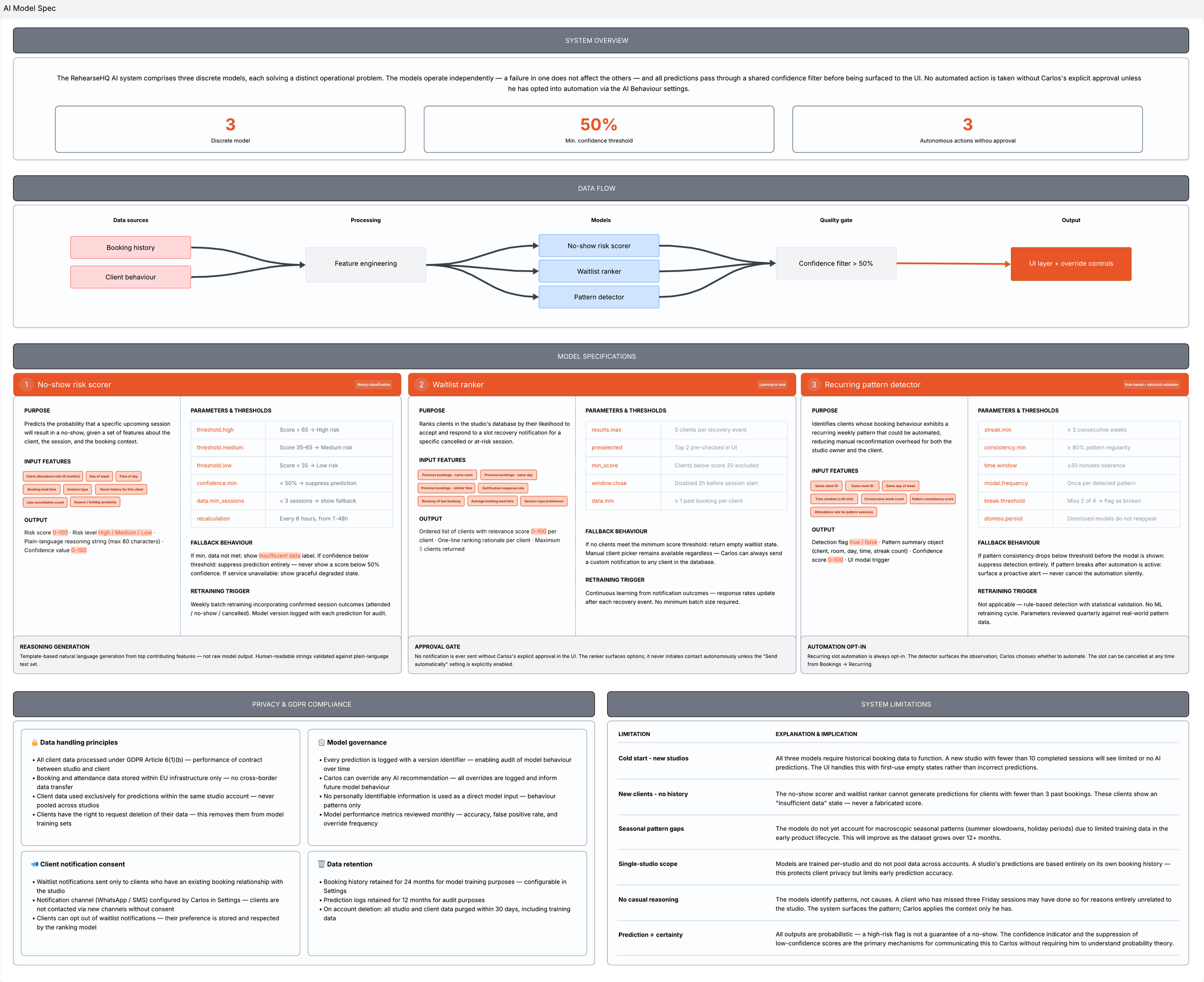
Accessibility checklist
Accessibility is not a phase that happens after design is complete. It is a set of constraints that should shape design decisions from the beginning. Treating it as a retrofit is both technically harder and ethically weaker than building it in from the start.
The checklist that follows maps the product against the four WCAG 2.2 principles — Perceivable, Operable, Understandable, and Robust — and adds a fifth section specific to this product: the accessibility implications of AI-generated content. This last section is the most distinctive and the most important. AI interfaces introduce accessibility challenges that standard WCAG criteria were not written to address (how to communicate AI authorship to screen reader users, how to make probabilistic confidence values accessible without requiring the user to understand probability, how to ensure that the intelligence layer never becomes a barrier to the core function of the product for users who interact with it differently).
Across thirty two criteria, twenty one pass, four are enhanced beyond the WCAG minimum, four are flagged for attention before implementation, and three are not applicable to the product in its current scope. The items flagged for attention are genuine unresolved questions rather than box-ticking, things that can only be properly resolved during engineering implementation and should be prioritised accordingly. The goal of this checklist is a product that every user can use fully, regardless of how they experience the interface.
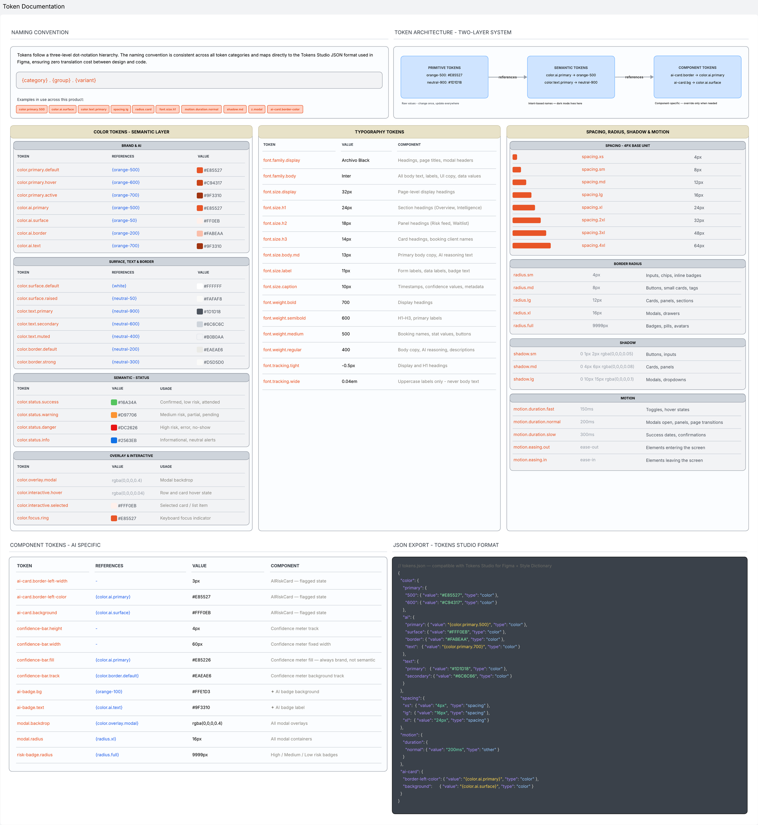
Token documentation
A design system without token documentation is a system that only its creator can maintain. Token documentation is the mechanism that prevents that fragmentation. It is the layer of the design system that sits between the visual decisions made in Figma and the implementation decisions made in code, translating intent into a format that is unambiguous, version-controllable, and portable across tools and frameworks.
The token system for this product is structured across three layers. Primitive tokens define the raw values. Semantic tokens assign meaningful, intent-based names to those primitives, but it communicates purpose rather than value, meaning it can be updated, overridden, or swapped entirely without touching the components that consume it. Component tokens sit at the third level, capturing the specific overrides that apply to individual components, values that are too specific to belong in the semantic layer but too important to leave undocumented.
The AI-specific component tokens deserve particular attention because they encode design decisions that would otherwise be invisible in implementation. It is a deliberate decision, rooted in the design principle that the confidence meter communicates certainty of prediction, not severity of risk, and that these are two separate signals that must never merge visually. Documenting it as a named token makes that decision explicit, enforceable, and auditable. The token documentation exists to replace reasonable assumptions with definitive answers.
The full token set is exported in Tokens Studio JSON format, compatible with Style Dictionary for code generation and directly importable into Figma via the Tokens Studio plugin. This means the token documentation is not a static reference artefact, it is a live source of truth that both designers and engineers work from, ensuring that a change made in one place propagates everywhere it needs to without manual coordination.
After implementation
This project highlights the importance of design as a tool for simplification, especially when dealing with emerging technologies.
Success metrics (KPIs)
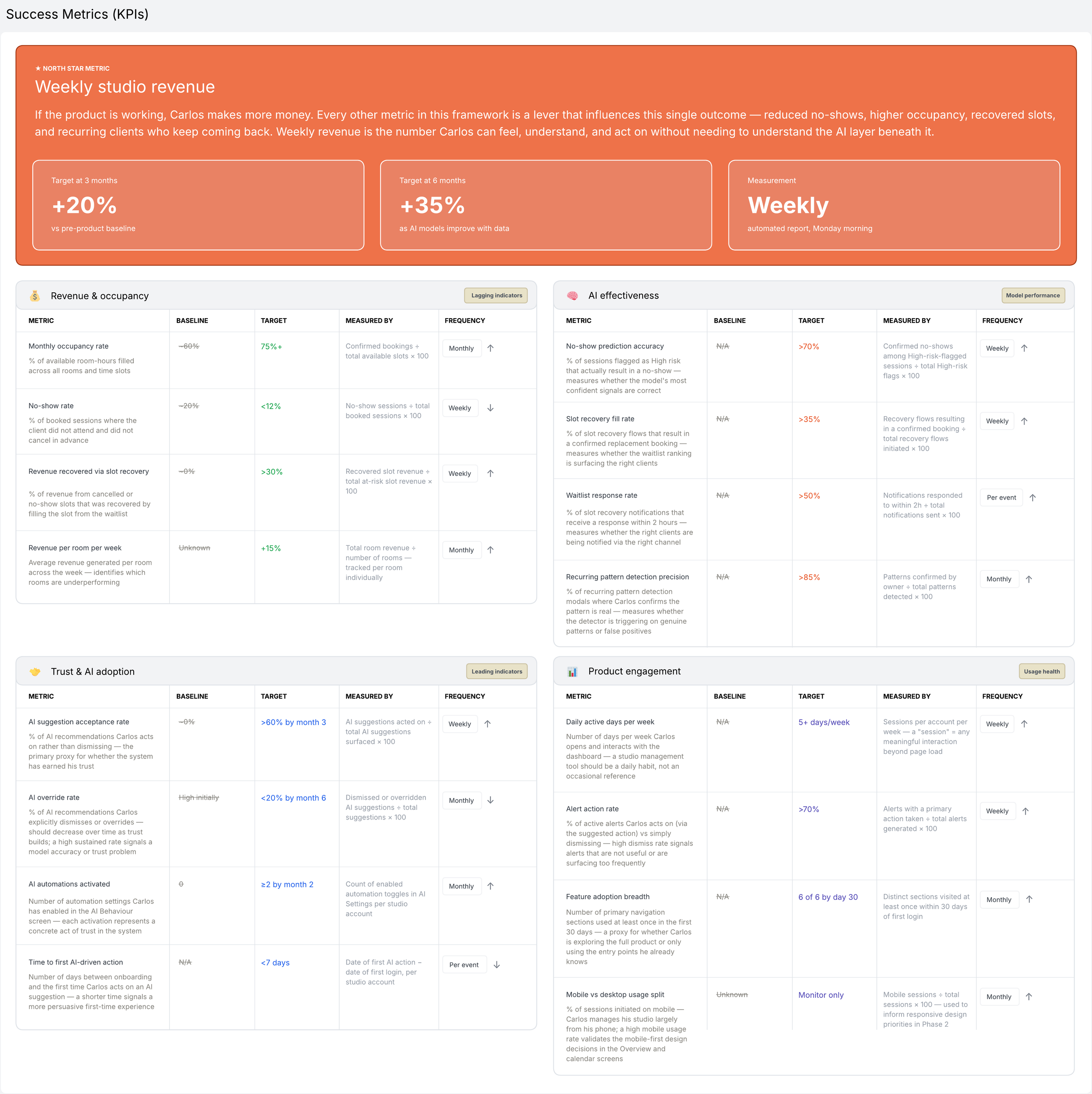
Defining success metrics before implementation is the act of making the product's promises explicit and giving the team a shared language for evaluating whether those promises were kept. Without them, post-launch decisions are made on intuition and anecdote. With them, every iteration has a direction.
The metrics framework for this product is organised across four categories: revenue and occupancy, AI effectiveness, trust and adoption, and product engagement. Each category addresses a different dimension of whether the product is working, whether the AI is performing as designed and whether his relationship with the system is evolving in the right direction over time.
The North Star metric is weekly studio revenue. Occupancy rates, no-show percentages, and slot recovery rates are all meaningful signals, but they are levers rather than outcomes. Weekly revenue is the number users feels directly, the one they can relate back to own experience without needing to understand the product's internal logic. Every other metric in this framework is a mechanism that influences that single number and measuring them separately allows the team to identify which mechanisms are working and which need attention.
The AI effectiveness metrics are the most technically specific in the framework and the most important to monitor closely in the first three months.
The trust and adoption metrics deserve particular attention because they behave differently from most engagement metrics. These are not metrics that plateau at a healthy level, they are metrics that tell a story about a relationship between a user and an intelligent tool, and reading that story correctly requires tracking them longitudinally rather than at a single point in time. If the override rate is still high at six months, it is a signal that either the model is underperforming or the explanations the product provides are not sufficient to earn the trust that acting on a recommendation requires. Both of those are design problems as much as engineering ones, and both are addressable but only if the metric is being watched.
Usability testing plan
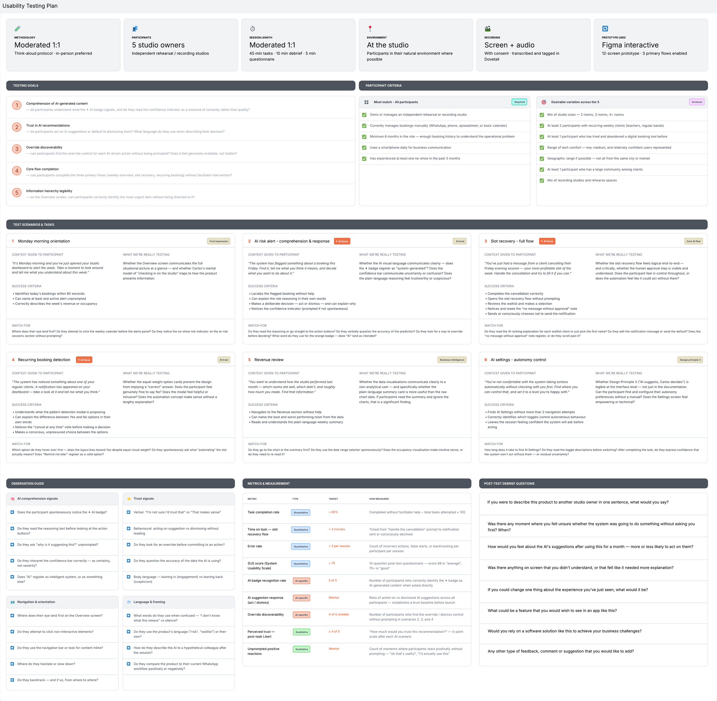
The usability testing plan for this product was designed around a specific and unusual challenge. Most usability tests ask whether users can complete a task, this one asks an additional, harder question: whether users trust the system that is guiding them through it. For a product where the core value proposition is an AI layer that surfaces predictions, suggests actions, and over time begins to operate autonomously on user’s behalf, trust is not a secondary concern. It is the primary condition under which the product works at all. A studio owner who dismisses every AI suggestion is not using an AI-powered dashboard but an expensive booking calendar.
Five moderated one-to-one sessions were designed, each running approximately sixty minutes, with participants recruited from independent studio owners who currently manage bookings manually. The choice to conduct sessions in person at the studio was deliberate. Observing participants in that environment surfaces behaviours that a remote session simply cannot replicate.
Six test scenarios were developed, each framed as a realistic situation rather than a feature demonstration. Participants are never asked to "use the Intelligence section" or "complete the slot recovery flow." They are told that a client has just cancelled a Friday evening session, or that the system has noticed something about a regular booking. This framing matters since it is the difference between testing whether someone can operate a feature and testing whether the product fits into how they actually think about their working day. Four of the six scenarios are specifically designed to stress-test the AI layer. The observations captured in these four scenarios will determine not just what needs to be fixed before launch, but whether the fundamental trust architecture of the product is sound.
The test produces both quantitative outputs and qualitative ones. Both types of data will be transcribed and tagged in Dovetail, the same tool used to analyse the original research interviews, creating a continuous thread between what users told us in the discovery phase and what they showed us in the validation phase.
A/B test hypotheses
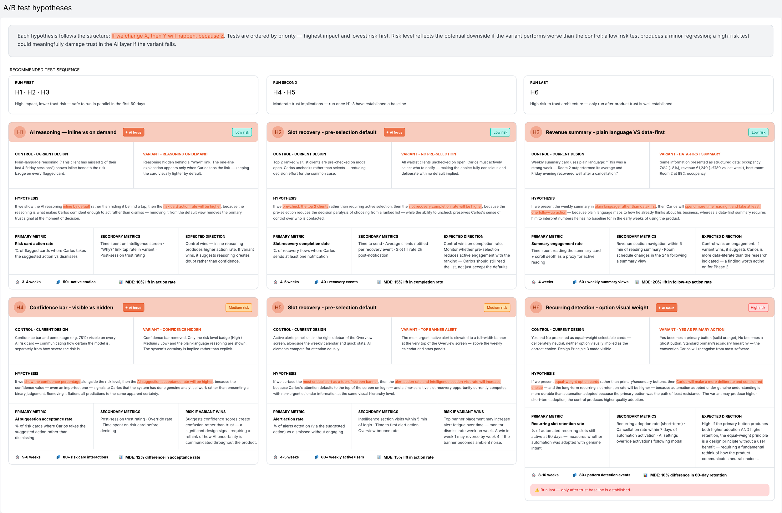
Every design decision in this project was grounded in research, shaped by the design principles, and validated through the usability testing plan. Research tells what users say and do in a controlled context while A/B testing tells what they actually do at scale, over time. The two are complementary and a product that relies only on one of them is a product that stops learning.
Six hypotheses were defined, each targeting a specific design decision that carries real uncertainty. The six tests are sequenced deliberately. The first three are lower risk: they test surface-level design choices where a losing result produces a minor regression and a clear iteration path. The final three carry higher stakes. H4 tests whether the confidence bar actually builds trust or quietly undermines it by making the system's uncertainty visible in a way that paralyses rather than informs. If the variant wins and hiding the confidence score produces higher acceptance rates, it is not a small optimisation finding, but it is a signal that the entire theory of how this product communicates AI uncertainty needs to be reconsidered.
H6 is the most philosophically significant test in the set. It tests whether the equal-weight option cards in the recurring booking detection modal actually serve users. If presenting Yes as a primary button produces both higher short-term adoption and higher long-term retention, then the equal-weight principle is a design value without a user benefit. That is an uncomfortable finding. It is also a necessary one and the only honest response to it is to run the test and let the evidence revise the principle rather than the other way around.
That willingness to be wrong is what separates a hypothesis from an assumption and what makes a testing programme worth running.
Iteration roadmap
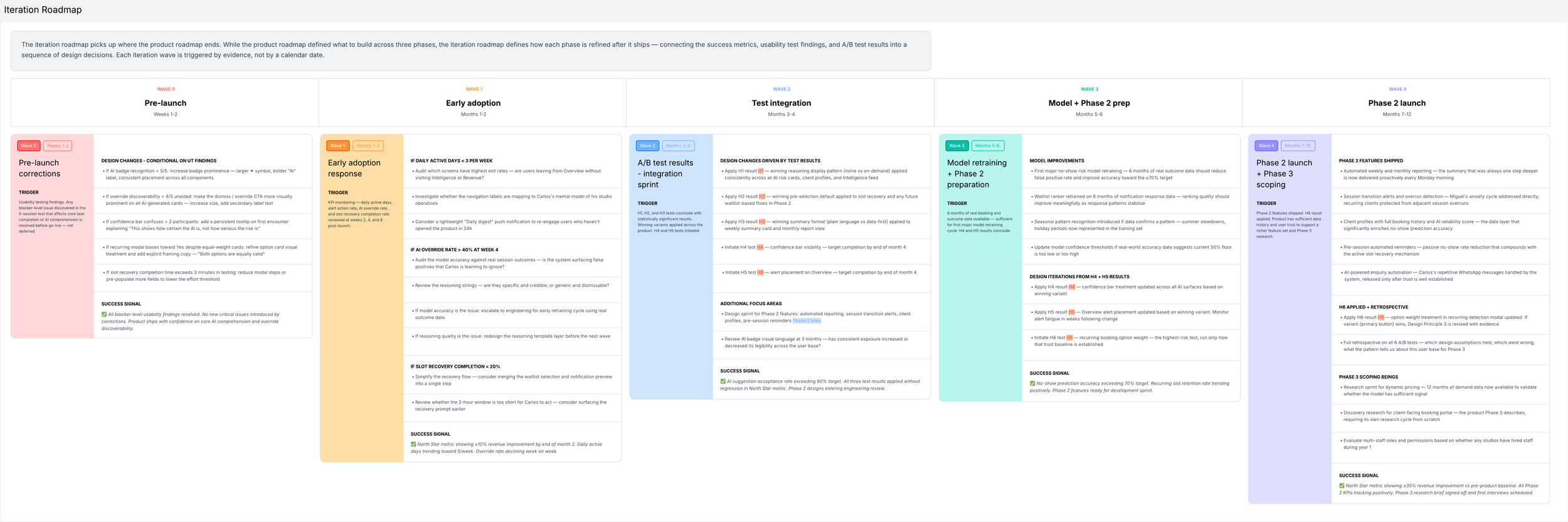
Shipping a product is not the end of the design process. It’s the point at which the design process has access to the data it needs to improve. Before launch, every decision is made on the basis of research and informed assumption. After launch, the product generates real evidence. The iteration roadmap translates that evidence into a sequence of design responses. It is structured across five waves, each triggered by a specific signal rather than a fixed calendar date because iteration driven by evidence is fundamentally different from iteration driven by a sprint cycle. Wave 0 happens before launch, addressing any blocker-level findings from the usability testing. Waves 1 through 4 follow at roughly two-month intervals, each building on the data produced by the previous one.
Two principles govern the sequencing. The first is that trust precedes capability. Phase 2 features are withheld until the data shows that users are acting on AI suggestions rather than dismissing them, and that the override rate is declining rather than plateauing. Introducing more automation into a relationship where trust has not yet been established does not accelerate adoption, it accelerates abandonment. The second principle is that the highest-risk design experiments run last. H6 is not run until month 5 at the earliest, after a trust baseline has been established and the product has enough data history to distinguish genuine preference from novelty effects.
The roadmap ends at month 12 with Phase 2 fully shipped, all six A/B tests concluded and applied, and Phase 3 scoping underway. At that point the product looks substantially different from the one that launched. That progression from informed assumption to evidence-based certainty is not a failure of the initial design. It is what good design looks like over time.
Retrospective
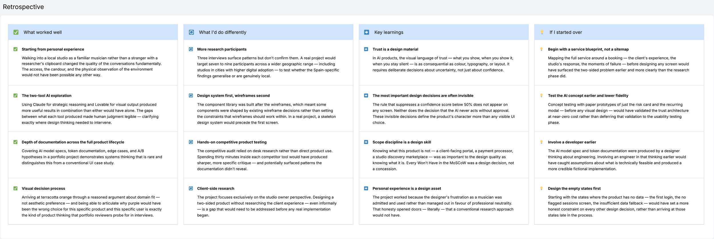
This project began as a portfolio piece and became something more interesting, an experiment on what it means to design with AI rather than alongside it.
The original intention was straightforward: create a UX case study that demonstrated AI literacy at a moment when every job description in the industry was listing it as a beneficial skill. But the more the project developed, the more it became clear that demonstrating AI literacy by simply dropping a few generated images into a Figma file would miss the point entirely. The question worth exploring was more fundamental: could AI tools genuinely support the full depth of a UX process (not just the visual execution, but the research, the synthesis, the strategic framing, the system design, and the documentation) in a way that produced something credible enough to function as a real product concept rather than a polished fiction?
The answer, after working through every phase of this project with that question in mind, is a qualified yes. Because the honest finding is not that AI tools can replace design thinking but that they can dramatically expand what a single designer can produce, explore, and document when used as genuine collaborators rather than as shortcuts.
What made this experiment genuinely interesting was the deliberate choice to use different tools for different kinds of thinking. Claude and/or Perplexity were used for the strategic and analytical work: developing the problem statement, building the personas, writing the HMW statements, specifying the AI model logic, documenting the token architecture, drafting the usability testing plan. On the visual side, Lovable and/or Uizard was used for visual exploration: rendering design concepts quickly, testing how the visual direction felt in an actual interface context, producing something tangible to react to before committing to a direction in Figma. The two tools produced fundamentally different kinds of output, and working with both simultaneously created a productive tension: Claude's outputs tended toward rigour and structure; Lovable's toward immediacy and visual intuition. Neither was sufficient alone. Together they covered most of the ground a small design team would have covered.
Every AI output, regardless of which tool produced it, required a designer's judgment to evaluate, refine, discard, or combine. The competitive positioning map required knowing enough about the market to assess whether the placements were honest. The persona quotes required knowing enough about the research to judge whether they were credible. The AI model specification required knowing enough about how machine learning systems actually behave to write constraints that would hold up to engineering scrutiny. In each case, the AI produced a first draft that was better than a blank page but not yet good enough. The design work was in the gap between those two states.
This is perhaps the most important professional learning the project produced. AI tools are genuinely powerful accelerators, they compress the time between a question and a plausible answer in a way that changes what a solo designer can attempt. But they do not compress the time between a plausible answer and a correct one. That gap still requires domain knowledge, critical judgment, and contextual understanding.
The project was designed to avoid the trap of being a "test AI tools" exercise, a portfolio piece where the AI is the subject rather than the instrument. Every decision was made in service of producing a product concept that could genuinely exist. Whether that intention was achieved is for others to judge. But the attempt to hold both things simultaneously (rigorous UX process and genuine AI exploration) is itself the point. Because that combination, navigated with discipline and honesty about what each contributes, is increasingly what designing products in the world actually looks like.
The single most important thing this project taught me:
“Designing with AI does not make the hard questions easier. It makes them harder to avoid. When the cost of exploring a question drops, the questions you chose not to answer stop being practical compromises and start being deliberate choices. And deliberate choices have to be justified.”