M360
✧
M360 ✧

Designing a scalable B2B product interface that turns complex real-estate data into clear, actionable insights.
Marketer Real Estate Technologies is a Norwegian SaaS company that delivers advanced marketing automation tools for real estate professionals. Their flagship platform, M360, enables property developers and real estate agencies to plan, launch, and manage marketing campaigns from a single, integrated workspace. By automating and simplifying tasks like campaign creation, sales tracking, and lead management, M360 helps users reduce costs and time-to-market while improving customer conversion rates.
As a Senior UX Designer, I worked on the core product experience in a highly collaborative UX team within the Product Department, where I played a key role in shaping the UI of the company’s B2B platform. I was responsible for end-to-end design work, collaborating closely with PMs, engineers, data scientists, and fellow designers restructuring complex workflows, uncovering research insights, elevating UI clarity, and contributing to a scalable design system used across the platform.
My contributions helped refine the product experience, strengthen its market presence, and attract new clients.
Role: Senior UI/UX Designer
Team: 1 Lead Product designer, 3 UX Designers, 1 Junior UI/UX Designer
Company: Marketer Real Estate Technologies
Credits: Sylvain Marengere (Lead Product Designer), Magnus Smogeli (UX Designer), Xia Li (UX Designer), Ignacio de Villalaín (Junior UI/UX Designer)
Challenge & Project Approach
M360 was powerful, but fragmented
Designing for the real estate sector especially through a B2B lens comes with a unique set of challenges. I approached them with a user-centered, research-driven mindset while working within the constraints and pace of an agile SaaS product team. The goal was not only to redesign specific screens or flows but to address the deeper problem of clarity, usability, and consistency across a complex, evolving product.
When I joined the team, the platform was already functional and in use, but the user experience revealed signs of fragmentation. While the tool had power, it lacked the clarity and simplicity that real estate professionals needed to feel confident and in control. For example, users were often unsure how to proceed from one step to the next and the terminology used across the platform wasn’t always aligned with how users thought or worked.
Our main challenge was to make M360 smarter, cleaner, and more intuitive without stripping away its depth. The platform had to scale from small agencies handling one campaign to large developers running simultaneous, multi-phase launches. From experienced digital marketers to sales representatives and project managers with limited technical background. On top of that, the product was aimed to scale internationally, supporting multiple markets and regulatory requirements.
My approach, as part of a team of UX Designers, was to focus on bringing structural clarity, consistency, and scalable patterns to aligning business growth goals with user confidence and operational efficiency.
Some of the most significant challenges we addressed included:
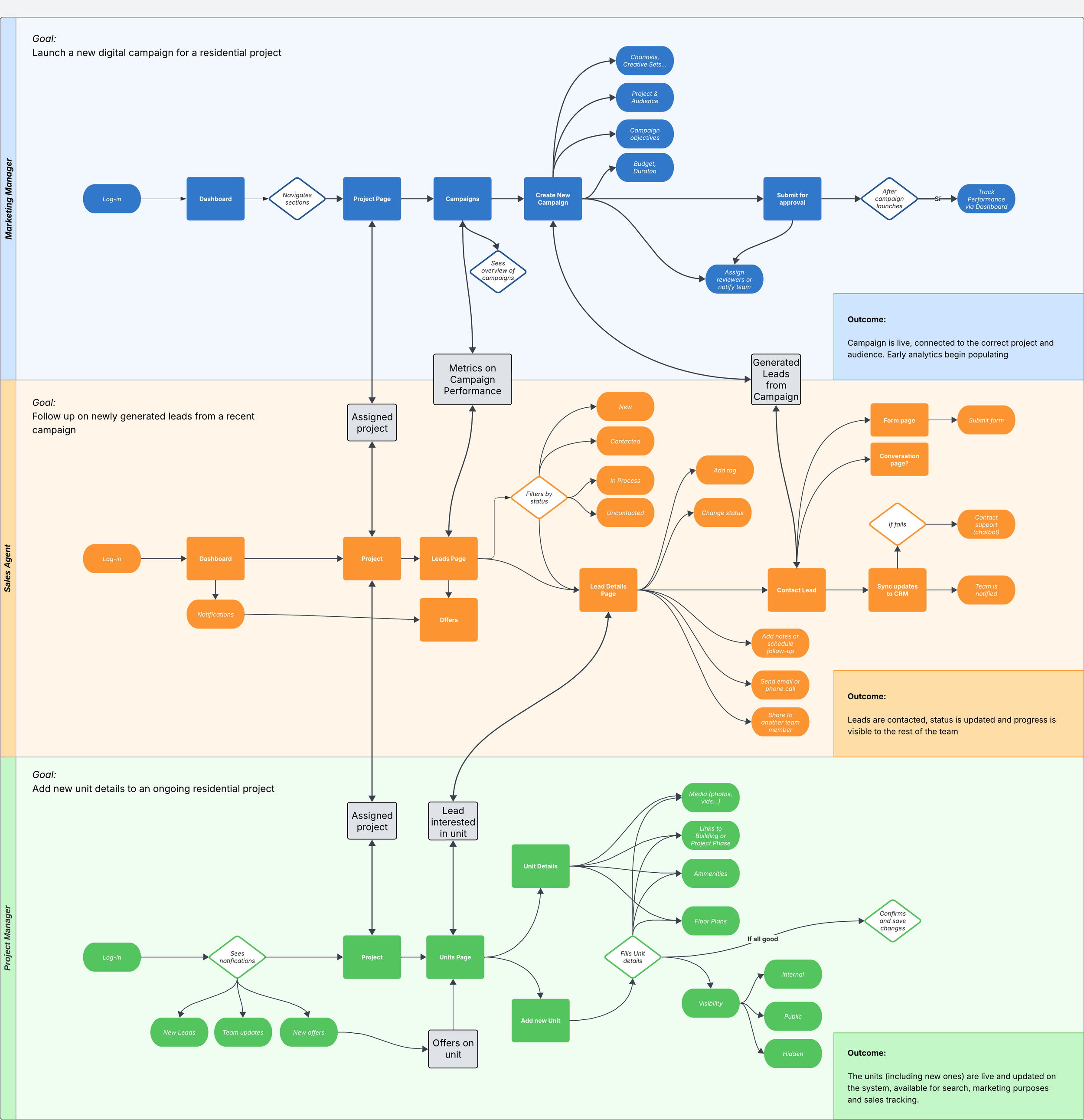
Complex, nonlinear workflows: Users needed to set up campaigns, define audiences, integrate CRMs, create content, and track results—often jumping between tasks. This made designing a clear, progressive flow extremely difficult.
Highly variable user expertise: Some users were seasoned marketers, while others were sales reps or project managers with non extensive digital experience. We had to design for both ends of the spectrum without overwhelming or oversimplifying.
International scalability: The platform had to support localization for different markets, with different languages, legal rules, etc.
Legacy UX decisions: As with many growing platforms, M360 carried inherited design patterns that hadn’t been updated or reconsidered. These created inconsistencies that slowed users down and confused new customers.

Discovery & Research
Unlike a greenfield project, M360 was already being used by real estate professionals across multiple markets when I joined. This meant discovery was less about defining hypothetical users and more about understanding real workflows, friction points, and behavioral patterns within a live environment
My work always began by seeking to understand both the user and the business context. This involved planning and running user interviews, collaborating with our PMs and customer success team to identify recurring pain points, and gathering feedback from real estate professionals who used M360 daily. These conversations gave us a direct window into their frustrations.
Because M360 served professionals operating under time pressure and financial accountability, we paid particular attention to moments where uncertainty could translate into hesitation or operational risk. This insight shifted our focus from simply “simplifying UI” to improving cognitive clarity and workflow guidance. We documented recurring friction points, mapped existing user journeys against intended product logic, and prioritized opportunities where structural changes would create the most meaningful impact. This research phase provided the foundation for reframing the product around clearer mental models, progressive disclosure, and more predictable interaction patterns.
To make sense of this research, I worked with the team to map user journeys that captured typical paths through the platform. We identified friction points, hand-off problems between roles (like marketing and sales), and places where users dropped out or resorted to external tools and workarounds. This mapping exercise became an essential shared reference for the team, keeping us aligned on which user problems were most critical to solve.
We also spent time reviewing data from our support channels and analytics, looking for evidence of recurring issues and areas where users stalled or needed help. By grounding our understanding in both qualitative and quantitative data, we ensured we were prioritizing the right problems.
Research methods and key insights
I helped the team identify clear opportunities for improvement applying methodology such as:
Empathy Maps
Helped us align on what different user types were thinking, feeling, and struggling with during campaign setup and management, revealing emotional friction points around uncertainty and lack of clarity.Roadmap Prioritization Workshops (Cross-Functional)
Conducted collaborative sessions with Product and Engineering to align research insights with business goals, helping us identify high-impact usability improvements that could strengthen market positioning.Project Lifecycle Definition
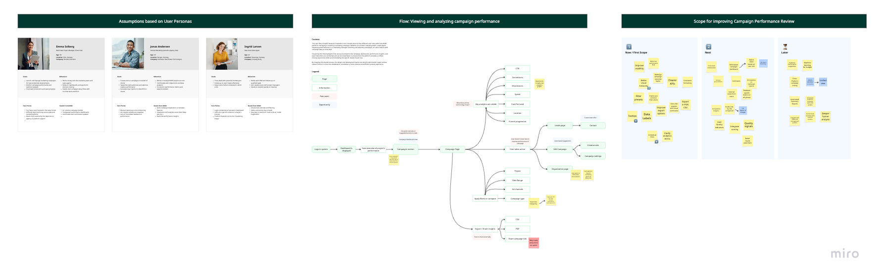
Mapped the end-to-end lifecycle of a real estate marketing project highlighting gaps between how users actually worked and how the platform structured tasks.User Personas
Clarified differences between marketers, sales representatives, and project managers, uncovering varying levels of digital maturity and decision-making responsibilities that influenced workflow expectations.User Flow Mapping
Visualized existing and ideal task flows to identify redundant steps, navigation inconsistencies, and non-linear behaviors that were not properly supported by the interface.Documentation & Insight Sharing
Created structured research documentation to ensure findings were accessible across the Product team, improving alignment and reducing repeated assumptions in future feature discussions.External Stakeholder Interviews
Provided direct qualitative feedback from real estate professionals, uncovering terminology misalignment, pain points in CRM integrations, and areas where users lacked confidence in decision-making.


Information architecture & Product structure
Because real estate marketing projects are inherently non-linear, the product structure needed to support flexibility without feeling chaotic. Instead of forcing users into rigid, step-by-step flows, we introduced clearer hierarchy, contextual navigation, and progressive disclosure to guide users while still allowing them to move between tasks fluidly
M360 supported the full lifecycle of digital marketing for real estate developments. However, as the platform evolved, features had been added incrementally, resulting in navigation patterns and task groupings that no longer reflected how users actually approached their work. One of our primary objectives was to realign the information architecture with real-world workflows rather than internal feature logic. We revisited how project management, campaigns, assets, integrations and analytics were structured, grouping them around clearer functional domains that matched users’ mental models. This helped reduce cognitive load and made it easier for users to understand where they were within the system and what actions were available at each stage.
We standardized structural patterns across modules (such as campaign configuration or asset management) to create predictability in layout and interaction. At the same time, scalability was a core consideration: the architecture had to support both small agencies managing a single development and large enterprise clients running multi-phase launches across markets. By focusing on structural clarity and reusable patterns, we strengthened the platform’s foundation, making it easier to extend with new capabilities without reintroducing fragmentation.
Through findings uncovered during user research, we identified recurring structural friction points that were slowing users down and undermining confidence in the platform:
Cluttered layouts: Key fields were buried or scattered across multiple tabs, increasing cognitive load and leading to avoidable data entry errors.
Poor hierarchy: Users struggled to understand how Buildings and Units related to each other, particularly in large-scale projects with complex structures.
No clear progress indicators: There was little sense of workflow progression or completion, making initial setup feel overwhelming especially for first-time users.
Inconsistent terminology: Labels and naming conventions didn’t always match industry expectations and sometimes translated poorly across international markets.
Limited bulk editing capabilities: Entering or updating dozens of units individually was tedious, pushing users to rely on offline spreadsheets and manual workarounds.
I worked closely with PMs, engineering, and other designers to overhaul these sections, with a focus on clarity, efficiency, and scalability. We began by tackling the information architecture to make it more transparent and intuitive. By introducing clearer hierarchy and consistent navigation users could always understand where they were in the process and how their data fit together. This was essential for multi-building projects, where confusion about scope often led to data entry errors or duplicated work.

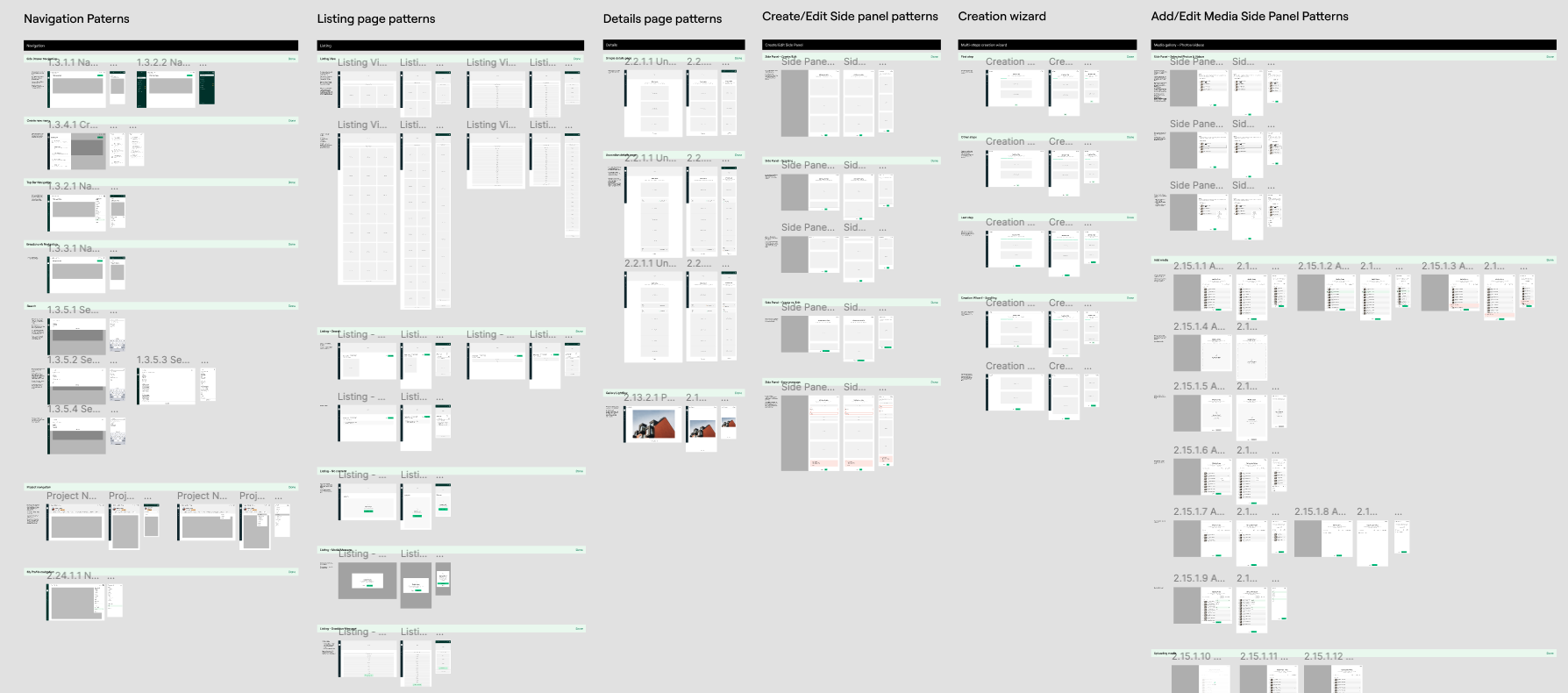
Design system & UX patterns
As workflows matured, consistency became critical.
As M360 evolved, its visual language and interaction patterns had grown organically alongside new features, leading to inconsistencies across modules. Similar actions behaved differently depending on context, layouts varied between sections, and UI components were not always reused systematically. As part of a team of Senior UX Designers, we worked to bring cohesion to the platform by strengthening the underlying design system and aligning on shared UX principles
I helped document usage guidelines and ensured components were aligned with accessibility standards and responsive behavior. This work allowed us to create a more cohesive and efficient design workflow, while also enabling engineers to implement features with greater consistency and speed aligning the Figma components with what the Devs implemented on Storybook. In parallel, I participated in shaping the evolution of Marketer’s visual identity and brand expression within the product. Together with the team, we explored typographic refinements, color usage, and layout systems that reinforced the company’s brand. This collaborative effort helped to bridge the gap between functionality and aesthetics.
This involved auditing existing components, identifying redundancies, and defining standardized patterns for common structures such as data tables, form layouts, configuration panels, and status indicators. The goal was not only visual consistency, but behavioral predictability—ensuring that users could transfer knowledge from one section of the platform to another without friction.
We introduced clearer rules around hierarchy, spacing, and component usage, along with interaction standards for progressive disclosure, validation states, bulk actions, and feedback mechanisms. Particular attention was given to high-density B2B interfaces, where large volumes of structured data needed to remain readable and actionable. By formalizing reusable patterns for complex tasks like campaign setup, unit management, and CRM integration, we reduced ambiguity in both design and development. This systematic approach improved collaboration with engineering, accelerated iteration cycles, and made it easier to introduce new features without reintroducing fragmentation.
Over time, the strengthened design system became a strategic asset, supporting both usability improvements and the product’s broader goal of establishing a strong, credible presence in the real estate technology market.


Key features deep dive
While the redesign addressed foundational architecture and consistency challenges, its real impact became evident within the platform’s most complex and business-critical modules. These areas were central to how real estate professionals operated daily. Each required balancing high-density data, business logic, and usability. The goal was not only to simplify interfaces, but to clarify workflows, reduce friction, and align the product more closely with how users actually think and work.
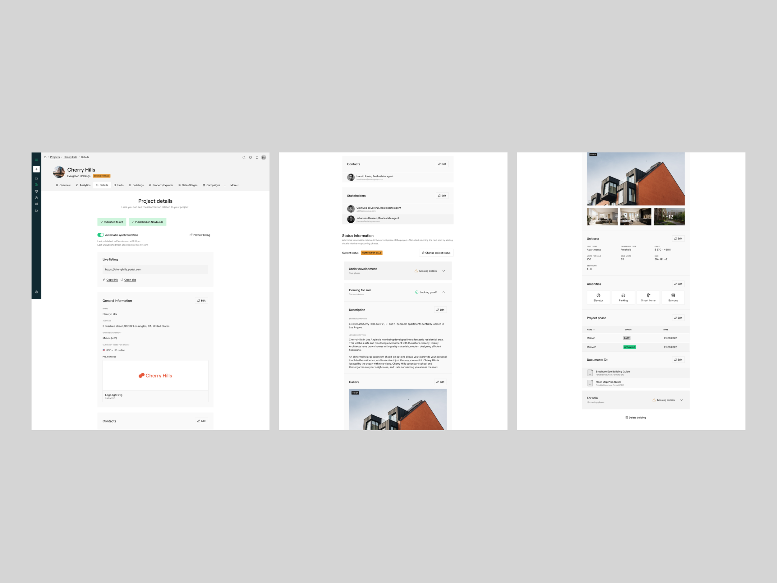
Projects Management (Buildings & Units)
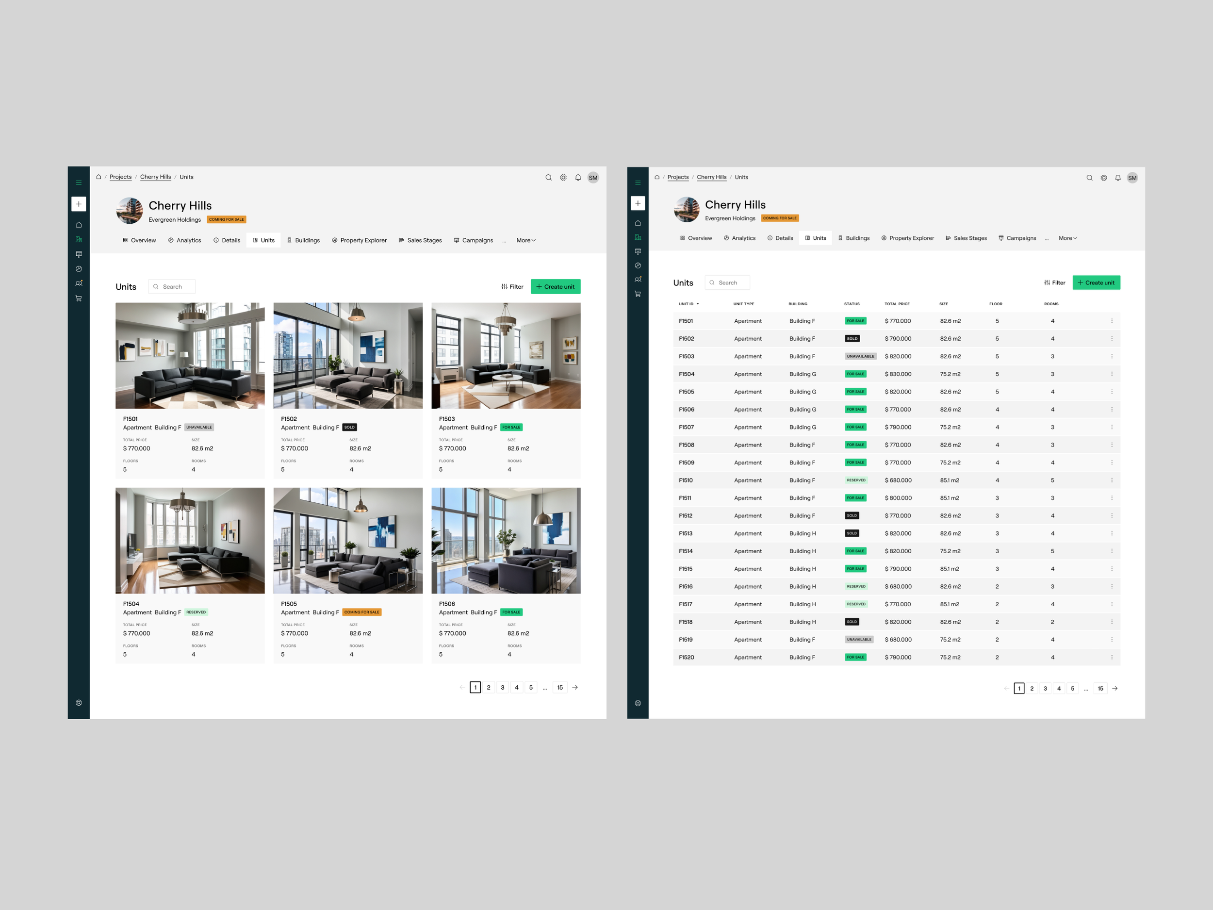
Managing real estate projects involves structuring buildings, floors, and individual units in a way that mirrors real-world hierarchies. Previously, relationships between these entities were not always intuitive, especially in large developments with hundreds of units.
We restructured this module around a clearer parent–child hierarchy, making Buildings the primary container and Units contextual within them. Navigation was simplified to allow users to move seamlessly between overview and detail levels without losing context. We also introduced improved bulk-editing patterns and structured tables optimized for high-density data entry. This significantly reduced manual effort and minimized the need for external spreadsheets, allowing users to manage complex inventories directly within the platform.
Another major focus was improving data entry efficiency, particularly for large projects with dozens or hundreds of units. To address this, we designed bulk import and export features compatible with industry-standard CSV and Excel formats. We also created batch-edit flows so users could quickly update attributes for multiple units in a single action. These improvements replaced clumsy, repetitive manual processes that often pushed users to manage inventory offline in spreadsheets.
We also added visual feedback and status indicators to make management easier. Users could now see unit statuses at a glance, enabling better inventory planning and faster updates during the sales process. We ensured the entire experience was responsive and optimized for tablet use, recognizing that many sales agents and developers interact with the platform on-site with clients.
Campaign Setup
The Campaigns section is designed to help real estate developers and marketing teams plan, launch, monitor, and analyze digital advertising campaigns promoting their projects. It's a core feature of the platform that bridges the gap between real estate marketing strategy and hands-on execution, empowering teams to manage ad budgets, audiences, creatives, and performance in one place.
Campaign creation was a high-stakes workflow where clarity and momentum were critical. However, the previous experience lacked clear progression and often overwhelmed users with scattered configuration options. We redesigned Campaign Setup as a guided, step-based flow with logical grouping of information and progressive disclosure. Each step clarified what was required versus optional, while contextual help reduced uncertainty. Clear validation states and progress indicators provided feedback and a sense of completion. The result was a more confident setup experience that aligned with users’ mental models and reduced setup errors.
Previously, the process of setting up and tracking campaigns often involved opaque workflows. Marketing teams struggled with unclear forms and a lack of guidance, making campaign creation intimidating. Meanwhile, once campaigns were live, it was difficult to get clear answers to questions like: Which audience performed best? Which creative drove the most leads? How well did our budget convert into results?
We overhauled the setup workflow itself, moving from a flat, cluttered interface to a more guided and structured experience. The new design made the onboarding process much less intimidating as we added contextual help and field-level guidance so users could complete forms confidently without needing to refer to documentation or call customer support.
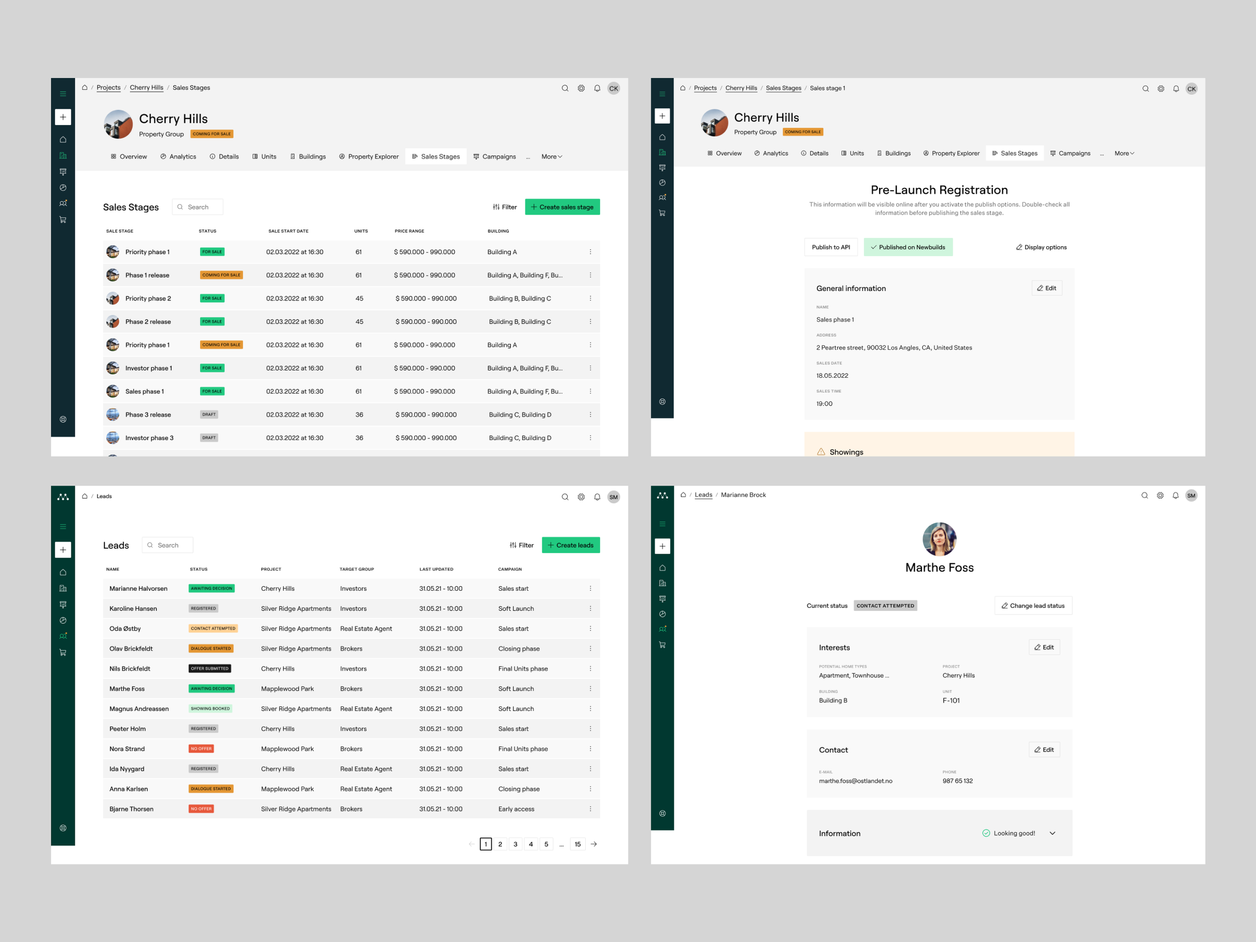
Sales Stages
Sales teams relied on the CRM module to track prospects across different stages of the buying journey. However, inconsistent status definitions and limited visibility across stages made it difficult to maintain pipeline clarity. The Sales Stages section enables teams to clearly define and manage these phases within a project. Each stage includes details like target audience, launch dates, price ranges, and which buildings or units are included. Previously, defining sales phases was ad hoc and poorly documented leading to confusion around launch timing, inventory, or pricing inconsistencies.
We refined stage definitions, standardized naming conventions, and improved visual differentiation between stages. Interaction patterns were aligned across pipeline views and detail views, ensuring predictable behavior. The improved structure made it easier for sales teams to understand deal progression at a glance and reduced ambiguity around next steps supporting more proactive sales management.
We made sales stages much easier to create, edit, and review. Tables now clearly list all stages with essential details visible at a glance, helping teams coordinate better. Dedicated detail views allow users to double-check dates, locations, and price ranges before publishing.
Selling new developments is rarely a one-size-fits-all release, developers often plan staggered sales phases to maximize interest and control pricing.
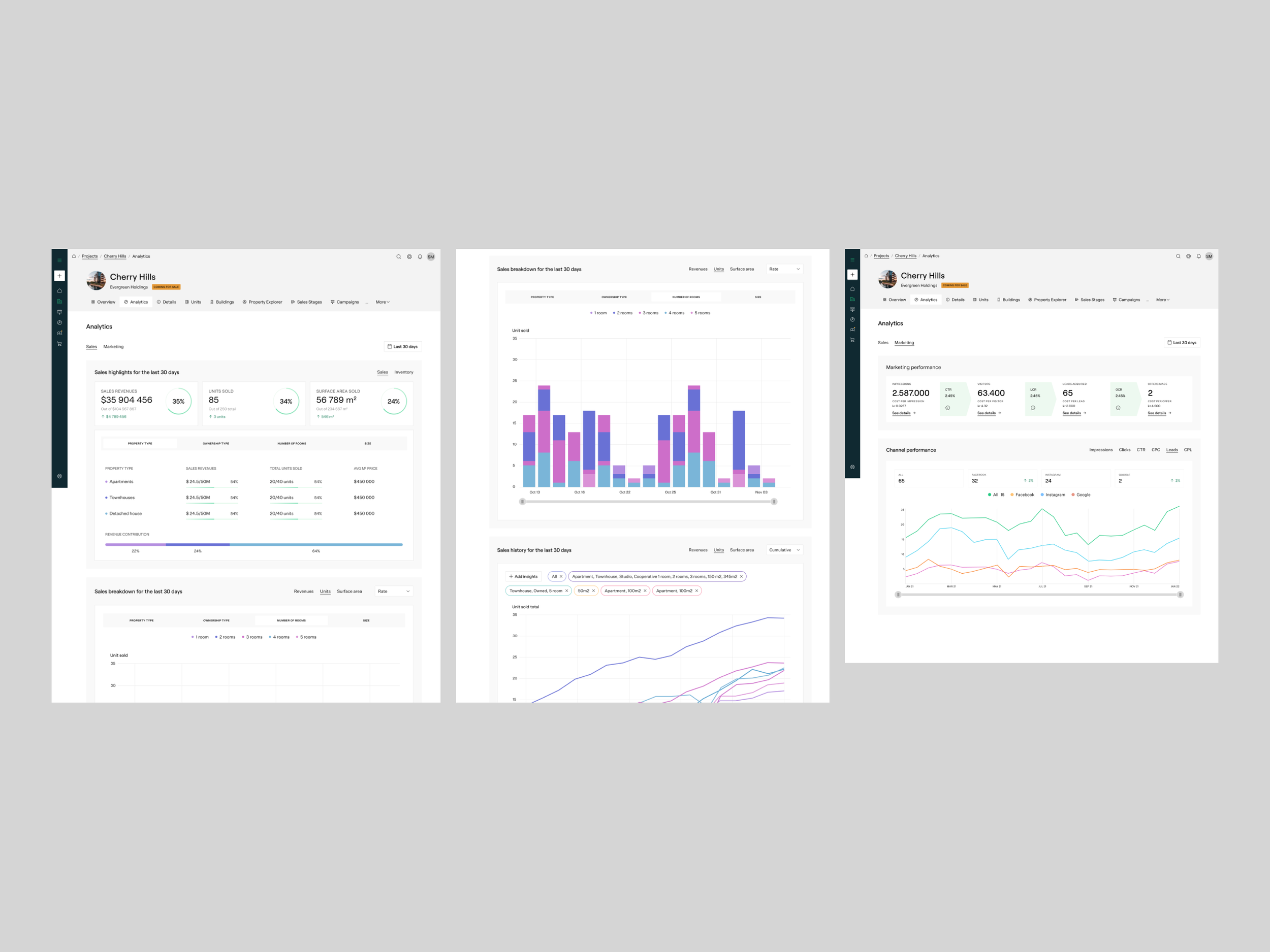
Analytics – Clear, Actionable Project Insights
The Analytics section in M360 provides a unified view of performance at a glance. It aggregates and visualizes key data about sales velocity, reservations, unit availability, and pricing trends across buildings or sales stages. Rather than relying on static, manually updated spreadsheets, users can now see up-to-date metrics in easy-to-read dashboards and charts. This helps teams answer crucial questions like:
Which units are selling fastest?
How many reservations are confirmed versus pending?
What’s the overall sales value achieved so far?
A robust and comprehensive Analytics section is a game-changer for real estate managers, providing the depth and clarity needed to make informed, data-driven decisions. Users can access detailed breakdowns of key performance metrics that are further categorized by sales performance and inventory, offering a clear view of what’s working and where adjustments might be needed. This empowers managers to maximize campaign effectiveness, improve ROI, and maintain a competitive edge in a dynamic market.
Analytics needed to communicate performance clearly while handling complex real estate metrics. Previously, insights were fragmented and sometimes difficult to interpret.
By redesigning the Analytics section we ensured users could get a quick pulse on the project while also exploring the details they need to inform pricing, staging, and marketing decisions. We focused on hierarchy and clarity prioritizing the most critical KPIs while supporting deeper exploration through structured filtering and drill-down capabilities. Visual consistency was aligned with the broader design system to ensure readability in data-dense environments. By improving layout logic and contextual grouping, analytics shifted from being a passive reporting area to a more actionable decision-support tool.


Property Picker: Improving Search and Selection for Buyers
A versatile tool that lets buyers explore and select units while supporting both B2B and B2C workflows.
The Property Picker is a central feature in M360, designed to help prospective buyers browse, filter, and select individual units within a real estate project. Its true strength lies in versatility: the tool is used by marketing and sales teams inside M360, but it can also be embedded on developer websites or third-party housing platforms. This dual B2B and B2C application enables users to discover and reserve units without logging into the platform, bridging marketing efforts with direct buyer engagement.
While it lives within the M360 platform, the true strength of the Property Picker lies in its versatility and reach. The feature is not only used by marketing and sales teams inside the platform but it is also embedded on external websites, such as developer landing pages or third-party housing search engines. Within a developer’s marketing funnel, the Property Picker plays a critical role: it acts as a conversion point where interest becomes intent. Whether integrated into a custom marketing site or used during a live sales demo, it helps communicate real-time availability, present property details visually, and guide users toward taking action (making a reservation, scheduling a viewing, or reaching out to a sales agent).
From a design perspective, I focused on usability, scalability, and customization. Improvements included refining the filtering logic, clarifying unit details, optimizing responsive layouts, and introducing theming options so developers could align the feature visually with their brand when embedding it externally. These enhancements made the Property Picker more adaptable for clients while preserving its core functionality.
The result was a feature that increased engagement, boosted buyer confidence, and drove unit sales across multiple channels. By bridging internal M360 workflows and external marketing experiences, the Property Picker became a reliable, high-impact tool within the M360 ecosystem.


Validation and iteration
Given M360’s density and the diversity of users validation was critical at every stage. We combined moderated usability testing, internal QA walkthroughs, and A/B experiments within the platform to uncover friction points and verify design decisions.
This allowed us to evaluate whether redesigned flows, new components, and system-wide patterns actually improved task completion, reduced errors, and aligned with user expectations. Early iterations focused on structural changes, such as hierarchy adjustments in Projects Management and progressive disclosure in Campaign Setup, before refining interface details and microinteractions.
Iteration was also informed by analytics and support feedback from live users. We tracked adoption rates, task completion times, and error patterns to prioritize changes that would deliver the most value. For example, testing revealed that bulk-edit workflows in Units & Buildings still caused occasional confusion, prompting adjustments to table layouts, inline feedback, and batch action options. Similarly, labeling inconsistencies identified in user research were refined iteratively to ensure both clarity and international compatibility. This ongoing cycle of testing, feedback, and refinement ensured that improvements were grounded in real-world usage and that the platform scaled reliably without introducing new usability challenges.
Some of the methods we applied at this stage were:
Moderated Usability Testing
Observed real users completing core tasks (campaign setup, unit management) to identify friction points, confusing flows, and errors that weren’t obvious from analytics alone.A/B Experiments
Tested variations of workflows, labels, and interface patterns to measure impact on task efficiency, completion rates, and user confidence.Analytics & Event Tracking
Monitored live usage data to detect drop-offs, errors, or repeated workarounds, guiding prioritization of iterative improvements.Support & Feedback Review
Analyzed real-time support tickets and customer feedback to uncover recurring pain points, terminology issues, and workflow blockers.Cross-Team Design Reviews
Presented iterative designs to fellow senior UX designers and stakeholders to validate patterns, ensure consistency, and catch usability risks early.

Outcomes and Learnings
My time working on M360 at Marketer was both challenging and rewarding. I’m proud of the improvements we delivered to the platform, the more streamlined experience we created for real estate professionals and the collaborative, user-centered culture we built as a team. It reinforced my commitment to thoughtful, research-informed design and strengthened my ability to deliver impact in complex product environments.
The impact of my work at Marketer was felt in multiple ways. By refining core user flows and simplifying complex steps, we reduced friction for real estate professionals leading to better customer satisfaction, greater confidence, satisfaction and higher adoption rates.
By grounding our design decisions in real user insights, I helped shift the product culture to be more research-informed and user-centered. My work also supported the design scalability due to the contribution to the design components system as well as contributing to the company’s goals of international growth by ensuring the platform’s UX could adapt to different market needs. My contributions also made collaboration with engineering more efficient, reducing inconsistencies and speeding up development.
The platform redesign improved task efficiency, user confidence, and workflow clarity. Users reported smoother experiences navigating multi-step campaigns, managing large inventories of units, and interpreting analytics. Adoption of advanced features increased as users felt more in control and less reliant on manual workarounds, while internal teams noted fewer inconsistencies and faster development cycles due to the updated design system.
Reduced friction: Users could complete multi-step workflows more intuitively.
Increased confidence: First-time users felt guided through complex processes.
Faster adoption: Teams began leveraging advanced features they previously avoided.
Operational efficiency: Bulk actions and standardized patterns reduced errors and reliance on spreadsheets.
This project taught me invaluable lessons about designing for complex B2B products such as:
The power of user research in uncovering real problems and validating solutions.
How to balance business needs with user experience, especially in a fast-moving SaaS environment.
The importance of cross-functional collaboration for delivering high-quality outcomes.
How a strong design system and documentation can improve team velocity and consistency.
The value of mentorship and design critique in growing as a team and maintaining high standards.
Adapting to agile processes while ensuring design quality and user focus.