Gym!
✧
Gym! ✧
Elevating a fitness app through thoughtful UI design that supports habit-building and user motivation.
A complete redesign of the mobile app for Gym!, a gym franchise operating in Estonia, Lithuania, and Latvia. This self-driven project stemmed from my passion for UX and my recognition of significant opportunities to enhance the app’s usability and overall user experience.
In 2020, I initiated a redesign of the Gym! app (a fitness franchise present across Estonia, Latvia, and Lithuania) after identifying clear usability and engagement gaps in the existing experience. While the app provided essential functionality such as class booking and membership access, the overall structure felt fragmented and transactional. Key features lacked hierarchy, navigation required unnecessary effort, and the product did little to support long-term motivation or habit formation. I saw an opportunity to transform it from a utility tool into a more holistic fitness companion.
This was a self-driven UX project, where I independently conducted research, defined the problem space, redesigned the information architecture, and developed an intuitive User Interface and interactive prototype. My approach focused on balancing functional clarity with emotional engagement ensuring that users could efficiently manage memberships and bookings while also feeling supported, motivated, and encouraged to return consistently. The goal was not just aesthetic improvement, but structural and behavioral redesign grounded in real user needs.
Challenge & project approach
How might we transform the Gym! app from a transactional tool into a motivating and engaging platform that supports users throughout their entire fitness journey?
Gym! positions itself as an accessible and affordable fitness solution, designed to support users in discovering workouts, tracking progress, and staying consistent in their routines. However, the existing mobile experience did not fully support these goals.
The Gym! app was designed with the intention to help users discover workouts, track progress, and stay motivated in their fitness journey. The existing experience was fragmented, with users struggling to navigate between workouts, classes, and progress tracking.
While the app covered essential functionalities it lacked cohesion and depth. Key features were fragmented across the interface, navigation patterns were inconsistent, and users were often required to switch contexts to complete simple tasks. As a result, the experience felt transactional rather than supportive, limiting the app’s role in the overall fitness journey.
The existing Gym! mobile app fulfilled basic functional requirements (membership access, class booking, and general information) but lacked cohesion and strategic depth. Navigation patterns were inconsistent, core features were siloed, and the app primarily served as a transactional tool rather than a platform supporting user engagement and retention. There was limited visibility into personal progress, minimal personalization, and little reinforcement of behavioral loops that encourage habit formation. As a result, the product underutilized its potential as a daily touchpoint in members’ fitness journeys.
I approached this project as a comprehensive UX redesign initiative. Rather than focusing purely on interface improvements, I aimed to rethink the product structure, clarify its primary value propositions, and align features with user motivations. The project scope included user research, competitor benchmarking, restructuring the information architecture, defining interaction patterns, and building a scalable design system. The objective was to create a more intuitive, motivating, and strategically aligned experience that could support both operational efficiency and long-term user engagement.
“From a product standpoint, this revealed a deeper issue: the app was not leveraging its full potential as part of the Gym! ecosystem. Despite having access to valuable user data and frequent interaction opportunities, the experience did not actively contribute to engagement, retention, or long-term user value.”
I approached this project as a strategic UX redesign, focusing not only on improving usability but on redefining the role of the app within the broader fitness experience.
The objective was to shift the product from a functional utility to a centralized fitness platform—one that supports users before, during, and after their workouts. This required rethinking how features connect, how users navigate the product, and how the experience can actively motivate and guide behavior over time.
To achieve this, the project was structured around several key areas:
Conducting user research to better understand motivations, behaviors, and pain points
Benchmarking competitors to identify industry patterns and opportunities
Redefining the information architecture to improve clarity and navigation
Designing user flows that create continuity across key actions
Establishing interaction patterns that reinforce engagement and habit formation
Building a scalable component system to support consistency and future growth
Rather than focusing on isolated interface improvements, the goal was to design a cohesive and extensible product experience—one that aligns user needs with business objectives and positions the app as a key driver of engagement within the Gym! ecosystem.


Discovery & Research
Understanding user behavior, motivations, and friction points in the existing Gym! experience.
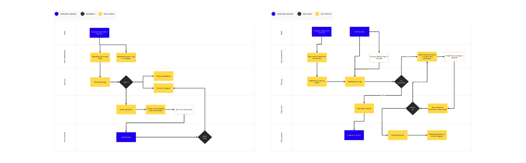
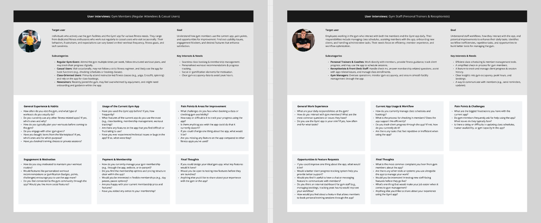
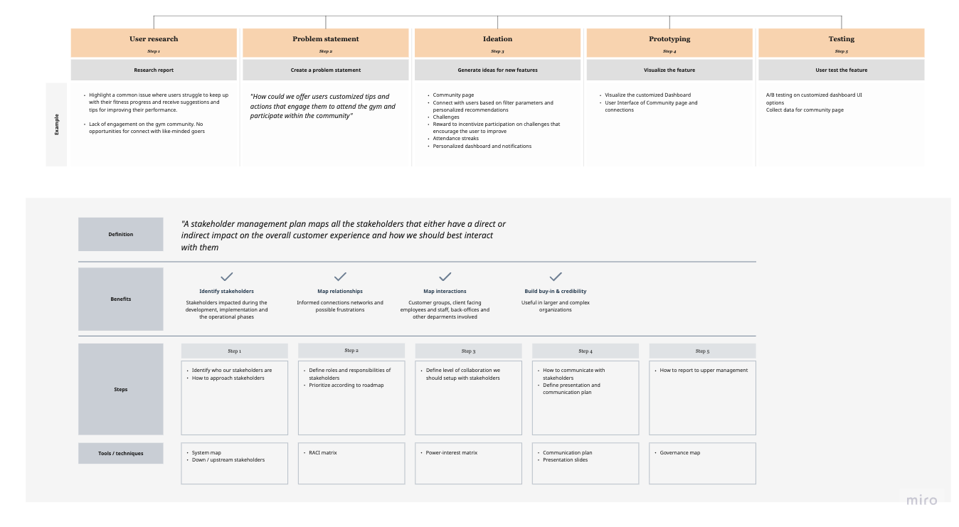
To ensure the redesign addressed real operational and user needs, I began with a focused discovery phase combining qualitative research and structural analysis. The objective was to understand how members, coaches, and administrative staff interacted with the Gym! ecosystem, identify friction in existing workflows, and define a clear scope for the redesign. This phase provided the foundation for both strategic direction and design decisions.
To ground the redesign in real user needs, I began by evaluating the existing Gym! app experience through heuristic analysis, user interviews, and competitor benchmarking. The goal was to understand not only usability issues, but also behavioral gaps—why users downloaded the app, how often they returned, and what prevented it from becoming a consistent part of their fitness routine. This phase revealed that while the app covered functional basics, it lacked clarity, personalization, and motivational reinforcement.
I conducted informal interviews with active gym members across Estonia and Latvia to gather qualitative insights into their expectations from a fitness app. I complemented this with a comparative analysis of leading fitness platforms to identify best practices in onboarding, habit formation, progress tracking, and engagement loops. The research highlighted a recurring theme: users didn’t just want access to bookings they wanted visibility into their progress, easier planning tools, and subtle motivation to maintain consistency.
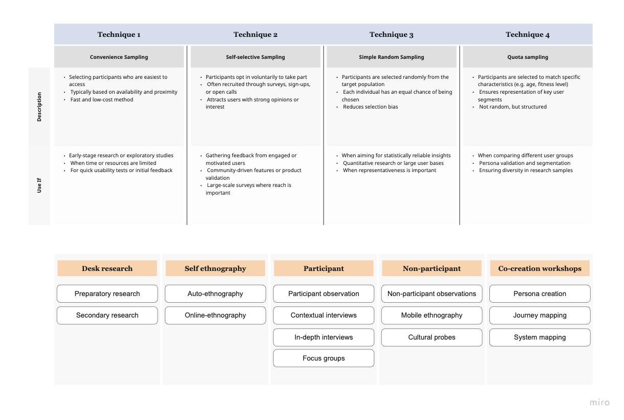
Research methods applied:
Stakeholder & Staff Interviews (Coaches, Administration, Gym Members)
Conducted conversations to understand daily workflows, member expectations, operational constraints, and pain points across different user groups.Competitor Analysis
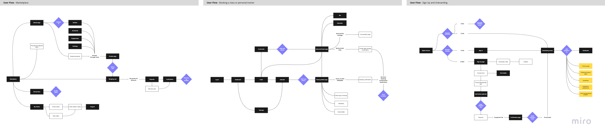
Evaluated leading fitness and wellness apps to identify best practices in onboarding, engagement, booking flows, and habit-forming mechanics.User Flow Mapping
Analyzed and restructured core flows such as class booking, workout tracking, and membership management to uncover friction and redundancies.User Journey Mapping
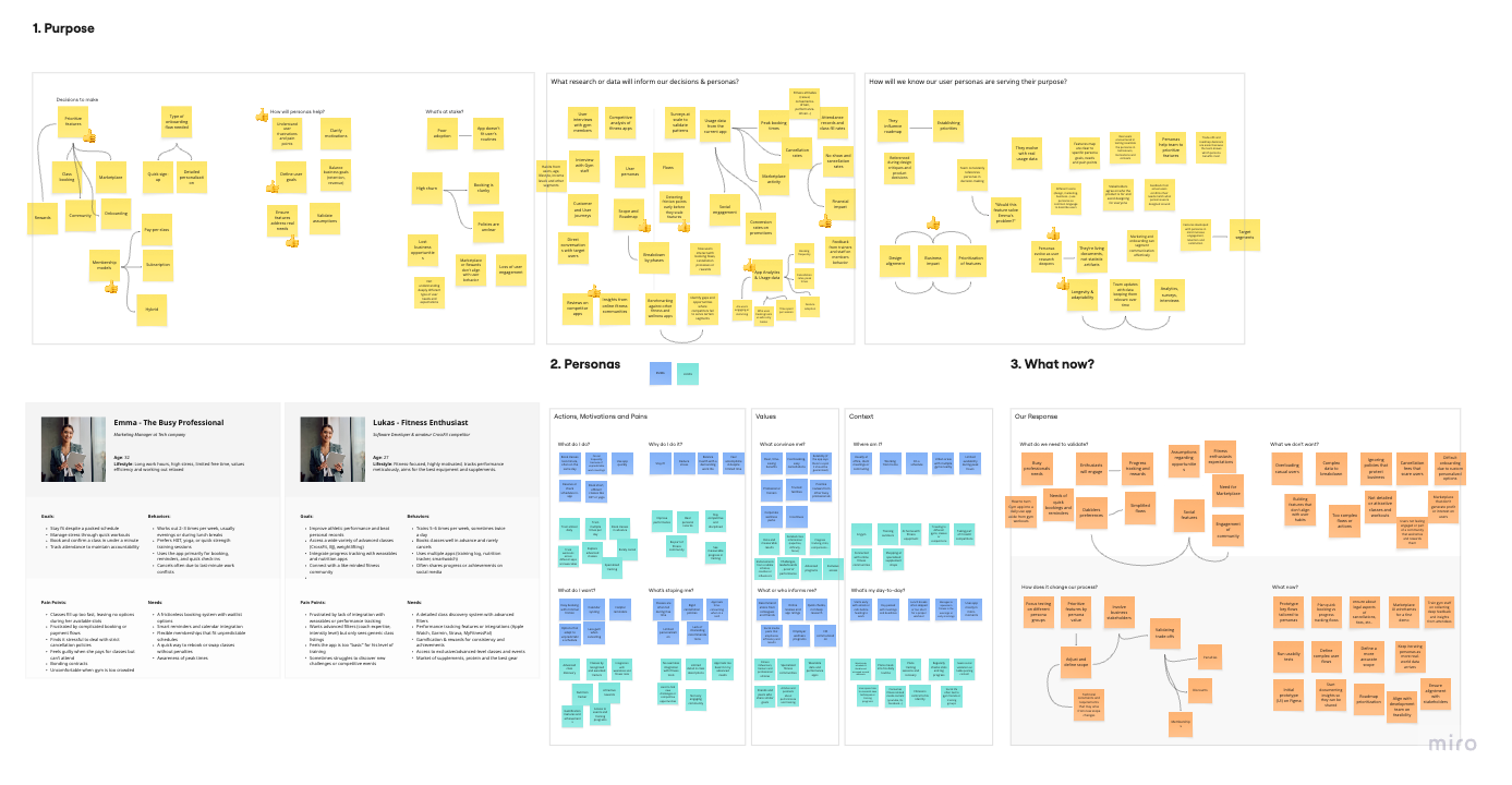
Mapped the end-to-end member experience (from discovering the gym to maintaining long-term fitness habits) to identify engagement gaps.Persona Development
Synthesized research insights into representative user archetypes to guide feature prioritization and tone of interaction.Project Scope Definition
Defined clear objectives, constraints, and feature priorities to ensure the redesign remained focused and strategically aligned.
Key Research Findings
Through research and analysis, several recurring pain points emerged:
Transactional experience: The app was primarily used for booking classes or checking access, with limited ongoing engagement.
Low visibility of progress: Users lacked clear feedback on attendance frequency, workout consistency, or milestones achieved.
Fragmented navigation: Important features such as bookings, membership details, and personal stats were siloed and required multiple steps to access.
Limited personalization: The experience felt generic, offering little adaptation to individual goals or workout habits.
Minimal motivational cues: There were no structured reminders, streaks, achievements, or visual progress indicators to support habit formation.

Problem framing
The discovery phase revealed that the Gym! app was functioning primarily as a utility tool rather than a fitness companion. While it enabled essential actions like booking classes and checking membership details, it lacked cohesion, motivation mechanisms, and a strong value proposition beyond transactions. The core problem was not missing features, but a lack of structural clarity and behavioral reinforcement.
The outcome of the user research methodologies provided key insights into how gym members interacted with the Gym! app and revealed opportunities to optimize their experience. By mapping out essential flows such I identified areas where users encountered unnecessary friction.
After observing the results from these research methods several observations could be pointed out regarding the flaws of the product's lifecycle, acquisition and usage stages. Not just the navigation was rather improvable but some key features of the app were lacking prominence due to these flaws that were generating that users wouldn't interact with them.
To move forward, I reframed the challenge around a central question:
How might we transform the Gym! app from a transactional booking tool into a motivating, habit-supporting fitness platform?
From this reframing, several strategic priorities emerged. The redesign needed to encourage engagement beyond transactional moments by giving users clearer visibility into their progress and activity patterns. Navigation and information hierarchy required restructuring to reduce cognitive effort and make core actions intuitive. The experience also needed to support habit formation through subtle motivational cues, milestones, and feedback loops. At the same time, simplicity had to remain central, ensuring that operational tasks such as booking and membership management remained frictionless. Finally, the digital product needed to better reflect and enhance the physical gym experience, creating continuity between in-app interactions and real-world workouts.
Considering all these insights a new approach for the app could be started in which these issues could be resolved and give the user a sense not of just accomplishment but also rewarding.


Information Architecture & Product structure
Restructuring the product to support clarity, engagement, and long-term habit formation.
The existing Gym! app lacked a clear hierarchy between functional tools (booking, membership, access) and engagement-driven features (progress, activity history, goals). As a result, users navigated between disconnected sections without a strong sense of continuity. To address this, I restructured the product architecture around core user intentions. The goal was to create a system that reflected how members think about their fitness journey.
From a user perspective, the product did not reflect how people naturally approach their fitness journey. Actions such as planning workouts, attending classes, and tracking progress existed in isolation, with little connection between them. As a result, the experience felt reactive, users would open the app with a specific task in mind, complete it, and leave, rather than engaging with it as part of an ongoing routine.
To address this, I restructured the product architecture around core user intentions rather than internal feature groupings. The goal was to align the system with how users think and behave, organizing the experience into meaningful stages of the fitness journey:
Plan — Discover classes, schedule workouts, and organize training
Train — Access sessions, follow workouts, and engage with content
Track — Monitor progress, history, and performance
Engage — Stay motivated through community, challenges, and rewards
This shift allowed the product to move from a collection of features to a cohesive journey, where each action naturally leads to the next.
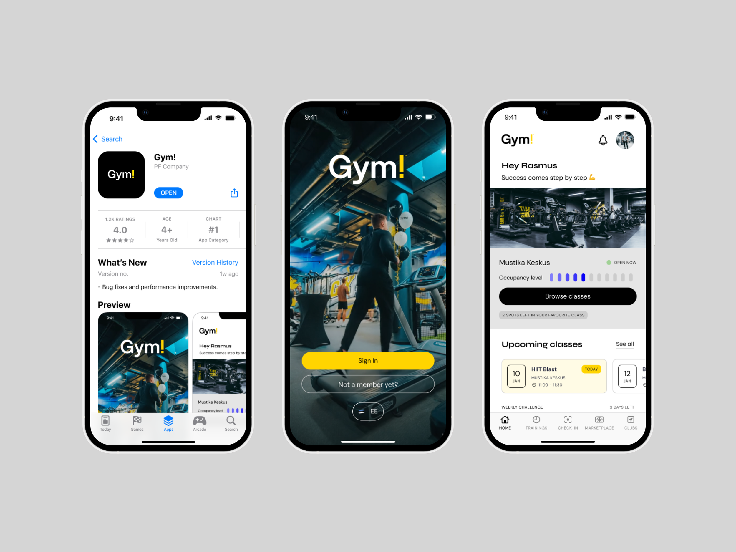
The navigation system was redesigned to reflect this new structure, prioritizing clarity and ease of access. Primary actions (such as booking a class or exploring available sessions) were made immediately accessible, while secondary features were organized in a way that reduced cognitive load and improved discoverability.
At the same time, engagement-driven elements such as progress tracking and activity history were elevated within the hierarchy. Rather than being hidden or treated as secondary features, they became central components of the experience, reinforcing user motivation and encouraging repeat interaction. This new information architecture transforms the app from a task-oriented utility into a structured and engaging experience. By aligning the product with user intentions and behavioral patterns, the app becomes easier to navigate, more intuitive to use, and better positioned to support long-term habit formation and engagement.
Several key principles guided this restructuring:
Clarity over complexity — Reduce unnecessary layers and simplify navigation
Continuity over fragmentation — Connect actions into meaningful flows
Visibility of progress — Surface feedback and achievements to reinforce behavior
Balance between utility and engagement — Support both functional tasks and long-term motivation
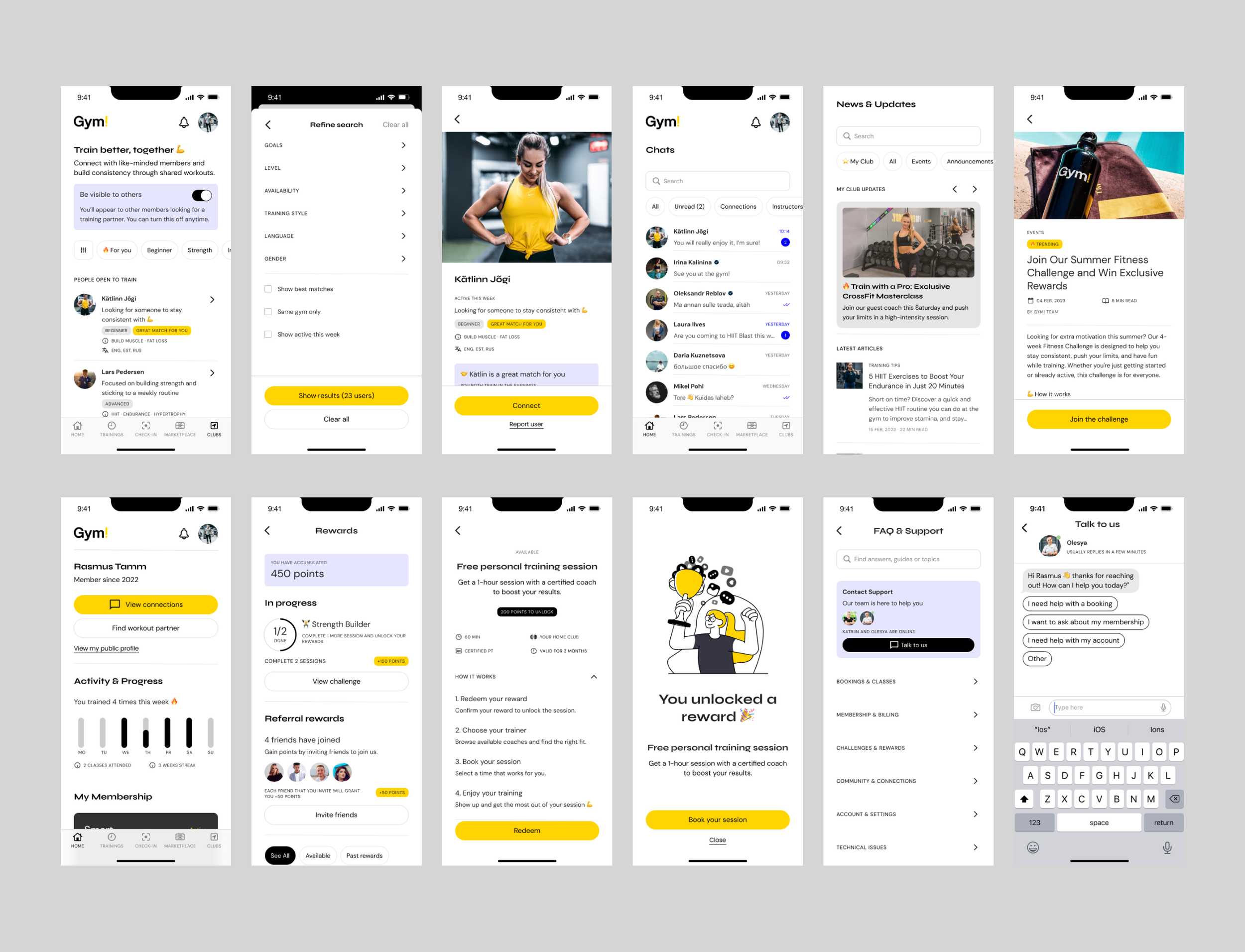
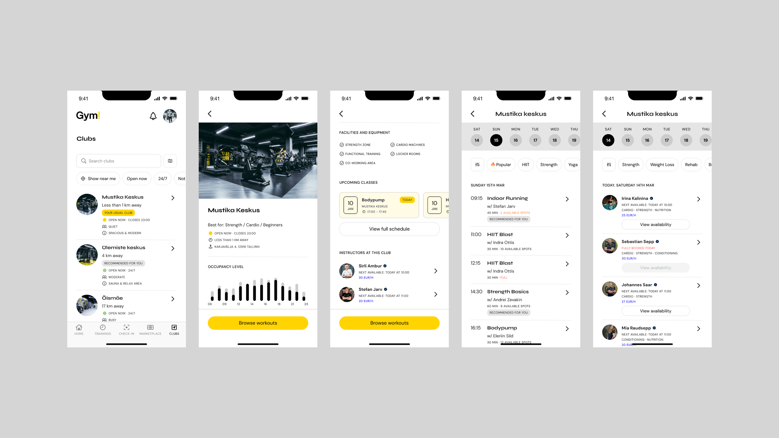
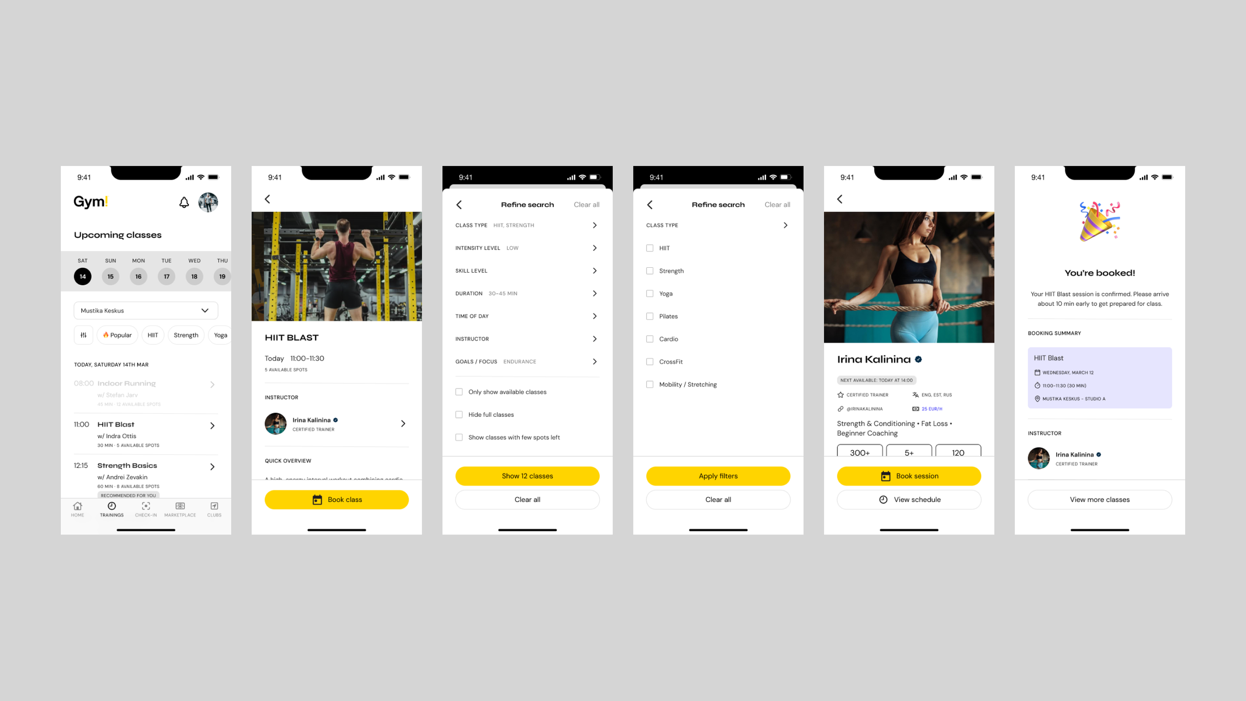
Key App features deep dive
Designing core features that balance operational efficiency with motivation and long-term engagement.
The redesign focused on transforming everyday interactions into moments that reinforce consistency and progress. Rather than adding unnecessary features, I concentrated on elevating the most critical touchpoints in a gym member’s journey. Each feature was redesigned to reduce friction, increase clarity, and subtly support habit formation, supporting users not only when they actively engage with the gym, but also between sessions.
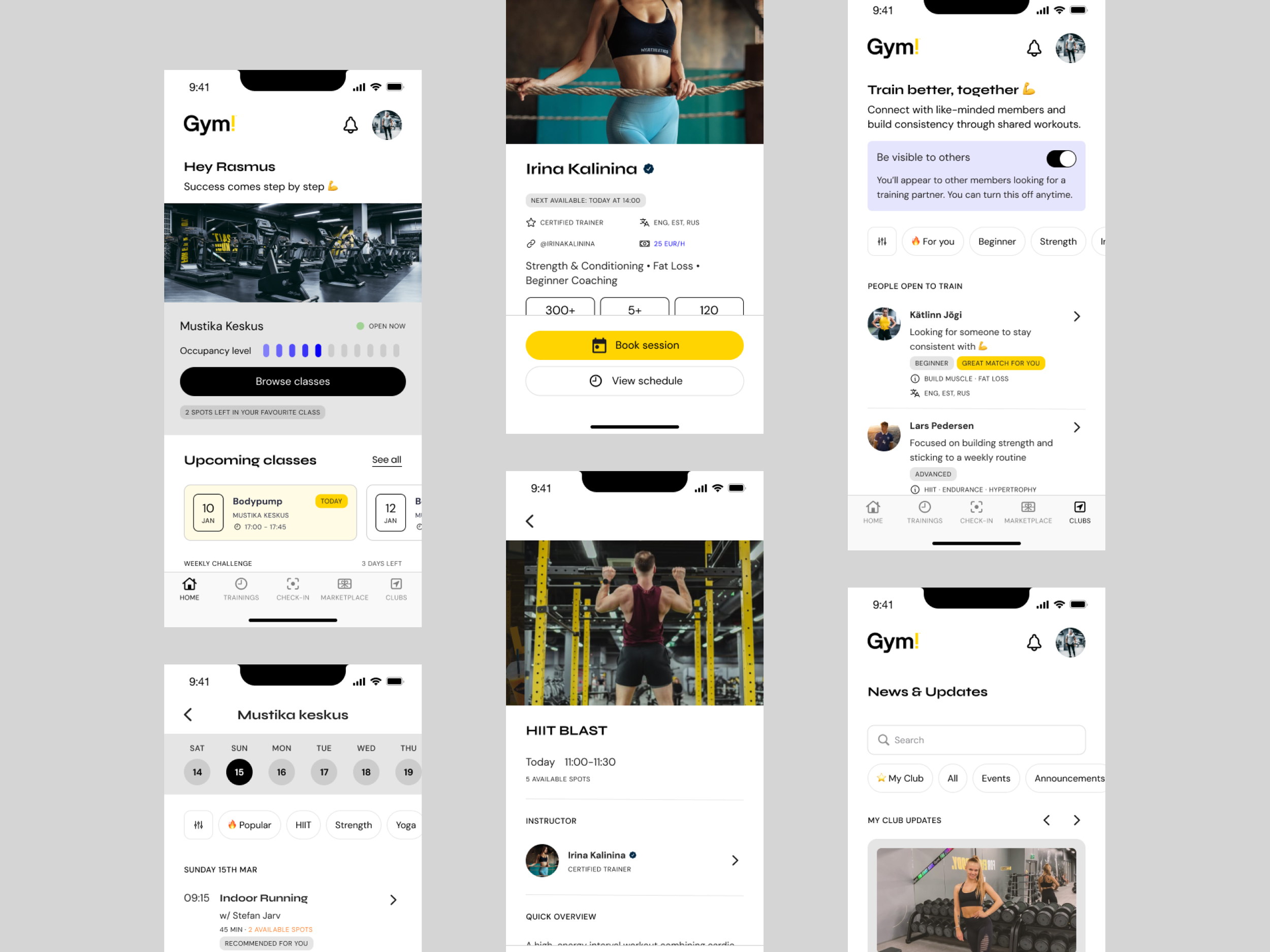
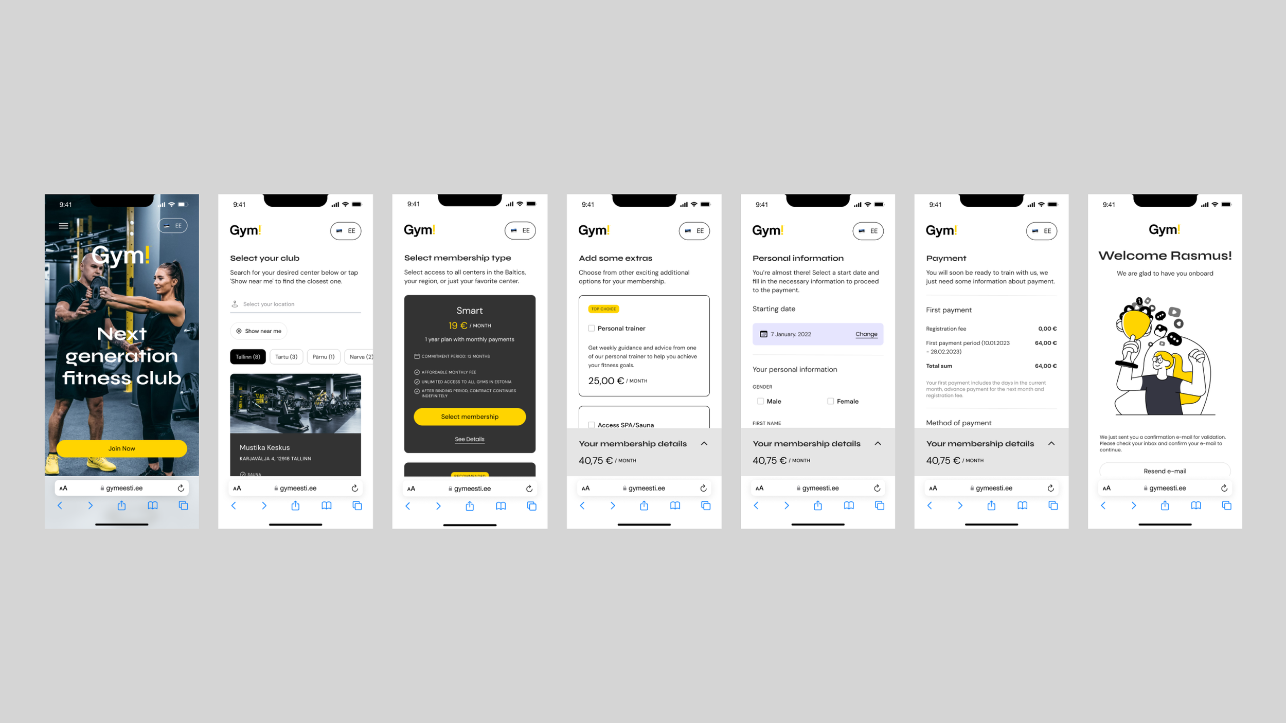
Planning & Booking Flow
Reducing friction in high-frequency actions
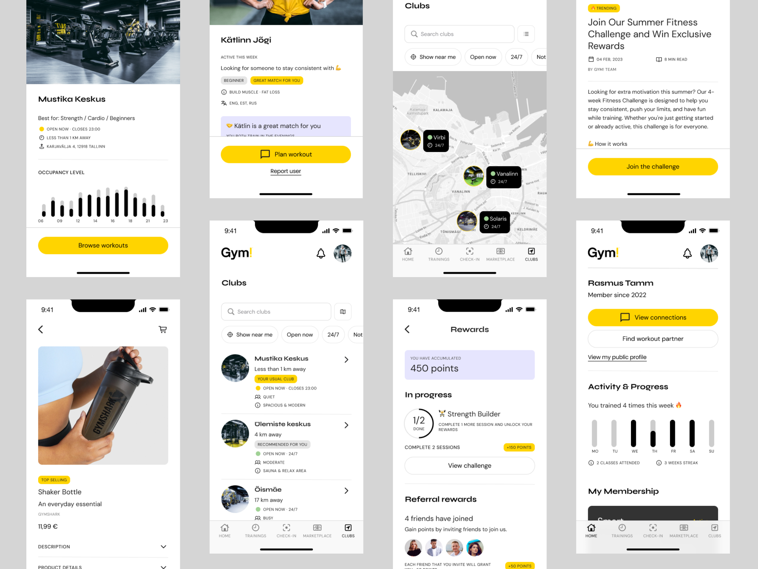
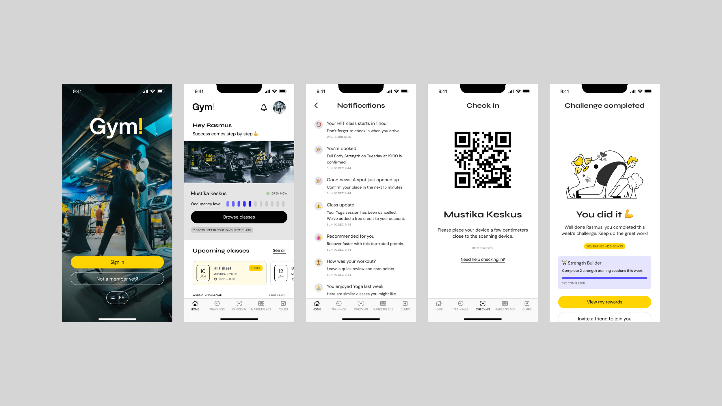
Class booking is one of the most frequently used features, making efficiency and clarity essential. The booking flow was redesigned to prioritize speed, visibility, and decision-making. Users can now browse sessions through an improved calendar interface, supported by intuitive filtering options such as time, trainer, intensity, and availability. Key information (including duration, capacity, and coach details) is surfaced upfront, allowing users to make informed decisions quickly.
The introduction of a structured calendar system also enables users to easily track upcoming sessions, creating a stronger sense of planning and commitment. By simplifying the flow and reducing cognitive load, booking a class becomes a seamless and repeatable action.
Progress & Activity Tracking
Reinforcing consistency through feedback
A major limitation of the previous experience was the lack of meaningful feedback on user activity.
The redesigned progress features introduces clear and accessible insights into workout frequency, attendance streaks, and overall consistency. Lightweight data visualization and structured summaries allow users to quickly understand their performance over time.
By making progress visible, the app shifts from a reactive tool to a motivational companion, reinforcing positive behavior and encouraging users to maintain consistency in their routines.
Community & Engagement
Adding a social layer to motivation
One of the key opportunities identified during the redesign was the absence of a social and community-driven experience.
To address this, a community layer was introduced, allowing users to optionally connect with other members, discover potential workout partners, and engage with like-minded individuals. Users can view profiles, share goals, and find others with similar fitness levels or motivations, creating opportunities for accountability and social reinforcement.
This feature is designed as an opt-in experience, giving users full control over their visibility and interactions. By balancing discoverability with privacy, the system encourages participation without compromising user comfort. The introduction of community transforms the experience from an individual activity into a more social and engaging journey leveraging peer motivation as a powerful driver for consistency and long-term retention.
Personalized Dashboard
Creating a dynamic and relevant experience
To reduce friction and increase engagement, the app introduces a personalized home dashboard that adapts to each user’s activity and behavior.
Rather than presenting static content, the dashboard highlights relevant information such as upcoming bookings, recent activity, recommended classes, and progress snapshots. This creates continuity between sessions and reduces the need for users to navigate across multiple sections. The goal is to make the app feel responsive and context-aware, supporting users with the right information at the right time.
Membership & Account Management
Operational tasks such as membership status, renewals, and gym access were reorganized into a clearer, more accessible structure. By grouping related information contextually and reducing redundant steps, users could manage subscriptions and access details with minimal friction. The experience remained simple and efficient while visually aligned with the broader system, ensuring consistency across functional and motivational features.
Rewards & Profile
Encouraging long-term engagement
To further reinforce motivation, the profile experience was expanded to include a rewards system tied to user activity and consistency. Users can earn points through actions such as attending classes, completing challenges, or maintaining streaks. These rewards create a sense of progression beyond physical results, offering additional incentives to stay engaged with the app.
By connecting activity with tangible benefits, the system introduces a feedback loop that supports habit formation and sustained usage.
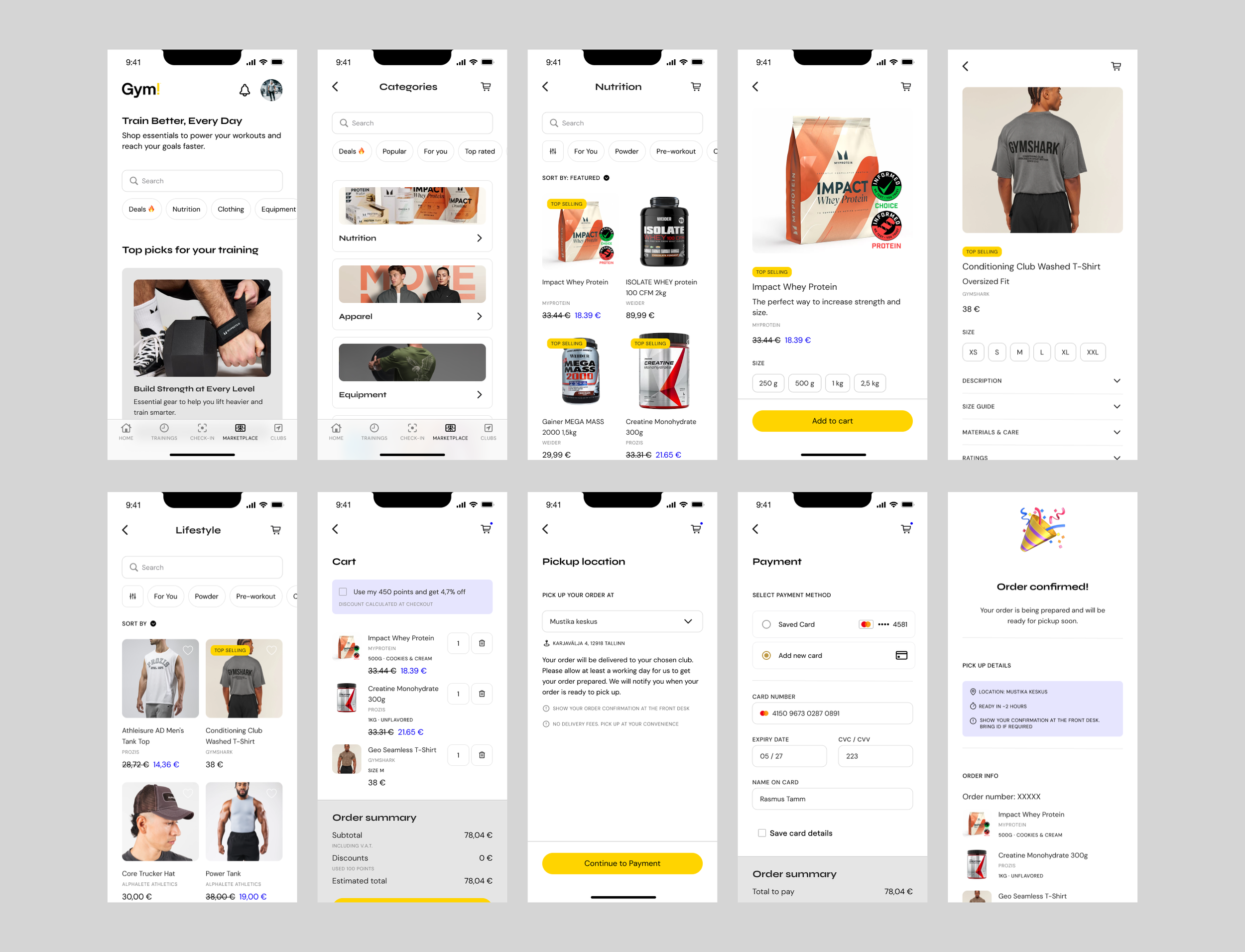
Marketplace
Extending the ecosystem
To extend the app’s value beyond scheduling and tracking, a Marketplace feature was introduced.
Users can browse and purchase fitness-related products and services (including supplements, apparel, personal training sessions, and class packages) directly within the app. The experience is designed to feel integrated rather than promotional, with clear categorization, simple product presentation, and a streamlined checkout flow.
This feature not only enhances user convenience but also introduces new opportunities for monetization, positioning the app as a broader fitness ecosystem rather than a single-purpose tool.
Validation & Iteration
Ensuring that the proposed solution is grounded in real-world constraints and continuously refined through feedback.
Since this project was developed as a conceptual redesign, it did not proceed to a full development phase. Instead, the validation process was approached through stakeholder review and strategic feedback. I structured the final concept as a proposal that could be presented to relevant stakeholders within the local Estonian branch of the franchise, including gym management, coaches, and administrative staff. The goal of these sessions would be to assess how well the redesigned experience aligned with operational workflows, member expectations, and potential business opportunities.
While the project remained conceptual, framing the redesign through stakeholder validation ensured that the proposed solution remained grounded in realistic operational contexts. This step also highlighted how the concept could evolve into a viable product roadmap if further pursued.
Through walkthroughs of key user flows and feature concepts, stakeholders would be able to evaluate the practicality of the redesigned features. These discussions would also help surface operational considerations (such as class scheduling logistics, membership management, and potential integration with existing systems) that could influence implementation.
Stakeholder Validation
To ensure the concept remained grounded in operational reality, the redesigned experience was structured as a proposal that could be presented to stakeholders within the Gym! ecosystem, including gym management, coaches, and administrative staff.
Through walkthroughs of key user journeys, stakeholders would be able to evaluate:
The practicality of the redesigned booking and scheduling system
The relevance of progress tracking and engagement features
The feasibility of introducing new components such as community and marketplace
These sessions would also surface important operational considerations such as class scheduling logistics, membership management workflows, and integration with existing systems helping bridge the gap between design vision and real-world implementation.
User Validation (Proposed)
While direct user testing was not conducted within the scope of this project, validating the redesigned experience with real members would be a critical next step.
Testing key flows, such as class booking, progress tracking, and community interaction, would provide valuable insights into usability, clarity, and overall engagement. Observing how users interact with the product in realistic scenarios would help identify friction points and uncover opportunities for further refinement.
Iteration as a Continuous Process
The project was designed with iteration in mind, recognizing that a successful product evolves over time. Each feature and interaction was conceived as part of a system that can be tested, measured, and improved based on real usage and feedback.
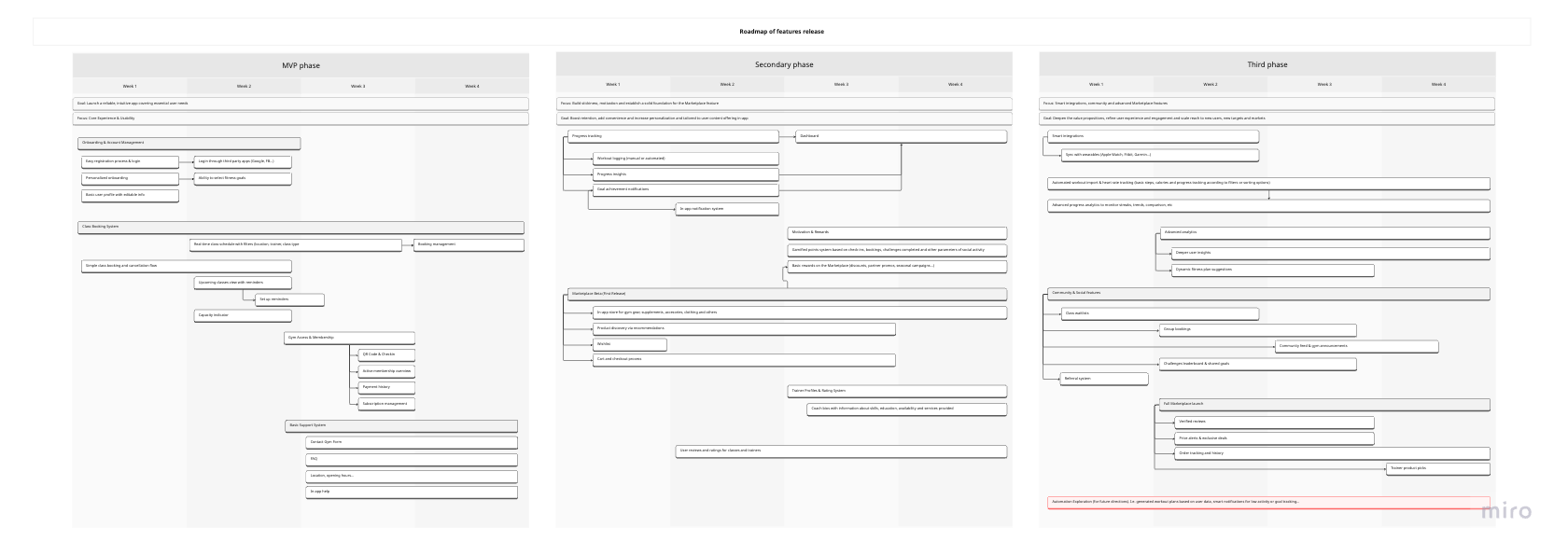
Next steps:
To move this concept toward a viable product, the following steps would be essential:
Conduct structured feedback sessions with gym staff and stakeholders
Validate core user flows with real members through usability testing
Define and prioritize features for an MVP release
Assess technical feasibility and integration with existing systems
Iterate on the experience based on qualitative and quantitative insights

Outcome & Reflections
Redesigning the Gym! app provided insights into user engagement, operational clarity, and the strategic role of digital experiences in fitness.
This project explored how the Gym! mobile app could evolve from a functional utility into a more engaging and strategically valuable product. By redesigning key interactions and introducing a more cohesive structure, the concept demonstrated how improved navigation, clearer flows, and more meaningful feedback could reduce friction and support consistent usage over time.
Beyond usability improvements, the redesign highlighted the potential for the app to play a more active role in the overall fitness journey, encouraging users not only to book sessions, but to stay motivated, track progress, and remain engaged between workouts. Features such as personalized dashboards, progress tracking, and community interaction were designed to create a more continuous and rewarding experience, aligning user behavior with long-term habit formation.
From a product perspective, the concept also emphasized how a stronger digital layer could contribute to business goals supporting retention, increasing engagement, and opening new opportunities for value creation within the Gym! ecosystem.
“This project marked a shift in my approach to design, from focusing on individual screens to thinking in terms of systems, journeys, and long-term product impact.”
Gym! project reinforced several key learnings about designing digital products in a real-world context:
Understanding real user needs: Learned the importance of grounding design decisions in research rather than assumptions, even when resources are limited.
Balancing functionality and engagement: Realized how crucial it is to design not just for usability, but also for motivating users and supporting long-term habits.
Structuring complex flows: Gained experience in organizing multiple features and interactions into a clear, intuitive information architecture.
Prototyping for communication: Learned how to create visual and interactive concepts that effectively communicate design intent to stakeholders.
Iterating conceptually: Practiced testing ideas and refining flows through feedback and reflection, even without development implementation.
Holistic product thinking: Developed awareness of how operational, user, and business needs intersect in a digital product.
Confidence in presenting designs: Improved skills in explaining design rationale and strategic choices to non-design audiences.
Growth mindset: Learned to embrace experimentation, accept limitations, and use early projects as a foundation for more complex, senior-level work.
Designing with iteration in mind: Even within a conceptual scope, approaching the project as an evolving system reinforced the importance of feedback, testing, and continuous improvement.