Cidade
✧
Cidade ✧
Shaping a multi-service super app, balancing complexity, consistency, and scalability across diverse user needs.
Cidade is an ambitious super app designed to serve the district of Cidade in São Paulo (Brazil), a historic area undergoing a massive transformation. As part of an extensive renovation plan, Cidade is being reimagined into a vibrant hub featuring luxury shopping, diverse businesses, cultural events, and fine dining experiences among other services. This ambitious revitalization effort required a digital environment capable of supporting the district’s growing demands, making the Cidade app a fundamental pillar of this transformation.
The project was developed while I was employed at OnOff Telecom in Estonia, where I worked as the sole UX Designer in a small but highly focused team alongside the Project Manager and the company’s CEO. With only a few initial wireframes from the CEO, my task was to build the entire design and user experience from the ground up, ensuring scalability and efficiency. Given the complexity of the project, two separate development teams were required (one local team from Brazil and another from Farfetch, which provided the foundation for such an extensive app).
From conceptualization to interactive prototypes and final designs, my responsibilities included structuring the app’s user experience, defining user flows, and building up a robust and scalable design system to maintain consistency, efficiency and streamline collaboration with both development teams.
Role: UI/UX Designer
Team: 1 product manager, CEO
Client: High-end renovation project in São Paulo
Credits: Nataliia Hryhorova (Product manager)
Challenge & Project Approach
The Cidade Super App was built from the ground up, the product vision was still forming, and the scope was ambitious: to create a single platform that could support a wide range of services and user needs, from visitors exploring the district to local businesses managing bookings, orders, and services. This required establishing a strong UX foundation that could bring clarity to a complex offering, support future growth, and avoid overwhelming users as new features and verticals were introduced.
As we were starting entirely from scratch, with no existing user flows, no design system, and no prior research to guide us. This made it critical to build a strong foundation that would accommodate the district’s varied businesses and user needs.
The team was very small: I was the sole UX Designer working closely with just a Project Manager and the CEO. This meant I had to handle every aspect of the UX work, from early research and ideation to wireframes, UI design, prototyping and documentation.
Adding to the complexity, the implementation required two separate development teams: a local team in Brazil and another from Farfetch. This introduced major technical challenges around coordination, alignment on requirements, and ensuring the design could realistically be built to spec across different teams and timelines. Communicating design decisions clearly and providing thorough documentation became essential to bridge these gaps.
My role & responsibilities
I was the sole UI/UX Designer on the Cidade super app, responsible for shaping the product from early concept to MVP and bringing structure to a complex, multi-service ecosystem.
The project started with high-level business goals and rough initial wireframes, so my mission was to translate an evolving vision into a clear, usable product direction.
My duty was to own the end-to-end UX and UI execution across the consumer app and business-facing tools, from user flows and interaction design to high-fidelity UI and interactive prototypes. In parallel, I created and maintained a reusable design system to ensure consistency across products and to support faster development as new features and verticals were added. As part of the workflow I collaborated daily with two distributed development teams helping in aligning UX decisions with technical constraints, preparing clear design handoffs, and iterating on solutions based on engineering and stakeholder feedback.
Beyond delivery, I facilitated workshops and design reviews to create shared understanding across teams, helping turn an initially fragmented product idea into a cohesive and scalable digital ecosystem.
Research & Discovery
Because the Cidade project started without existing research or validated user flows, the discovery phase focused on quickly building a shared understanding of the problem space and identifying proven patterns that could guide early decisions.
Given the time and scope constraints, research leaned toward rapid, lightweight methods for which I documented insights as part of a living discovery process, using them to inform information architecture, strategy, and prioritization of MVP features. This approach allowed the team to move forward with confidence despite uncertainty, while keeping space for iteration as new insights emerged during development and early internal testing.
Competitor analysis
I conducted competitor and market analysis across super apps, food delivery platforms, booking services, and local marketplace products to understand how complex ecosystems structure navigation, onboarding, and cross-service discovery. This included studying how established platforms balance breadth of features with clarity of user mental models, and how they reduce cognitive load when users move between different types of tasks, such as browsing, booking, ordering, and managing services. The goal was not to copy solutions, but to extract reusable interaction patterns and structural principles that could be adapted to Cidade’s context and long-term vision.
Customer journey maps
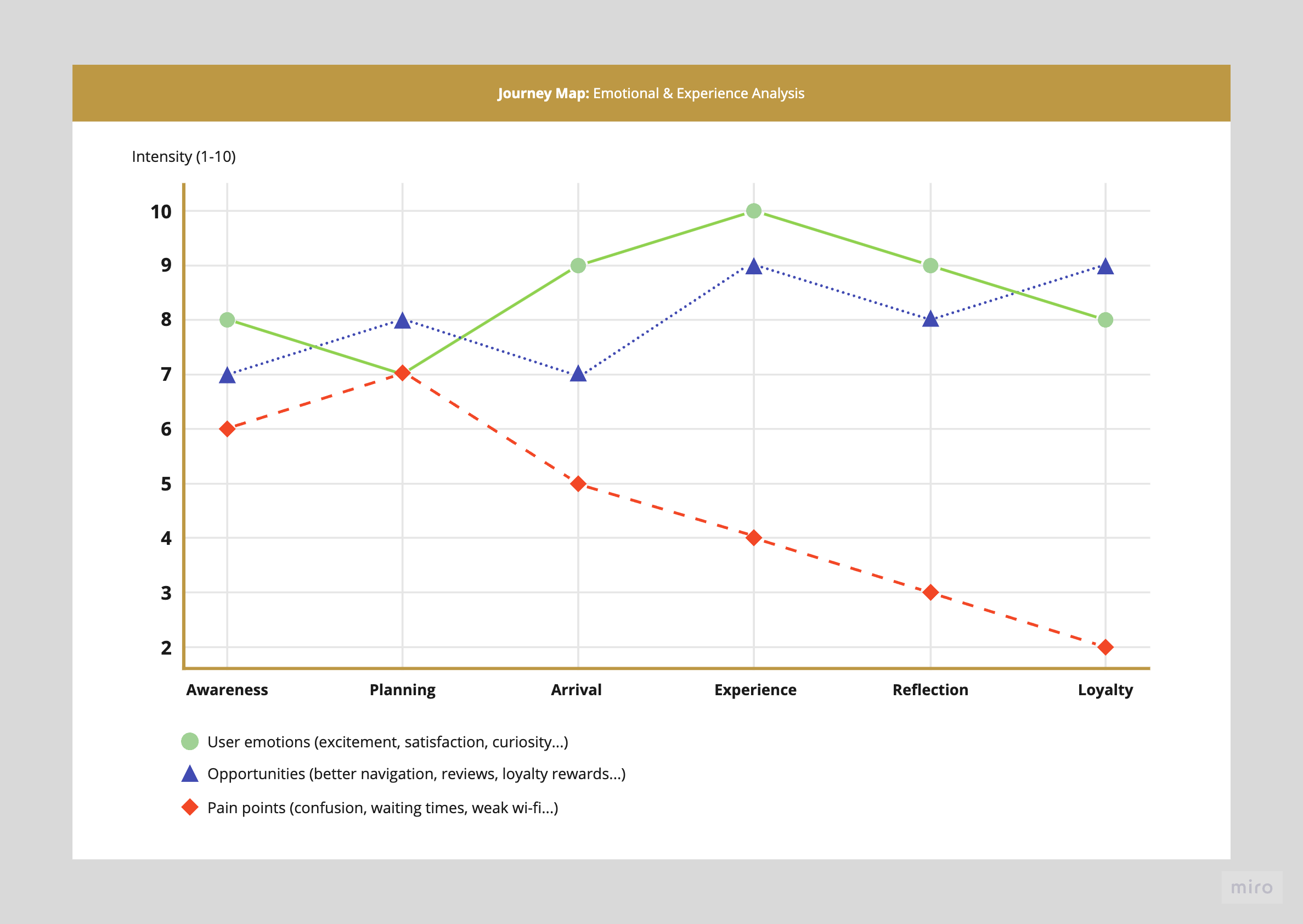
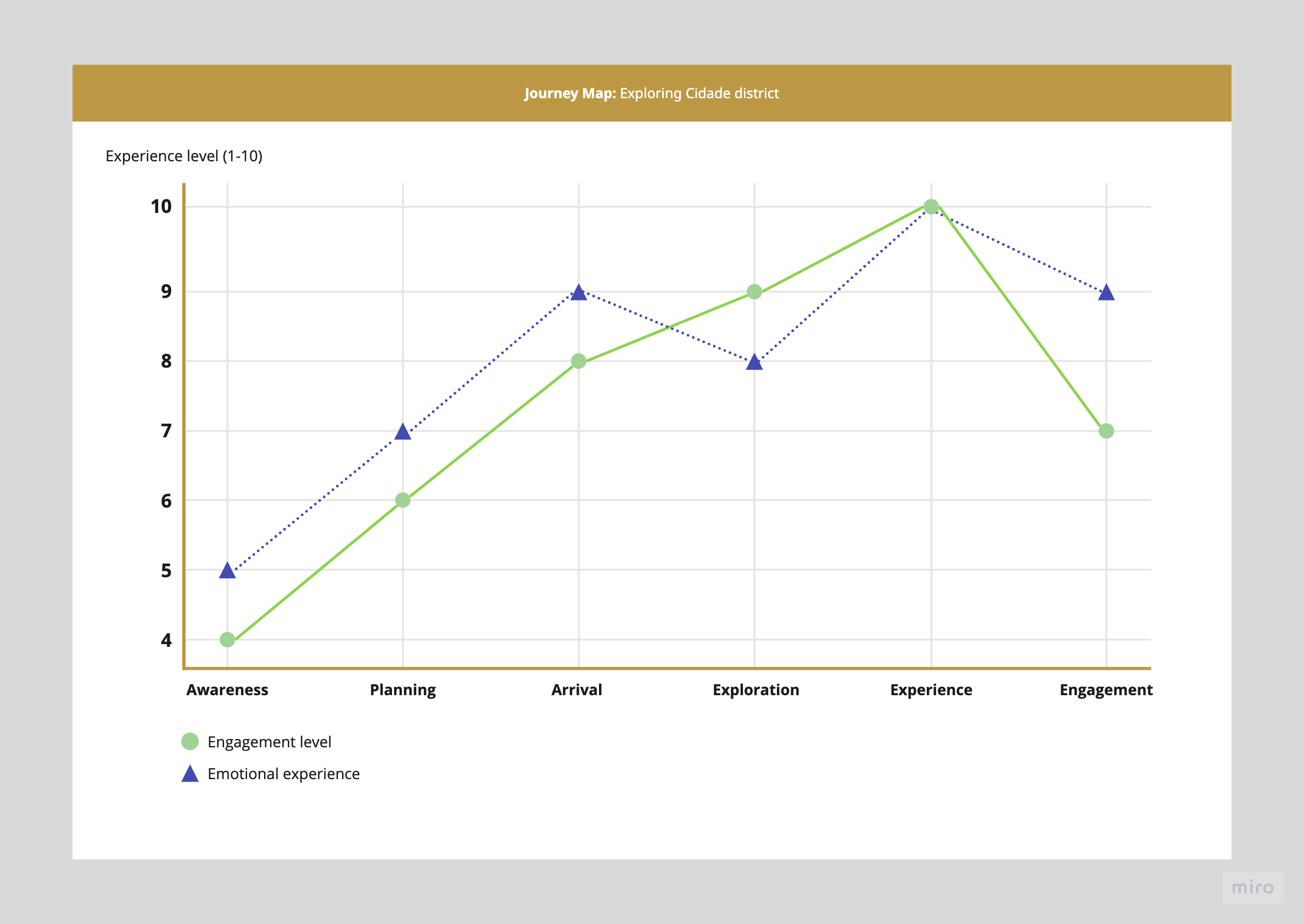
Journey maps helped to allow us understanding the dimension of this project as we were able to highlight key engagement moments, emotional peaks, and pain points, allowing for a better understanding of possible user frustrations and giving the chance to come up with opportunities for enhancement.
User personas
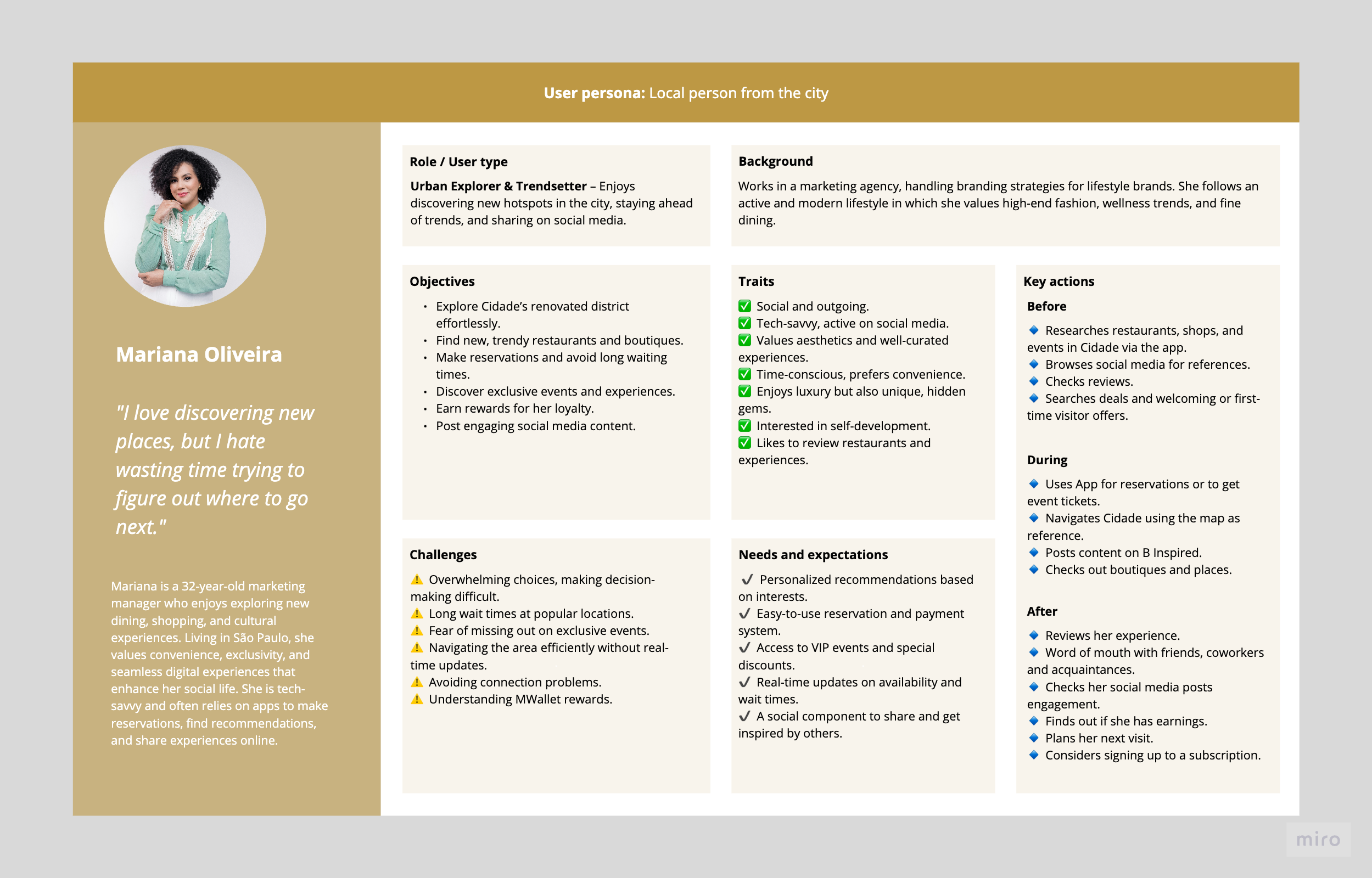
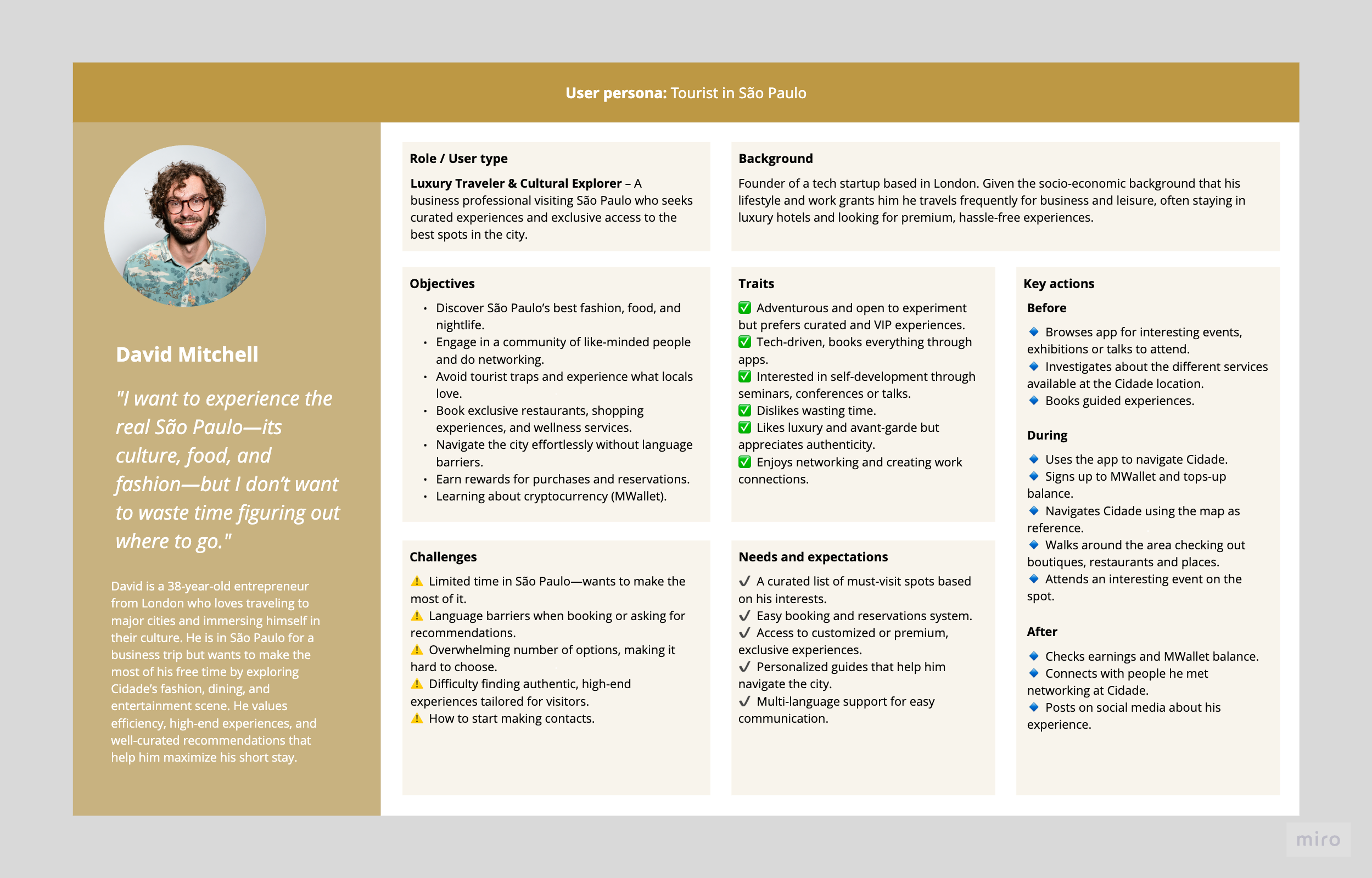
Creating detailed user personas was a crucial step in the early UX research phase of the Cidade super app. These personas helped define core user needs, pain points, and behavioral patterns, allowing the team to shape the app’s features and user journey accordingly.
By developing Mariana’s persona, we gained insights into how a local user interacts with the app daily—whether for fashion, wellness, or social engagement. Her needs highlighted the importance of community-driven features like B Inspired, seamless integration with local brands, and an engaging loyalty system.
On the other hand, David’s persona provided perspective on the experience of a short-term visitor who values efficiency, curation, networking and premium services. His expectations emphasized the need for fast reservations, multilingual support, and exclusive experiences that would make his visit memorable.
These personas allowed us to:
Validate feature priorities—ensuring the app serves both locals and tourists effectively.
Identify pain points early—such as language barriers, time constraints, and the overwhelming number of choices.
Design user journeys with clarity—by mapping key actions before, during, and after app interaction.
Create a product that feels intuitive and relevant—for different user segments, increasing engagement and retention.
Journey Maps & User Flows
IJourney maps maps highlighted phases of the experience (like discovery, planning, booking, visiting), the user's emotional states, pain points, and opportunities for improvement at each step. It helped me prioritize features, refine flows, and design solutions that responded to genuine user goals.
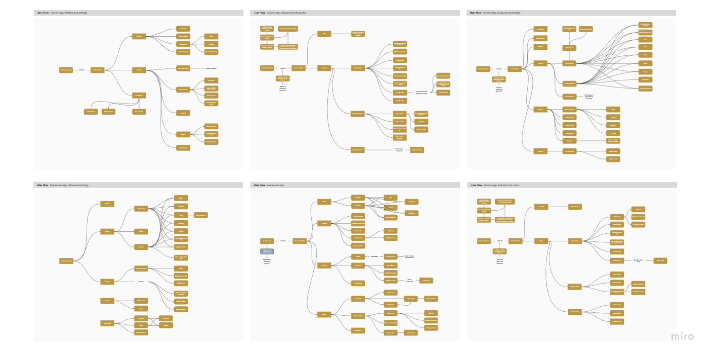
User flows charted each step a user would take to complete a goal, ensuring the paths were logical, efficient, and free of unnecessary complexity. They were essential both for designing the UI and for communicating requirements to the two separate development teams.
A/B Testing during early UX Research prhase
During early design validation, I used A/B testing to explore critical interaction choices. Testing these variations with users and stakeholders helped refine the design based on real feedback, ensuring the chosen solutions were the most effective and intuitive. Examples of A/B tests carried out:
1. Navigation & Onboarding Flow
A Version: A step-by-step onboarding guide with illustrations and tooltips explaining each feature.
B Version: A minimalist skip-able onboarding with a brief video tutorial instead.
Goal: Determine which approach leads to higher feature discovery and engagement rates for first-time users.
2. Booking System for Restaurants & Experiences
A Version: A traditional list-based layout for browsing and reserving restaurants/events.
B Version: A map-based interface, allowing users to book based on location.
Goal: Measure which layout drives faster decision-making and higher conversion rates.
3. Social Engagement in ‘B Inspired’ Section
A Version: Allow users to engage via likes and comments on photos/videos.
B Version: Introduce a reaction system (emojis) and shareable story format.
Goal: Test which engagement model generates more user interaction and content sharing.
Heuristic evaluation after UX Research
After completing all the foundational UX research work I conducted a thorough heuristic evaluation of the app’s design. This step was critical for ensuring that even with strong research foundations, the final experience wouldn’t fall prey to common usability pitfalls.
By reviewing the designs against established usability principles I was able to systematically identify issues that could frustrate or confuse users. This evaluation helped uncover subtle problems that might not emerge in early testing but could hurt long-term usability, especially given the app’s complexity and diverse audience. It also provided a clear, actionable set of recommendations for refining designs before handoff to the development teams. Ultimately, the heuristic evaluation served as a quality-control step to ensure the Cidade app delivered not just on its ambitious feature set but also on a smooth, satisfying, and accessible user experience.
Problem framing & Information Architecture
At the start of the project, “Cidade” was defined more as a business ambition than a concrete product: a digital layer to support the transformation of a historic district in São Paulo into a modern lifestyle destination. The initial challenge was to turn this high-level vision into a set of clear user-centered problems the team could actually design and build against.
I worked with stakeholders to unpack assumptions, identify the core value the app needed to provide and define what success would look like for an MVP. This meant narrowing a very broad scope into a small set of meaningful problems that could demonstrate value quickly, while still aligning with the long-term ambition of building a district-scale digital ecosystem.
Through this framing process, a central problem emerged: how to design a single app that could support multiple services and user types without overwhelming users or fragmenting the experience. At the same time, the product had to remain flexible enough to accommodate new services, partners, and features as the district evolved. To guide design decisions, I defined a set of problem statements and success criteria around clarity of navigation, scalability of the information architecture, and reusability of UX patterns across consumer and business-facing products. These framing principles became a reference point throughout the project, helping the team prioritize features, manage scope, and evaluate design trade-offs as the product evolved.
Given the breadth of services and user types within the Cidade ecosystem, information architecture became one of the most critical design challenges of the project. I started by mapping the core user intents across the ecosystem and used these intents to define a small set of primary navigation pillars. These pillars allowed users to build a clear mental model of the app, while giving the product team a stable structure to attach new services and features over time. The goal was to design an architecture that could grow with the district’s transformation in São Paulo without requiring frequent structural redesigns.
To keep the experience cohesive across different verticals, I designed the product structure around reusable UX patterns rather than isolated feature silos. Shared navigation models, content hierarchies, filtering patterns, and transactional flows were intentionally standardized so that moving between services (such as discovering restaurants, booking wellness experiences, or renting fashion items) felt familiar and predictable. This modular approach to information architecture allowed the team to generate an MVP that felt coherent while laying a foundation that could scale as new features were introduced into the ecosystem over time.
Design system & UX patterns
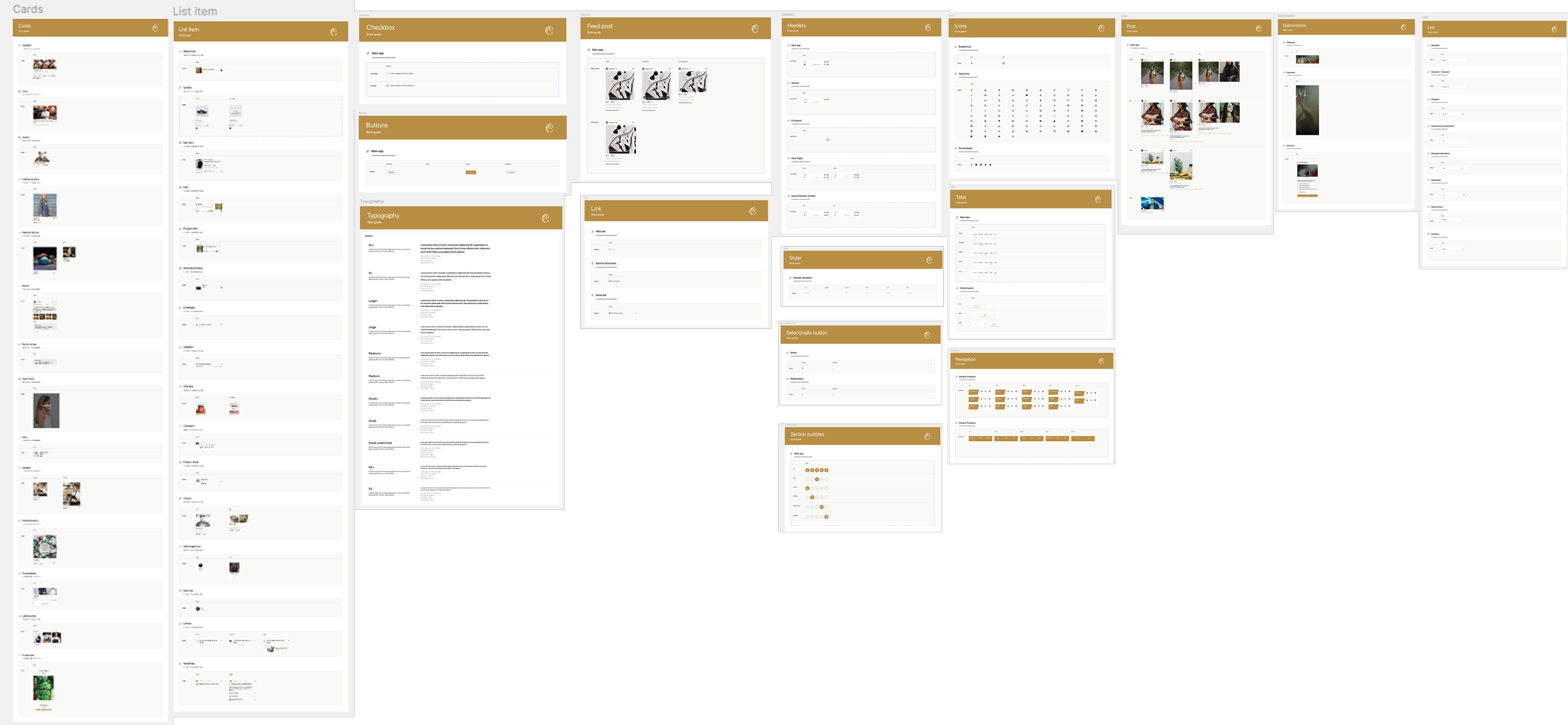
Establishing a design system early became essential to avoid fragmentation and rework. The goal was to create a system that was flexible enough to sup
port different use cases while maintaining a coherent brand and interaction language across the ecosystem.
I defined a core set of UI components, interaction patterns, and layout principles that could be reused across the consumer app and the business-facing tools for restaurants and farmers. This included foundational elements such as typography, color usage, spacing, grid systems, and component libraries, as well as higher-level patterns like listing layouts, filtering behavior, booking flows, and transactional states.
Beyond visual consistency, the design system functioned as a shared language between design, product, and engineering teams. I documented component usage guidelines and UX patterns to support two distributed development teams working in parallel, reducing ambiguity during implementation and making it easier to onboard new features without reinventing solutions. This approach improved design-to-development handoff, helped surface technical constraints early, and accelerated iteration as the product evolved. Over time, the system became a key enabler for scaling the platform, allowing new services and verticals to be introduced with minimal disruption to the overall experience while preserving a consistent and recognizable user interface.
Key features deep dive
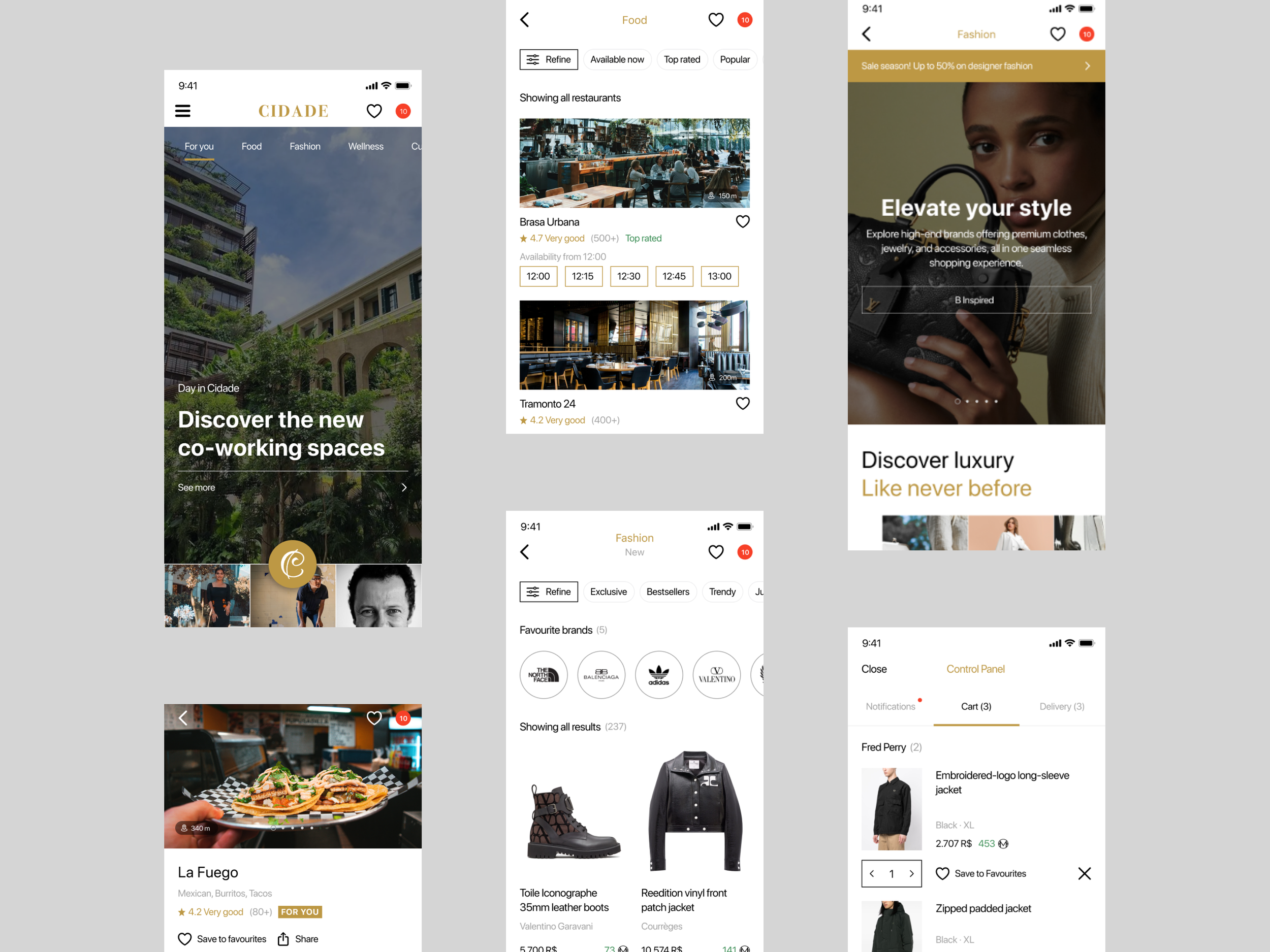
In designing the different sections of the Cidade app I focused on creating a cohesive yet flexible experience that could adapt to the unique needs of each area while feeling like part of a single, unified brand. I worked to balance visual appeal with usability, making sure that users encountered a seamless experience that encouraged discovery and engagement throughout Cidade’s vibrant ecosystem.
Food
The Food section connects users with the best culinary experiences in Cidade. Whether dining in, ordering for delivery, or shopping for organic ingredients, this section provides seamless access to top restaurants, local markets, and fresh produce.
Restaurants – Explore Cidade’s finest dining options. Browse restaurant profiles with videos, photos, menus, and user reviews. Secure a reservation with just a few taps and experience world-class cuisine.
Delivery – Enjoy restaurant-quality meals from the comfort of your home. Order from a variety of local restaurants and track your delivery in real time.
Biomarket – Shop for organic, locally sourced, and bio-certified products from São Paulo’s best farmers and sustainable producers. Get fresh, high-quality ingredients delivered straight to your door.
Fashion
The Fashion section brings together the best of Cidade’s luxury and designer fashion, giving users access to exclusive collections, vintage pieces, and even rentable outfits.
New – Browse high-end boutiques and luxury brands in Cidade. Discover the latest trends in clothing, accessories, jewelry, and footwear, and shop directly from your favorite brands.
Vintage – A curated space for vintage lovers and aspiring designers. Find unique, timeless fashion pieces and support up-and-coming local designers who bring fresh styles to the industry.
Rent – Need a statement outfit for a special occasion? Rent designer fashion items from top boutiques in Cidade, as long as you have sufficient balance in your MWallet.
Culture
Cidade is a cultural hub, and the Culture section offers users an easy way to discover and attend the best events in town. Whether it's entertainment, knowledge-sharing, or spiritual gatherings, this section keeps users connected to what’s happening in the district.
Entertainment – Find and book tickets for concerts, fashion shows, cinema screenings, theater performances, live music, art exhibitions, and other major cultural events.
Talks – Stay informed with industry-leading conferences, seminars, and masterclasses. Connect with thought leaders and expand your knowledge on a variety of topics.
Religion – Explore religious and community events such as festivals, guided tours, spiritual ceremonies, and faith-based gatherings.
Wellness
The Wellness section is designed to help users prioritize their health, fitness, and self-care. From workouts to spa treatments and premium beauty products, everything you need for a balanced lifestyle is here.
Classes – Join various fitness and wellness classes, including yoga, CrossFit, BJJ, boxing, capoeira, and more. Book your spot and stay active with expert-led sessions.
Services – Browse and book wellness treatments, including massages, skincare therapies, spa experiences, and body treatments, all offered by top professionals.
Beauty – Shop high-end beauty products, including makeup, skincare, perfumes, and cosmetics from luxury brands, ensuring you always look and feel your best.
Educational
The Education section offers exclusive, high-quality courses designed by prestigious institutions and academies specifically for the Cidade project. Users can explore a variety of subjects, including business, entrepreneurship, fashion, design, fitness, and technology. Each course is structured into multiple lessons, interactive workshops, and a dedicated resource library, providing a comprehensive learning experience. Users can access video lessons, downloadable study materials, and participate in Q&A forums with fellow students and instructors. Upon completion, learners receive a certification, adding value to their professional and personal growth. This section is designed to make high-level education accessible, empowering users with knowledge and skills tailored to Cidade’s evolving industries.
“B Inspired” Social Feed
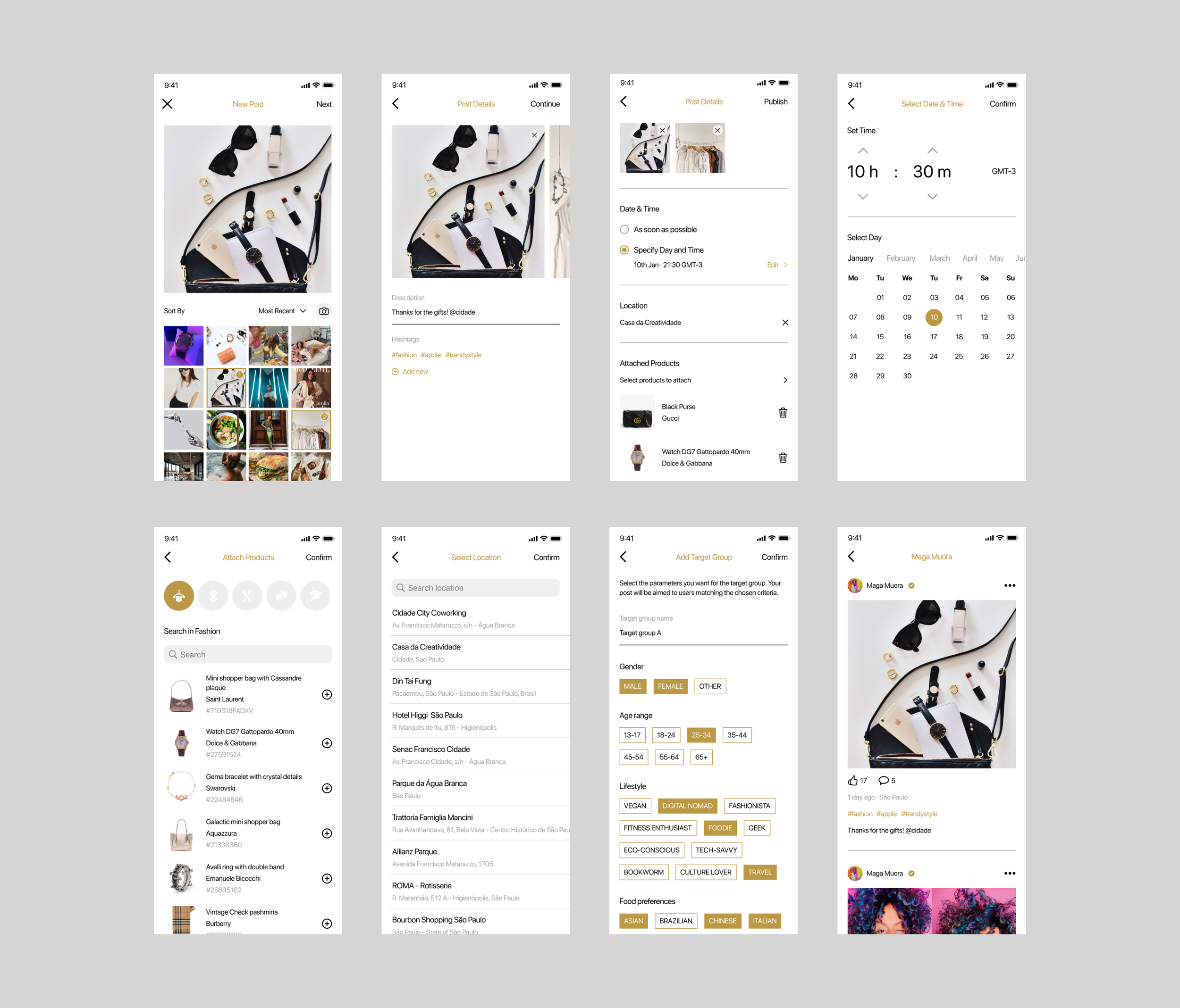
B Inspired is the social media heart of the Cidade super app an Instagram-like platform where users and influencers can share their experiences and inspire others. Whether it's posting about a dining experience at a top restaurant, attending an exclusive fashion show, exploring cultural events, or enjoying the district’s vibrant lifestyle, this section brings Cidade’s energy to life through user-generated content.
This feature plays a crucial role in engagement by fostering a sense of community and encouraging interaction. Users can discover new activities, get recommendations from real experiences, and feel more connected to the Cidade lifestyle. B Inspired is more than just a social feed—it's a dynamic space where trends are set, experiences are shared, and Cidade’s unique atmosphere is showcased in real time.
B Inspired adds a layer of complexity to the app, as it requires seamless media uploads, an intuitive interface for browsing and engaging with content, and algorithms to surface the most relevant and inspiring posts. By integrating this social element, the Cidade app becomes more than just a marketplace it evolves into a living, breathing ecosystem where users are not just participants but contributors to the district’s ever-growing story.
When approaching the design of the B Inspired section I drew inspiration from proven social media models—particularly Instagram’s intuitive, visual-first layout—because users already know how to navigate and engage with that kind of feed. But I didn’t want it to feel like a simple copy. Instead, I considered how Cidade’s unique mix of culture, fashion, food, and events could be showcased in a way that encourages local pride and discovery.
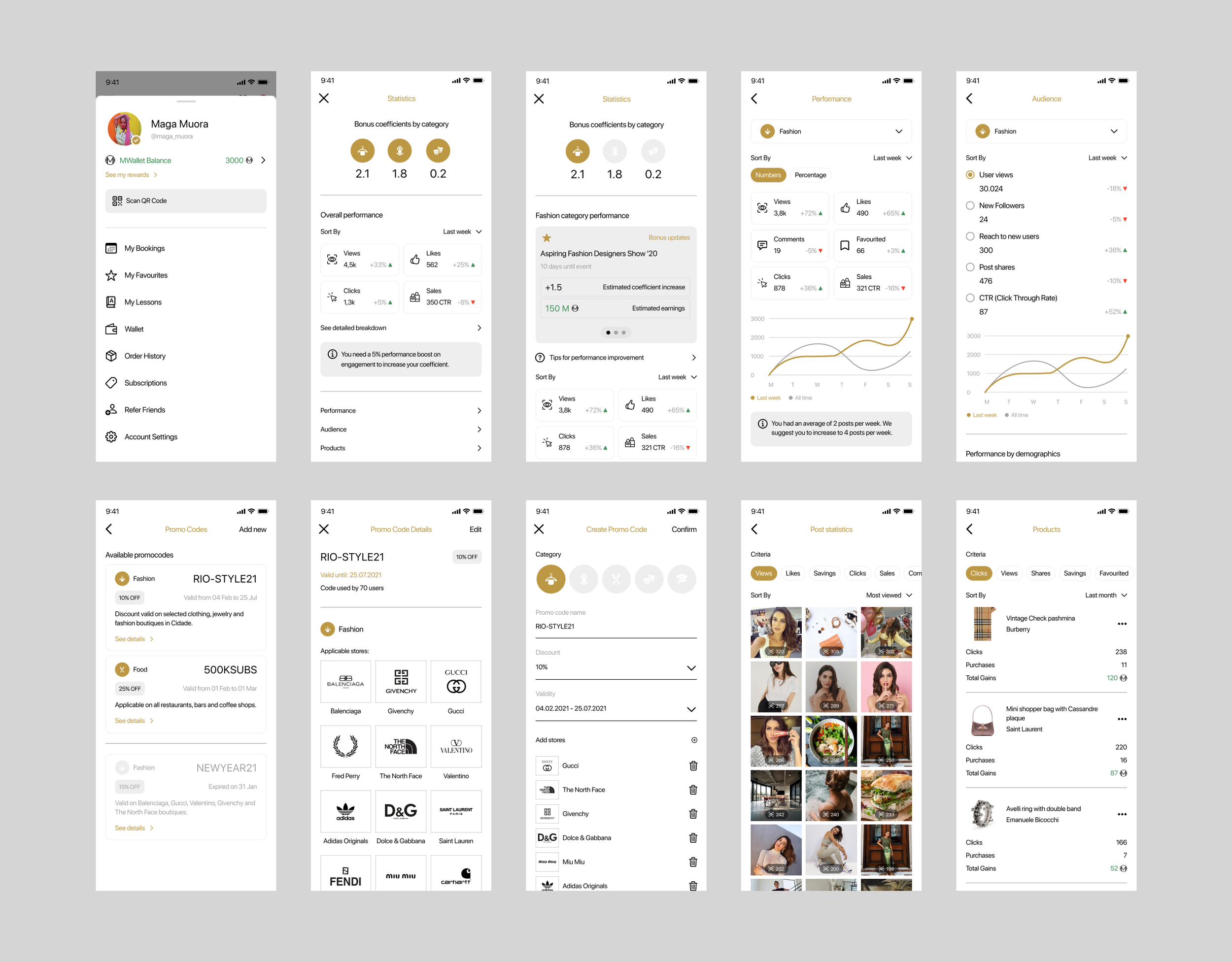
Wallet & Incentive System (MWallet / MCoins)
The MWallet and its MCoins started as a simple reward and earning system within the Cidade app, designed to incentivize user engagement through purchases, event participation, and interactions within the app. Initially, MCoins served as a loyalty currency, rewarding users for activities such as dining at restaurants, shopping at boutiques, attending cultural events, and subscribing to exclusive services. Users could accumulate MCoins and redeem them making it a valuable system that encouraged retention and spending.
As Cidade expanded and its ecosystem grew richer, MWallet evolved beyond just a rewards system and transformed into a full-fledged payment solution. MWallet allowis users to not only store and manage their MCoins but also topup their balance using traditional payment methods like credit cards and bank transfers. This shift positioned MWallet as more than just an incentive tool it became an essential financial feature, offering users convenience and exclusivity in their transactions within Cidade.
The most ambitious leap in its evolution came when MCoins transitioned from being a digital points system to a true cryptocurrency. This expansion meant that MCoins were no longer restricted to the Cidade ecosystem; instead, they could be transferred, exchanged, and even used as a digital asset beyond the app. By integrating blockchain technology, the MWallet ensured secure, transparent, and decentralized transactions, aligning with the future of digital finance. What started as a simple loyalty feature had now become a sophisticated cryptocurrency-driven payment system, reinforcing Cidade’s position as an innovative and forward-thinking district where technology and lifestyle seamlessly blend.
The Cidade super app offers as well premium subscription packages tailored to different lifestyles, ensuring users gain exclusive access, perks, and discounts across food, fashion, culture, and wellness. Each package caters to a specific audience, allowing users to choose a membership that aligns with their interests while benefiting from VIP treatment. This approach enhances user engagement and encourages long-term app loyalty by making the Cidade experience even more immersive and rewarding. This strategy incentivizes long-term commitment, encourages exploration & spending so subscribers are more likely to attend events, shop, dine, and use premium services to make the most of their membership. It also creates a sense of exclusivity & prestige as VIP perks make users feel special, reinforcing Cidade’s luxury and high-end positioning as well as it targets niche audiences effectively.
Courier, Farmer & Restaurant CMS Apps
Beyond the consumer-facing app, the Cidade platform required business-facing tools to support operational workflows for multiple user types. To ensure usability and scalability, I designed each CMS with a focus on clarity, speed, and actionable insights.
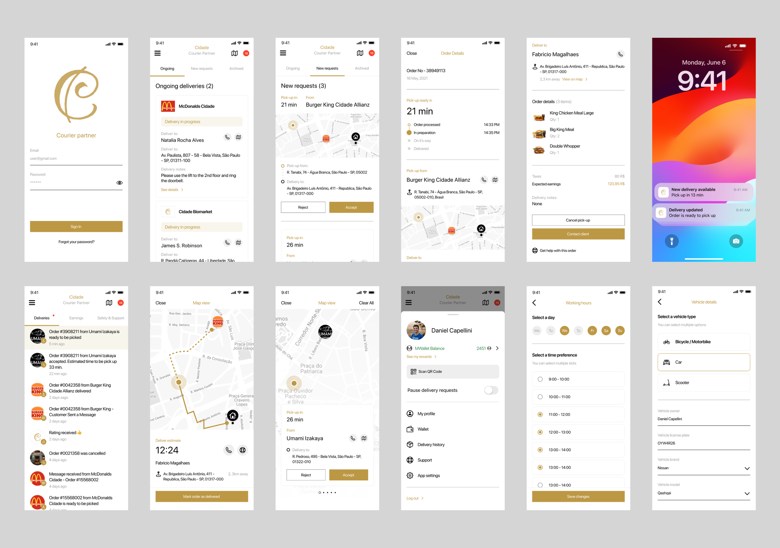
The Courier Partner app is an essential tool designed specifically for delivery couriers, providing them with everything they need to manage their work efficiently and maximize their earnings. Acting as the backbone of Cidade’s delivery network, the app allows couriers to receive and accept delivery requests instantly, whether for food orders, package deliveries, or other on-demand services. With a clear and intuitive interface, couriers can view all relevant details about each order, including pickup and drop-off locations, estimated delivery time, and customer instructions, ensuring a smooth and organized workflow. Couriers have full control over their working hours, allowing them to set their availability based on their preferences. Earnings are transparently displayed, providing real-time insights into completed deliveries, bonuses, and potential incentives, with customizable payout options so couriers can choose how and when they get paid.
The Farmer app is designed for farmers, giving them full control over their product listings, orders, and overall business operations within the Cidade ecosystem. The app allows farmers to seamlessly add, update, and manage their products, ensuring that customers always have access to fresh, high-quality goods. With real-time inventory management, farmers can track stock levels, adjust pricing, and highlight seasonal or specialty items, making their offerings more dynamic and appealing. Beyond just product management, the app streamlines the entire order process, from receiving requests to confirming and preparing shipments. Farmers can view detailed order information, track delivery statuses, and communicate with buyers if needed, ensuring transparency and efficiency in every transaction. The earnings dashboard provides real-time insights into sales performance, allowing farmers to monitor their revenue, access payout options, and plan their financial growth with confidence.
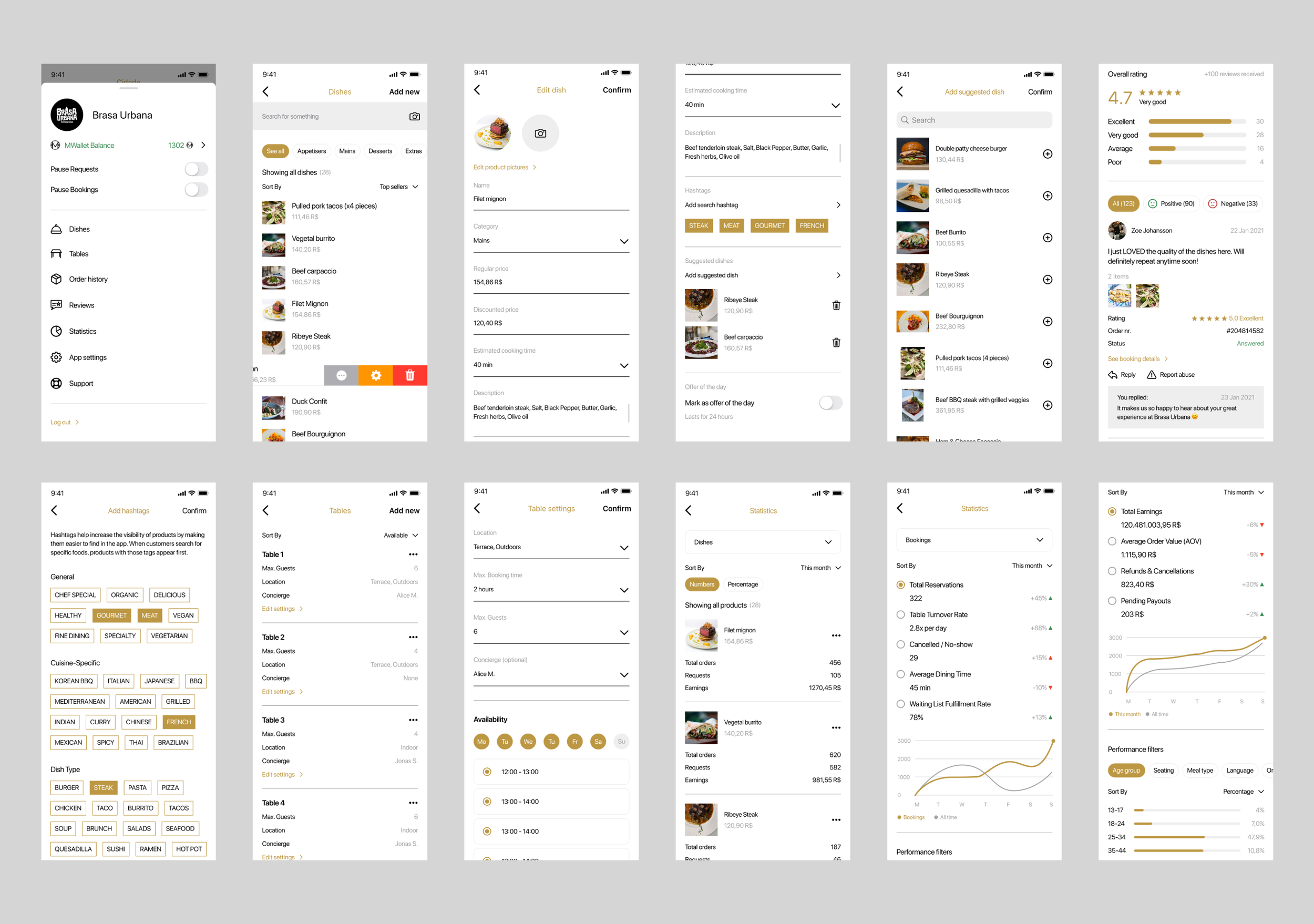
The Restaurant App is designed to be an all-in-one solution for restaurant partners, offering seamless management of table bookings, food delivery orders, and customer interactions. With an intuitive and elegant interface, restaurant managers can efficiently handle reservations, confirm check-ins, manage waitlists, and oversee delivery logistics, all from a single platform. Restaurants can view and sort reservations by time, status, or priority, ensuring smooth operations during peak hours. Each booking entry displays essential details such as: guest name and number of guests, booking time and reference number, seating preferences (indoor, outdoor, terrace) or special requests (concierge/valet service, birthday celebrations, non-smoking area, allergies). Staff can confirm a guest's check-in, move them to a waitlist, or cancel a booking if necessary. The app also enables direct communication with customers via a call button, allowing restaurant managers to reach out instantly for clarifications or confirmations. It also integrates a delivery tracking system, allowing restaurants to monitor orders in real-time.
Outcome and Learnings
This project strengthened my ability to approach design strategically while remaining detail-oriented in execution. I gained deeper experience in designing for multiple user types, building systems that can scale across services, and balancing operational needs with user experience. If I were to approach a similar project in the future, I would focus even earlier on lightweight usability testing with each user type to validate assumptions before committing to architecture and flows.
Overall, Cidade reinforced a principle I now apply consistently: successful product design is as much about system thinking, clarity, and alignment as it is about pixels and interaction details.
Even though the Cidade app was never released publicly, my work as UX designer had a significant impact on the project’s trajectory. I helped transform an initial idea into a concrete, research-informed, and highly structured product vision. The deliverables I created served as a solid foundation that would have allowed the development teams to move forward confidently. Despite the app wasn’t released, the design work showed that thoughtful UX can de-risk a complex, multi-stakeholder project before significant development costs are incurred.
As the sole designer I learned the importance of establishing a clear product structure even when the full scope is still evolving. I also reinforced the value of alignment and communication, i.e. workshops, design reviews, and documentation were critical to bridge teams, align expectations and ensure that decisions could be executed effectively in development. This project taught me how to navigate complexity while working in a small team with limited resources and no in-house development. The necessity to design for such a broad and ambitious scope pushed me to improve my ability to break down problems, prioritize, and maintain consistency. Some of my takeaway learnings were:
Improved my ability to communicate clearly with a small, cross-cultural team spread across different countries.
Learned to navigate a highly complex project scope with many interconnected features.
Gained experience aligning diverse stakeholders around a shared vision and research-backed decisions.
Strengthened my skills in breaking down big, ambitious goals into manageable, user-centered design solutions.
Practiced balancing real user needs with technical and business constraints.
Developed a better approach to maintaining design consistency across multiple app sections and use cases.
Learned to adapt my UX process for projects without in-house development teams, ensuring deliverables were clear and actionable.

